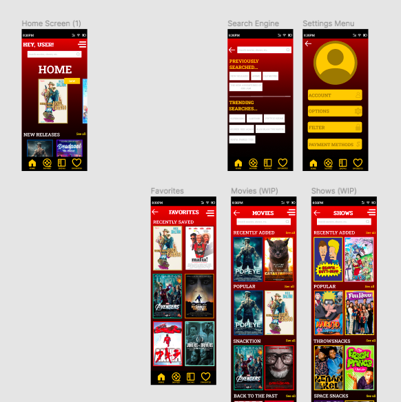
To start off, this project was way more fun to complete. It gave me more creative liberty to do what I want and allowed me to explore my options more. Explore more options allowed me to experiment with new things such as scrolling and animations. I ended up finding out how to do new things and for the most part, the project was fairly easy to design and map out. However, I did end up finding some things fairly difficult as well. It wasn’t as easy to design as I imagined it would be and I went through several different designs before I arrived at the one currently seen:

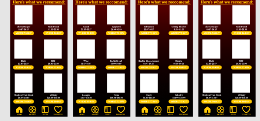
I’m happy with where the design went in the end. In my opinion, there’s a couple things I wished to improve not only with the project but with my own response to it. For one, time management was pretty difficult. I had several other essays, tests and projects to complete so it was difficult for me to find a clear schedule to work on the project. I ended up finding time and I feel like in the end, it turned out better than expected. I have with it, is the placeholder images and texts put in place. If I worked on the project more, I would’ve added more images but for now, this is what I’m working with:

I feel like it takes you out of the emersion of the app (even though it’s a prototype). I can apply my knowledge to future projects and assignments by experimenting more with things I was previously unaware of. The scrolling and animations were fun to implement and were fairly easy to figure out. I looked at several videos to find out how to make an app that looked modern, fun and easy to use. In the end, I feel like once you experiment with the app it should be fairly easy to figure out. You can take a look for yourself if you would like: