What did you learn?
I found this very interesting because it allowed me to learn how to stylize my text. What fonts to use, where to place words, how to place words– all things I’ve learned during this project.
What was easy? What was challenging?
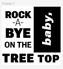
This is another visual imagery project– but with Typography instead of images. I found it easier to make the project without imagery. Of course, there was still a level of thinking involved as well. How I wanted to emphasize words was a big thing to me, so I began to emphasize words using black boxes. There’s also a difference in emphasis as well. The word “baby” only has lowercase letters and is relatively inside the black box, allowing it to be read in a calmer tone– as opposed to “ROCK” in capital letters and nearly bursting out of the box.
How could your submission be improved?
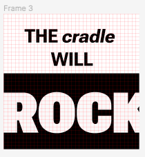
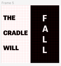
I could use some more variety in Frame 5. I could possibly make “Fall” appear a bit more like it’s falling and not so static. I could attempt to do this by adding more spaces in between the letters. There’s also a lot of white space in the “the cradle will” section doesn’t look amazing in my opinion.
How could the professor improve the submission for the next class?
I think this project is fine the way it is. I suppose eliminating space should be more touched upon.
How might you apply this knowledge to future assignments or work scenarios?
You can use Typography in all sorts of creative ways, from posters to websites– there’s no limit to how you can apply it to your work. You could use it in notes as well to label sections of a notebook.