What did I learn?
I learned a couple of new things while doing this project. Using shapes to portray movement in media. Looking back; I can see a lot of the way brands use gestalt methods to make their logos appear more lively and painters use gestalt principles to make their work appear more lively. This project definitely allowed me to be a bit more creative in my thinking.
What was easy? What was challenging?
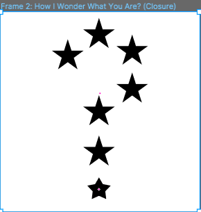
I found some of the Gestalts to be easier to plan out and actually execute, namely the Continuation Gestalt and Shared Fate Gestalt. I did have some trouble imagining ways to add some more variation to the project. I tried switching up the colors on Closure to see how it would look and I think it made it look a bit more dynamic compared to the others.
How could it be improved?
I could definitely change Similarity and Repetition; I find them pretty boring compared to the others. I think the project would benefit from Multi-Stability as well. I’ve tried to add Multi-Stability, but it didn’t look quite good in my opinion.
(Note: I would include an image… but I forgot to take a screenshot.)
How can the professor improve the project for the next class?
N/A
How can I apply this knowledge to future projects?
I can use this in my future projects by implementing the gestalt principles when I want my shapes to look more dynamic.
What specific reading inspired me?
I didn’t have any specific readings that inspired me when making the project. I did find this one really interesting: https://thoughtbot.com/blog/gestalt-principles
I liked seeing how paintings like the Starry Night utilize gestalt principles and how common of a principle it really is.