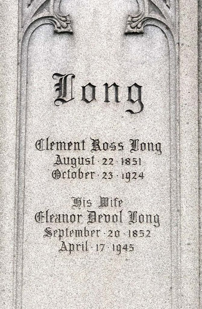
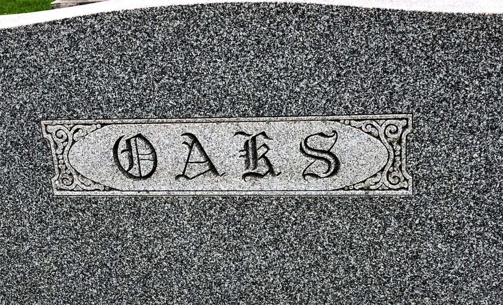
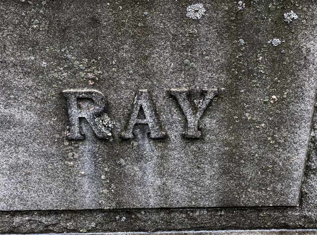
This is blackletter font because it has extra decorations, as you can see, especially in the capital L, S, O, A, and K.
This is a slab serif font because the letters are a little thicker but still have the feet at the ends of the letters.
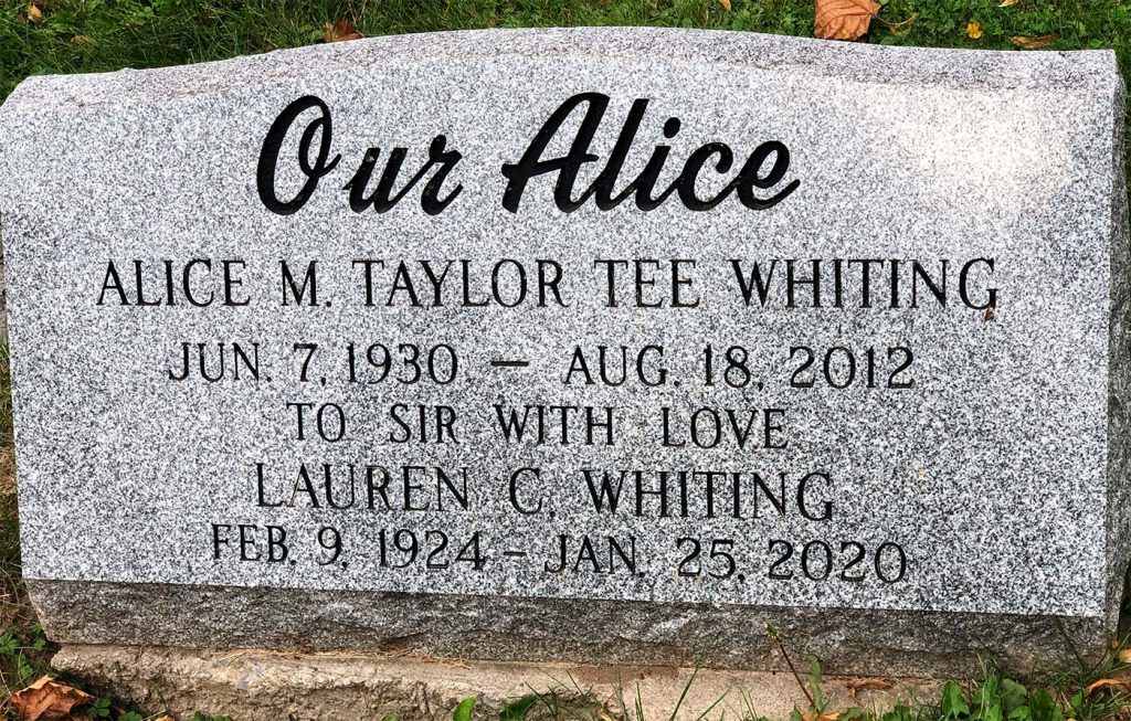
This is a script font because it mimics cursive handwriting. They only did “Our Alice” in cursive, so it seems more personal.
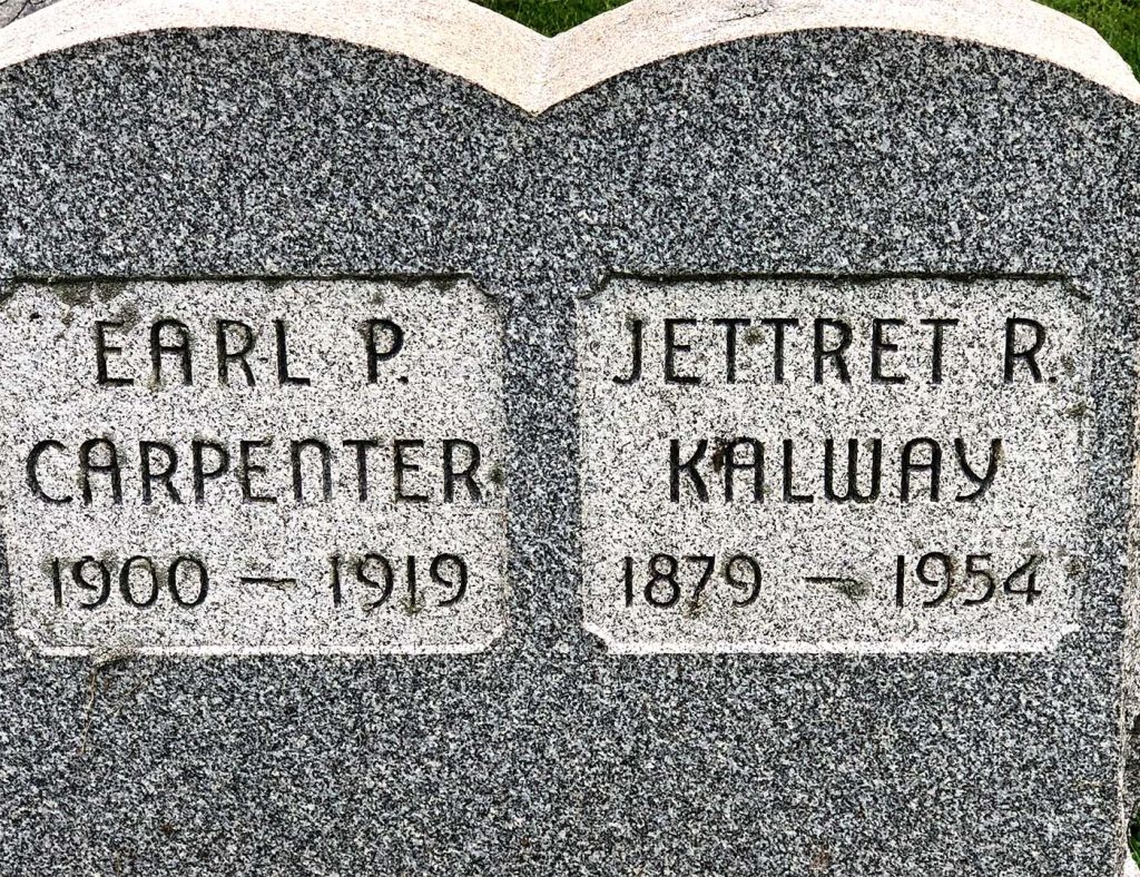
This is a historical font because the use of shapes is apparent, along with the slight changes in the left photo that was made. In “Carpenter,” they chose to do a lower n to keep with the round theme, and they did the same with the y in “Kalway” to get rid of those sharp features those letters give when capitalized.
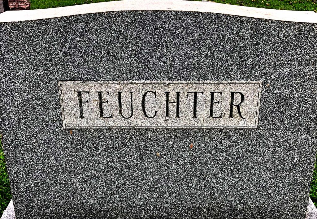
This font is serif because the feet of the letters are finished off in a more decorative style, and the body of the letters has this sense of being skinny on one side and thicker on the other.
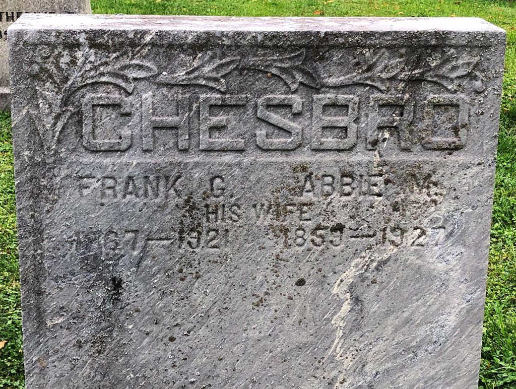
The font here is Sans serif. If you look below “Chesbro,” the font used is sans serif. You can tell because the letters have a consistent thickness to them, and they don’t have any feet.