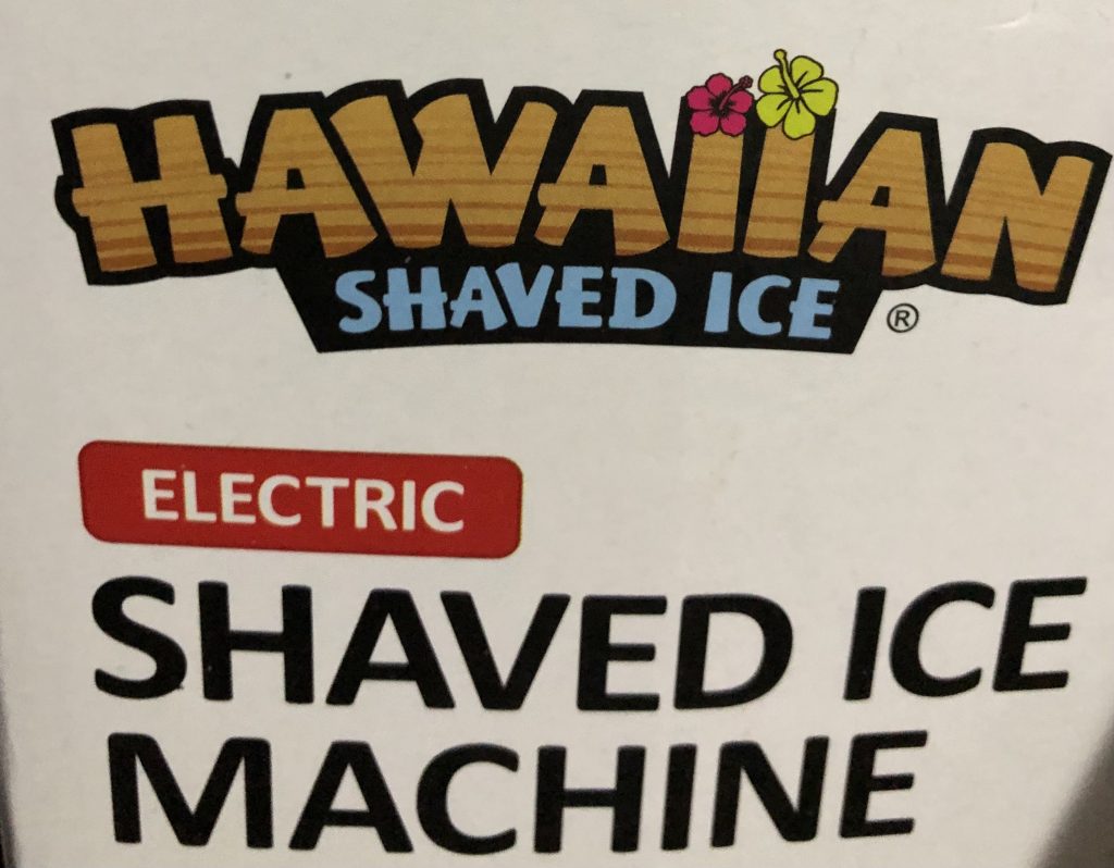
The typography I found was the one used for “Hawaiian” on this shaved ice machine box. I like the choice they made with the font because the blocky shape reminds me of boards you would see on a shack. The pattern/coloring inside furthers that connection for me. The reason I’m referring to a shack is because when I was in Hawaii, I had stopped to get shaved ice on the big island, and it happened to be in a shack, so I thought it was a cool similarity. I would also like to point out how there are two flowers at the top of the i’s, almost representing the dots on a lowercase i. This, to me, is an interesting choice because all the words are uppercase, but I guess they are trying to display that the i’s are i’s, and not L’s. Overall I like the typography choice because it’s simultaneously bold but smooth with the round edges at the tops and bottoms of the letters.