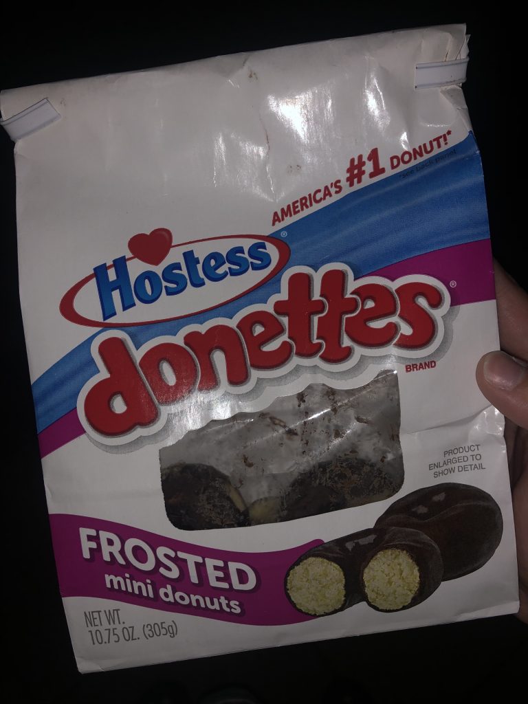
The first typography I found was the one used for the word “donettes” on this packaging. It not only stood out to me because of the way it’s spelled but the choice of font and use of all lowercase letters. I like the choice of font because the roundness of each letter reminds me of the shape of doughnuts, and that’s what they’re selling. They give the sense of bubble letters but overall go very well with the contrast of the typography used for the rest of the words on the bag. Along with this, since “donettes” is the only word on the bag that has very unique typography, it tends to pop out amongst the rest.
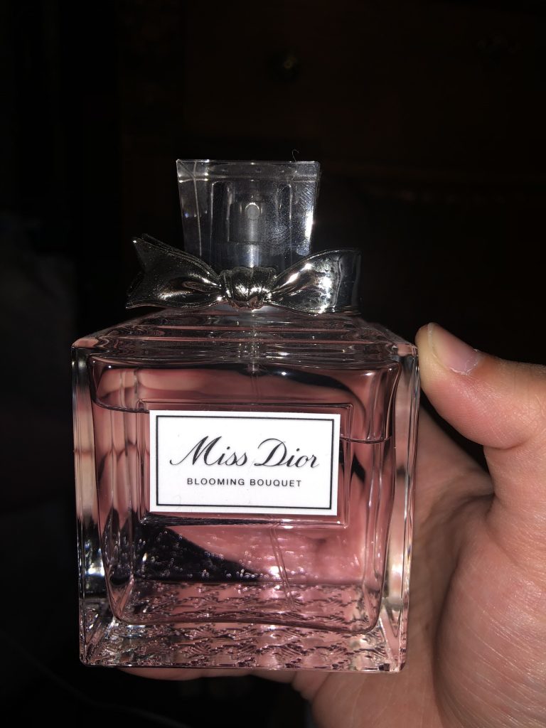
The next typography I found was on one of my perfume bottles, “Miss Dior.” I like the typography chosen for this product because it’s clean and readable. It’s very appealing because when I think of a brand like Dior, I think of fancy, prestige, or expensive, and the typography that was done for the name of the perfume gives me that impression. In general, I like fancier types of print like this perfume, and I associate typography of this nature with being fancy. Like I would see it at an expensive restaurant of some sort.
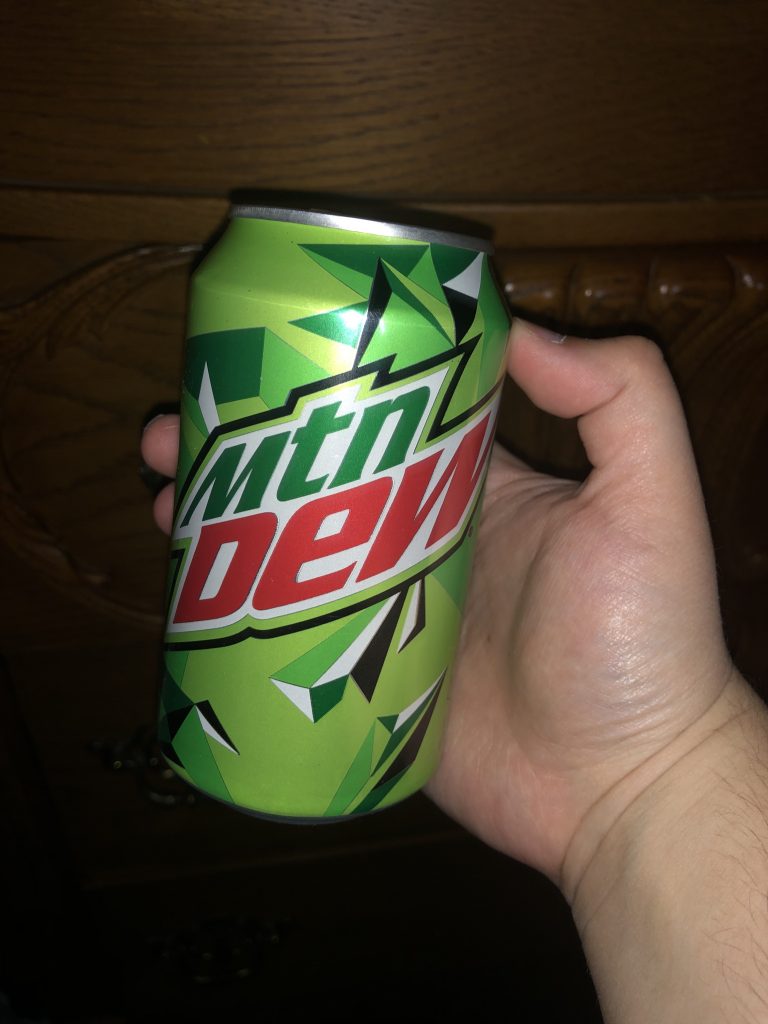
Lastly, I found typography on another food product, but this time, it was on a “mtn dew” can. Now for this one, I was very interested in it because the first thing I noticed was that towards the end of the W, the word dew looks stretched but, it happens to look the same on the box the cans came in. Along with that how the most noticeable letters are lower case, and they are the t and n in mtn and the e in dew. I like the typography because it goes well with the design of the can. It gives a more edgy look, especially with the outline around the letters. On top of that, I find it interesting that each letter is about the same size no matter if there is capitalization or not.