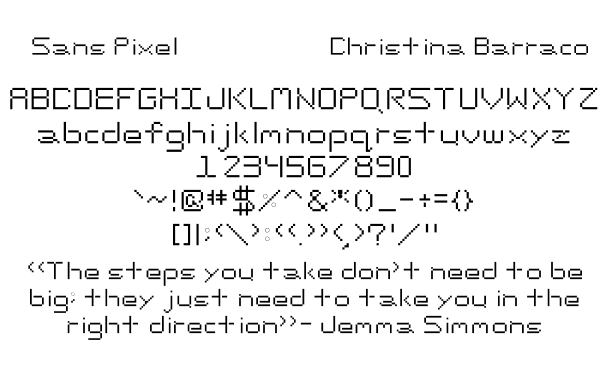
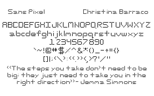
My Font:
Process Pics/Sketches:
The picture above was the first font I made, but I wasn’t liking the doubling up on one side, so I scratched this as a font possibility and moved on to the next.

The picture above was the second font I started, but it felt very boring. Overall the letters came out too sharp, and I felt I couldn’t go further since it would be hard to accomplish this with specific letters.
Reflection:
- What did you learn?
I learned how to tell the difference between the different types of fonts there are. I also learned how to format when it comes to using simple shapes in a smaller work area.
- What was easy?
It was easy figuring out what type of font I wanted to base mine on.
- What was challenging?
It was challenging staying within the boundaries I set and sticking with the rules when it came to difficult letters.
- How could your submission be improved?
My submission could be improved if I gave myself a bigger area to work with so I had room in general along with room to make decisions later on, in the alphabet, so it was easier to adjust the rest of the font if needed.
- How can the professor improve the assignment in the future?
I don’t think anything needs to be improved.
- How might you apply your knowledge in future assignments or work scenarios?
I’ll apply my knowledge in the future, for let’s say, I’m working for a company, and they want to rebrand but want a unique font. I can create a new font from scratch based on the type classification they like. I could also see this scenario happening with a new company that wants to stand out amongst the competition.
- How did a specific reading, video, or example inspire or help you?
Thinking with type helped me properly structure my letters and set the cap and x-height to where it can work for every letter. It also helped me figure out which font type I wanted to base mine on since it gave a good description, along with good visuals for each type.
http://thinkingwithtype.com/letter/#anatomy


