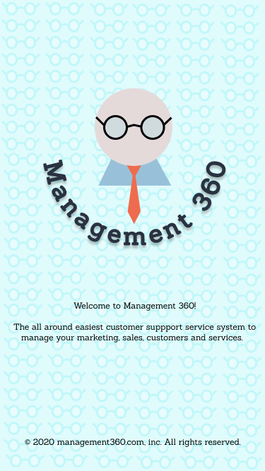
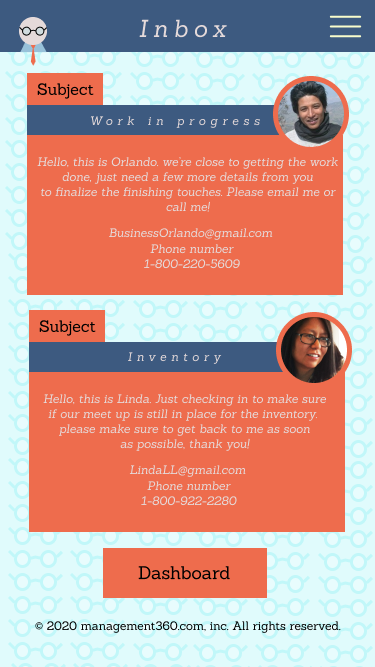
For my first project of the semester I focused a lot on making the design very consistent with the colors and typography. For the overall app and its functions its a very basic user interface. I did not know what to create specifically I just wanted to get the basic idea down on how CRM should be laid out and flow.

When I had a handful of people review the app, most of the feedback was positive. I got a lot of “easy to navigate” and “enjoyable aesthetic”. I think one thing that went wrong during tested was small text boxes. A lot of people were saying that it was hard to click on the boxes to type.

Overall, I enjoyed the project because of the learning experience. For the next project it will be much easier to create an interface that a lot of people will enjoy during their time in quarantine.