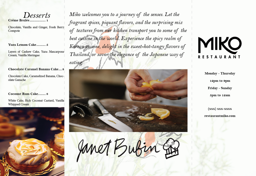
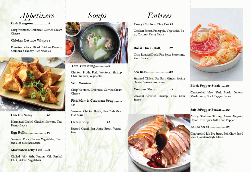
I am glad the first project was to create a menu. It was the perfect entry to print design. During the first project I learned about character styles. I will probably never get the hang of that at all. Even from last semester I still couldn’t get a hang of paragraph styles and character styles.

For my menu idea I first wanted to do an accordion style menu but I later realized that I did not have a lot of ideas for what my idea was. I had already put the entire cocktail menu on my table tent so I did not want to repeat and put it on the menu. So they entire back panel I used for the chef’s message.

The easiest part of the project was coming up with the imagery and like my background images. I kind of resemble the images to NYC corner American Chinese food spots. This is kind of the exact menu style I had despite it not being accordion style. I got the images and menu colors and images basically perfect. The challenging part of the project was cutting out the menu. I definitely messed up even with the ruler cutting out the menu and table tent.

I noticed that I never added a border or anything onto the this menu. That is something I would definitely improved on with my submission because it would have made cutting a lot easier.
I enjoyed this project a lot. I wish I could post the images of them standing but the file is not right and I also need to resize them so I will edit this post later so that I can show the menu at its full potential.