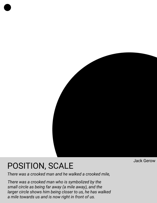
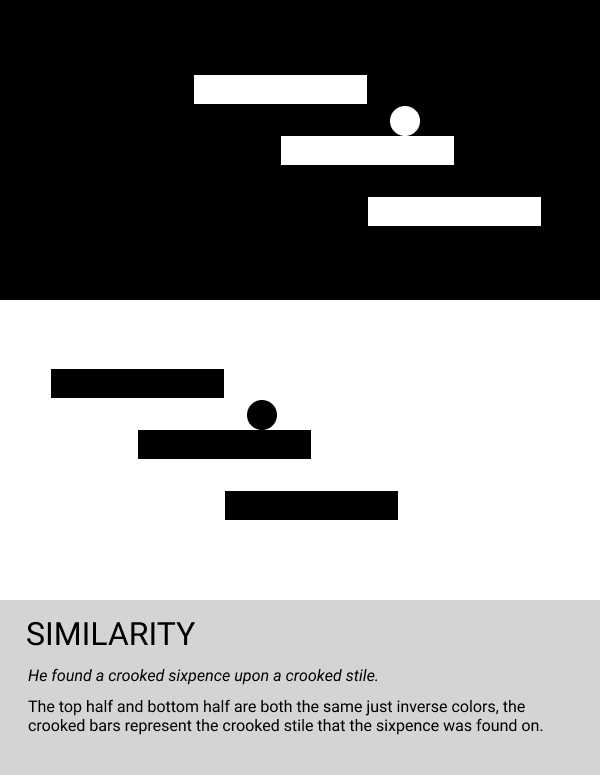
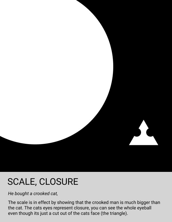
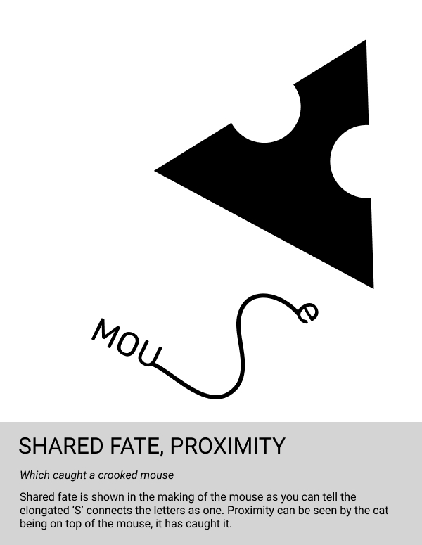
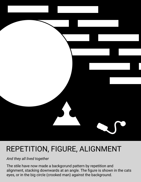
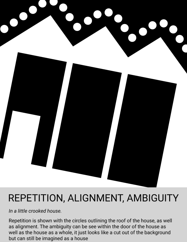
Starting off the story on slide one, I really wanted to emphasize the change in distance that the man travelled. In order to do that I decided to make the circle small as if to seem like it is far away, then it travelled the mile that the poem described and now it is close which would mean it would have to be bigger. We then move on to slide two, here I wanted to depict the stile as accurately as I could while still being very simplistic and vague. Thus, the three bars were made in its place. The sixpence was as simple as it gets, just a small circle, attracting the viewer to it as it is the odd ball out. Next comes slide three where I wanted to really emphasize the size of the man to the cat, very large and in charge, showing ownership of the cat. The cat itself was simple enough to make, just a small triangle to depict the face with even smaller eyes just to get the point across that it is indeed an animal. Next, on slide four, the cat has caught a mouse. in order to depict this I had to make the otherwise tiny cat seem very large as it dominates over the mouse it has caught. The idea for the mouse really just came from messing around with Figma. I knew I wanted to make an exaggerated tail, so I drew one out and it turned out looking like an 's' so I just went and made the rest of the body the remaining letters of 'mouse'. Throwing them all together in slide five was really just that, throwing them on the slide and seeing what worked best. I purposely left out the sixpence as it would no longer be in his possession because he bought the cat with it. Also, the mouse is now un-readable, I did this because of how tiny the mouse really should be. It's big enough to make out that it is the mouse but not big enough to have all of the detail in slide four. Finally, in slide six, I depict the tiny crooked house. Although I left the house as the size of the whole frame it does not necessarily point to it being a large house. I decided that making it smaller would have left to much blank space that would have taken away from the actually reason for the slide, the house. i left it simplistic, just a roof and a door so the viewer can tell it's a house but nothing more.