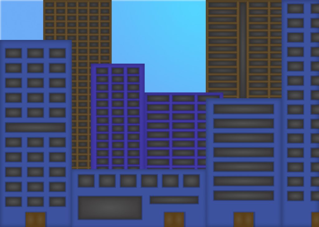
Starting off in the urban city, I chose to go with a split-complementary color scheme. The brown, purple, and blue buildings meshed well together I think. The millions of different windows also make it feel as if every building is different, along with the overlapping of different colored buildings helps to add depth to the scene. There is a lot of repetition/continuation in this scene with the windows as well as some ambiguity with the buildings as they overlap and as they run off the screen.
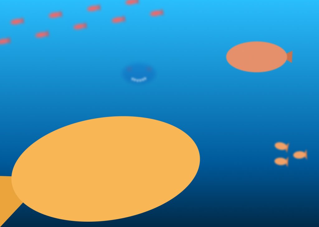
Next, we move onto the seascape. With this one I chose to use complementary colors, I feel the blues and oranges work well together. I created depth in this scene by scaling the fish differently and adding more and more blur to the objects as they get further away. There is some repetition and scale amongst the fish as well. I made sure to change the color of the fish so they matched with the water gradient.
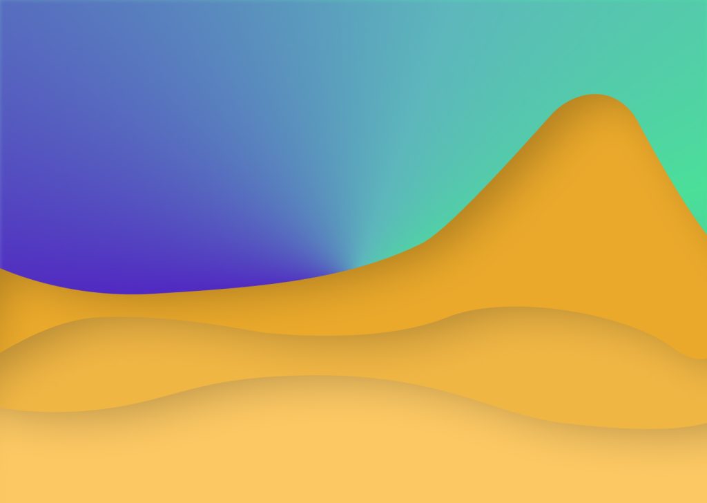
My third piece is the arid desert. I left this one simply since it is supposed to be a very lifeless desert. I went with a triadic color scheme by using the yellowish oranges for the sand dunes and an angular gradient of purples and cyans for the sky. The sky almost represent the northern lights, just in the wrong part of the world. There is contrast in the dunes as they overlap one another.
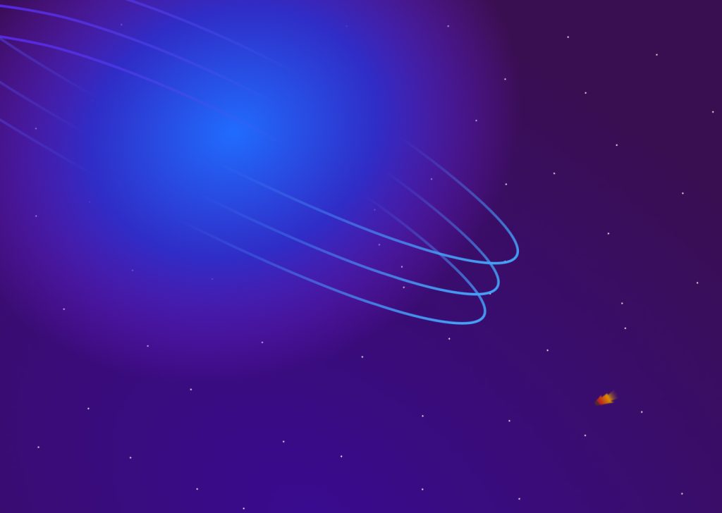
Finally, we look at my outer space scene. I decided to use an analogous color scheme here because space is usually very dark toned so using an analogous scheme allowed me to stick with dark blues and purples. I created a planet inspired by Saturn with its rings. I made it a gaseous planet so I could utilize the radial gradient and make it seem see through like a gas. I scaled the planet up enormously to make it really seem gigantic compared to the tiny meteor flying by. The meteor itself also has an analogous color scheme to it with the reds and yellows representing the flames its generating from moving so fast.