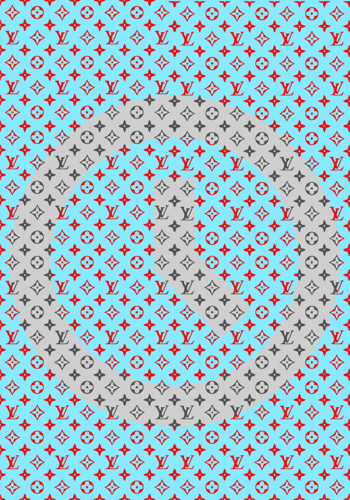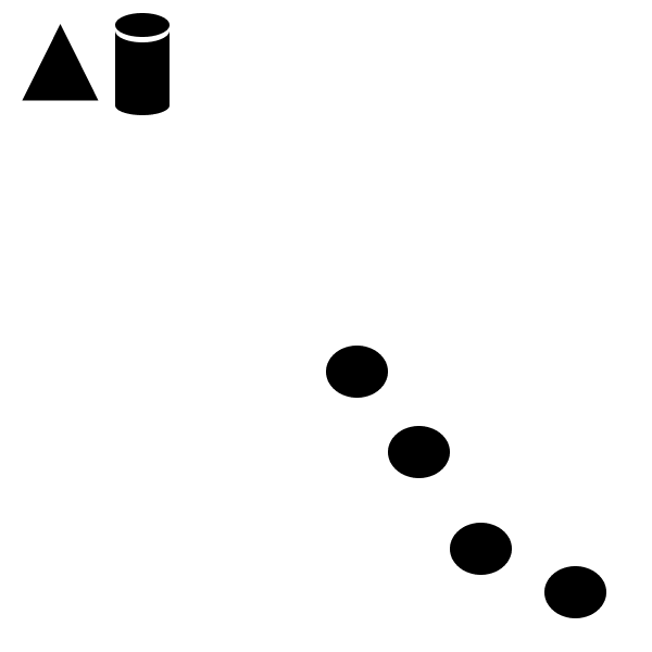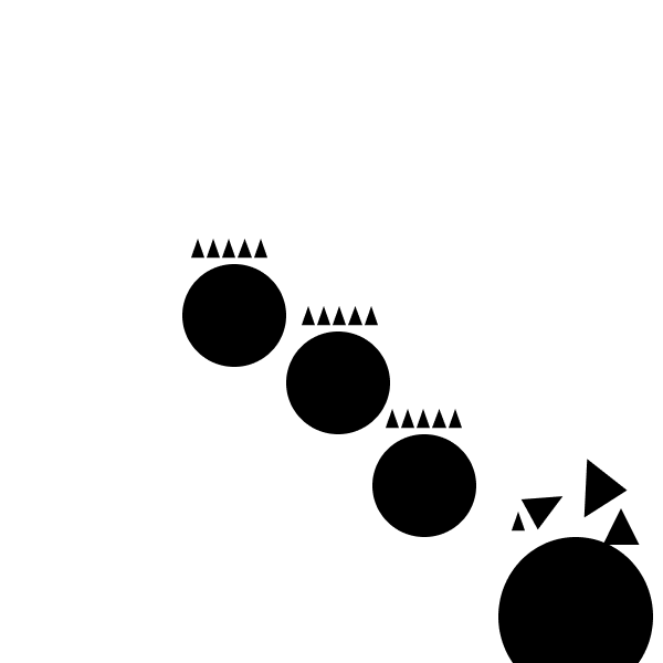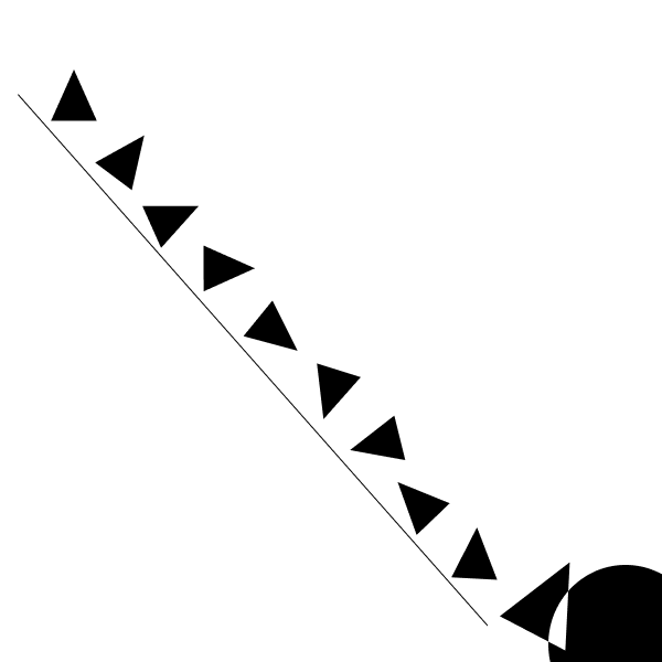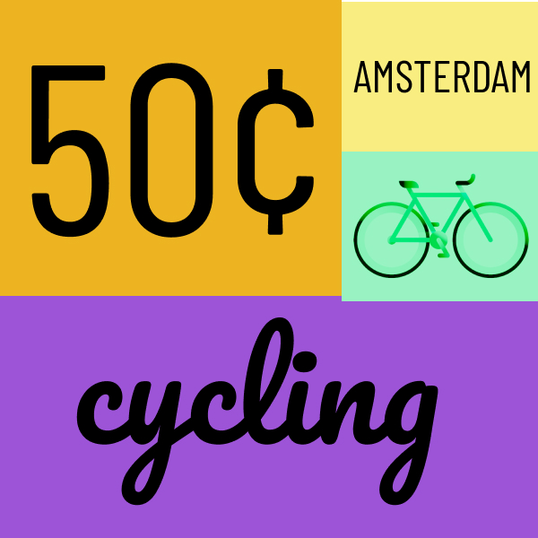
In my first frame, I went with a bicycle theme. When I was spending time in Amsterdam I was fascinated by the amount of bikes being ridden around the city at all hours of the day. It was such a unique aspect of Amsterdam’s culture that really stuck out to me. In this design, I used a split complementary color scheme combining shades of yellow with reddish purple and bluish purple. It looks like something that would be hung up in a bed and breakfast tourists would stay at while stopping through the city.
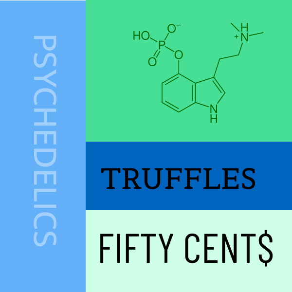
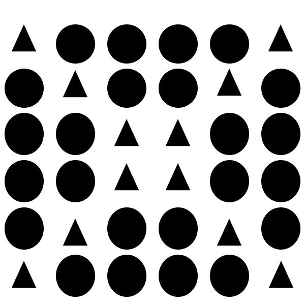
In this frame I wanted to depict the incredibly unique legal drug culture of Amsterdam. It is amazing to me that a country can legalize psychedelic substances like LSD (acid), MDMA (molly or ecstasy), and Psilocybin (mushrooms). The image in the top right is the chemical compound of Psilocybin. Even with these loose drug laws, abuse rates remain incredibly low. It is something to be analyzed for other countries. For this design I used an analogous color way of blue and green, which has always been a favorite color combination of mine.
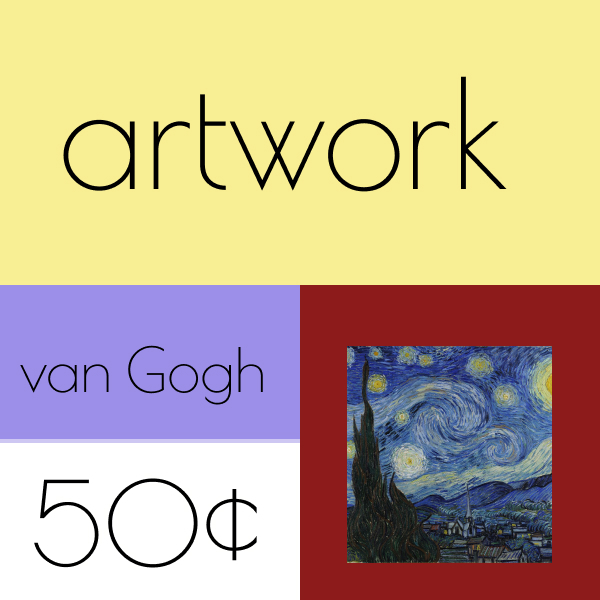
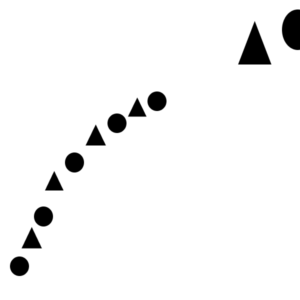
The artwork scene in Amsterdam is unbelievable. The city is home to the world famous Vincent van Gogh museum, containing an extensive collection of the late artist’s work. Seeing it was my favorite part of visiting the city, and potentially my favorite memory from my travels so far. I used the triadic color scheme consisting of blue, yellow, and red. The shades I used seemed to work together to create an appealing layout all together.
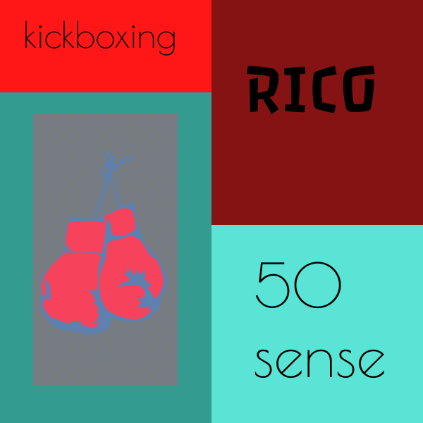
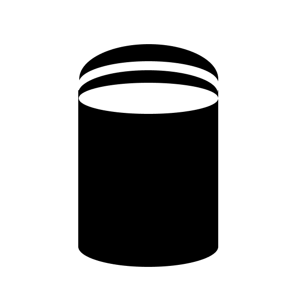
In this frame I tried to depict dutch kickboxing, which is a big part of the athletic culture in Amsterdam. I really enjoy the sport as a fan and unskilled practicing amateur. Many world champion kickboxers have come out of The Netherlands and the most notable is Rico Verhoeven, the current heavyweight world champ. The color scheme is complementary, utilizing various shades of red and green. The boxing gloves fit perfectly in a green background for this color way because they are traditionally depicted in the color red.
What did you learn?
I didn’t necessarily learn anything new with this project, but rather reinforced the techniques and theories that have been covered so far in the course. I got to get creative with color patterns and subtopics related to Amsterdam, and enjoyed the trip down Nostalgia lane that it gave me.
What was easy?
This project was not too challenging, but it took some creative thought process to figure out the ideas I used for my frames. I love Amsterdam and the topic came quite easily.
What was challenging?
Finding color schemes that worked well was challenging for me, being colorblind. I think that would be my biggest struggle in the design world. Other than that the project was straight forward and easy to complete once I got the color patterns sorted out.
How could your submission be improved?
I think I could have done more research into cool fonts to use in my designs. There are many to choose from and I’m sure if I spent a long enough time looking through them all I could find some that fit my ideas perfectly, but with that being said I like the way my project turned out overall.
How could I improve the assignment for the next class?
I think if the assignment allowed for more utilization of images and less written words, it would open up opportunity for more creative thinking. Less words and more representative imagery that can be up for interpretation.
How might you apply your knowledge in future assignments or work scenarios?
I am going into a career in marketing, and most likely will never be putting together designs on a grid. With that being said, it is good that I improved my knowledge on color coordination and layout spacing. If I ever have to approve designs in the future this knowledge will benefit me most definitely.
