Project 4: Typography

Well, we’ve made it to the last project, and it has been a fun ride all along! Taking everything we’ve learned through the year and applying it to a more personal project is something I always appreciate in a class. My heritage is something that is very important to me as I find it helps me gather inspiration and hope in the days to come, so being able to put even a bit of it into a creative project is special to me.

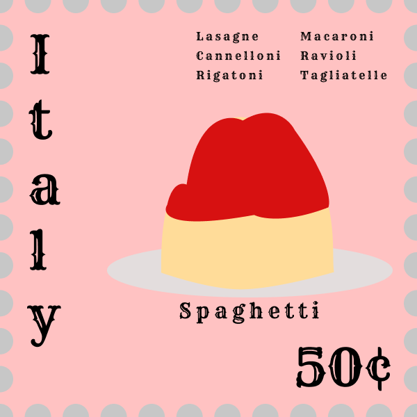
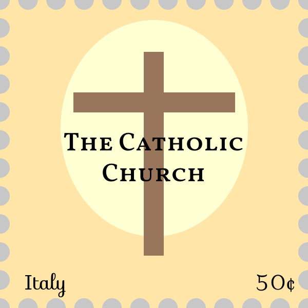
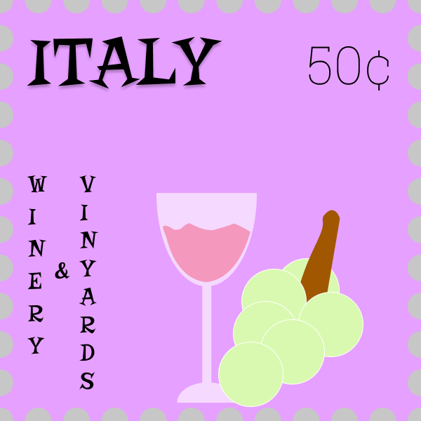
For this project I decided to pick the country Italy to base my stamps off of. For the four, I stuck to the idea presented – food, industry, and sightseeing, but for the four category of stamp I decided to do one based on religion, given that it’s such an important aspect of our culture’s identity. Fun fact: 79% of all Italian’s identify as Roman Catholic! That statistic goes up to a staggering 87% for all Italian’s living in Italy. The reason I stuck to food, industry and sightseeing is because in popular culture, these three things are quickly thought of if you asked somebody what they thought of fitting from Italy.

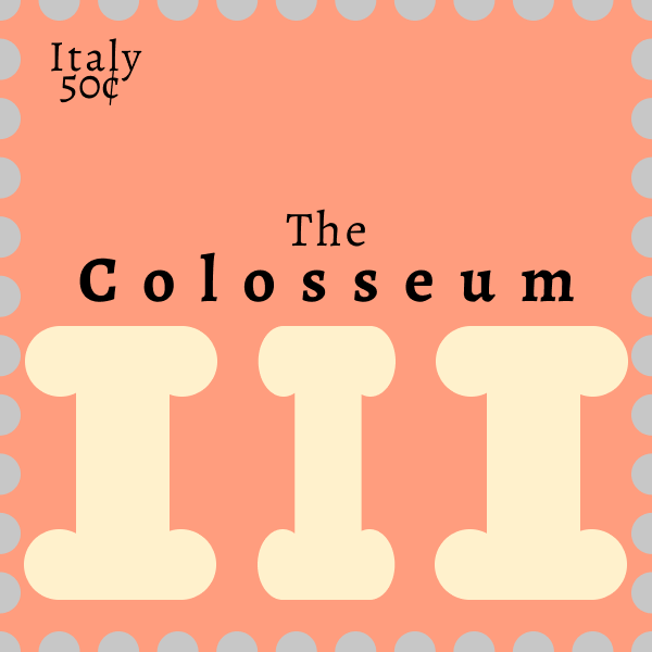
Of course these would be pasta, wineries, and the Roman Colosseum!

For designing the stamps, I went through a few different sketches for each. The only one I nailed on my first shot was the winery stamp, and even then I finicked with it for a while once I was actually in Figma! The other three took a couple of iterative designs to get through. The Colosseum stamp was originally yellow and pearly-grey! It was as ugly as it sounds, so that idea was quickly scrapped.

I was surprised to see the difference that choice of font could make in how your eye perceives a piece of information. For my food stamp, I originally had a very plain text for ‘Italy’ and more elegant texts for the pastas, but I quickly realized that the detail was lost in the smaller text and would fit the larger text much better. With a simple switch, some movement and some layout editing, bada bing bada boom, the stamp started to come together!

The tight to wide, thin to bold text really helped me push the sense of scale that the sightseeing stamp was trying to push. It’s as if it almost emulates the power and grandeur of the pillars under them and at the Colosseum!

Typography was something I took a bit for granted before this and the lab before hand; outside of positioning and the simple ‘feel’ of the font style, everything else felt very arbitrary, but even just looking at other adverts now (or prints in general!) shows more purpose in the designers choices.

This has been a fun and informative 5/6 weeks and I’ve had a blast with all of the projects, and am glad to have learned about Figma. It’s nothing like Photoshop but for a free, very beginner friendly tool, it is a wonderful thing.

Edward Krauzowicz.

Project 3: Metaphores

This was certainly a project to work on! With more material to read and thus more content to ultimately digest, I figured that this project would be something that taxed me, or made me work extremely hard to understand what I was supposed to do for the task, like Project 2 put me under (at least comparatively)!

This actually wasn’t that difficult at all. I found myself quickly getting a few sketches going for a different phrases. A couple included: Love is a Fire; Walking on Eggshells; On Cold Feet; and, of course, A Cloudy Mind, which is what I ended up going with. As you can see from the initial concept, in which I played around with color and a ‘pattern,’ I was sold on the silly idea of a brain literally clouded with, well, clouds! Signifying a clouded thought pattern, of course.

The story that the image and background image – a vector pattern of a stylized cloud and brain repeated on a washed ‘brain pink’ color – is one of a hectic, or clouded, thought process. Perhaps with some touch ups it could show as an ad of sorts, maybe for an antidepressant or some such.

The hardest part of this assignment was probably picking out the metaphor I wanted to use! Actually translating it into a combined image wasn’t difficult at all, unless you count difficulties using Figma over something more professional like Adobe Illustrator a difficulty that is! I wish I had been able to properly do everything in Illustrator, but as is, with Figma, I am still happy with how this piece turned out.

Edward Krauzowicz

Project 2: Color!

This was a fun project to work on! I don’t think I’ve ever considered color in a technical sense – color pairs and color schemes for projects always just came naturally to me. That isn’t to say that I’m a savant; what I’m saying is that I would just eyeball it and ‘see what looked right!’

The project was simple enough – design four abstract landscapes using four different color schemes. The desert landscape required a complementary scheme – two colors paired on the perfect opposite of the color wheel; The city landscape required an analogous scheme – one color of varying saturation and lightness; The seascape required a triadic scheme – three colors equally spaced apart on the color wheel; and the starscape required a split complementary scheme – in addition to the base color and its complement, you also use the two colors adjacent to the complement.

The difficult part of the project, in my opinion, was not understanding the basic ideas behind color schematics; the hard part for me was making something dynamic out of just a color scheme! Abstract art is a difficult forte to master, and creating a piece with only colors – limited by the given schemes, none the less – is a difficult challenge! The hardest landscape for me to tackle, personally, was the starscape. I just couldn’t quite capture the feeling of ‘alone’ that I was going for. I decided pretty quickly that I wanted my background to be a deep purple, as that made the most sense for a space backdrop. I was a bit dismayed when my split complementary, then, was orange, yellow, and red orange. None of those – bar a dark orange/red orange, scream planets to me. They’re all very vibrant, even at some of the darkest hues I was willing to go. Anything darker and I felt the piece became muddled and murky. That said, I think the piece looks nice – it just wasn’t the image in my head.

The most fun part of the project to me was probably working on the city. I feel like using an analogous scheme for this piece helped me tell a complex story through the art. The spire – based on the Seattle Needle – stands above all other buildings in the foreground, giving it a feeling of an impressive stature. The color – a light hue of pink – only further adds to a radiant feeling as, with clever placement via Gestalt principles, allows it to be the first part of the piece the viewer sees or has their eyes focused on. However, this isn’t the brightest building, nor the tallest; those in the background, and the furthest, in fact stand not only taller, but also shine a much, much brighter hue of pink. The foundation for a story is present, and I believe it lets an audience start to piece together something without me telling too much. Analogous was certainly my favorite palette to work on.

– Edward Krauzowicz

Project 1: Gestalt Principles

Our first project was a simple task, or so I thought. The earlier labs were easy to complete and made sense, although as most things in life go, that was only the first step to something more complicated. I felt as though I had a decent grip on gestalt principles of design, but explicitly imploring them in a design philosophy – and one as basic as this task presented – proved to be much more difficult indeed.

Without anything fancy to work with or mask my artistic efforts, I was forced to look upon the piece as something more primitive. The space – a black and white negative – provided me no color to lean on, and being locked into the primitive shapes of Figma for our first abstract drawings and then being locked into the given shapes in the toolkit left me with little to create on my own. Factor in the assignment where we must retell the story of a six lined (or so!) nursery rhyme and it became a difficult assignment.

In a twist, I found the abstract work a bit simpler than the representative work.

I leaned heavily on the gestalt principle of symmetry in most of my pieces – frames one, two, and six particularly implore the concept. One and two are both framed nicely in a mostly symmetrical fashion – the star that is the focal point is found at the center of the frame. Six also employs symmetry, although I broke the rule instead of enforced it, drawing the eye to the star that breaks the circle pattern with a contrasting stripe as well as the star’s placement.

Frame three uses the gestalt principle of uniform connectedness, linking the planet to the star via a simple line, placing them in a relation – the star is ‘up above’ the world, so to speak.

Frame four uses the rule of thirds to direct the flow of the viewer’s eyes. From the bottom across, the frame is nicely filled and allows for a natural flow over the piece.

Ultimately, this project was harder than I anticipated! I thought it would be simple as implicitly following gestalt principles is usually a mindless task – something designers such as ourselves do without thinking! It becomes much harder to do this when we have to sit down and pick our brains to design something in an unnatural way, breaking it down to the core psychology behind what makes a design good. That said, it was a fun experiment/assignment, and I think I’ve gotten a better grip on the principles that fuel the choices we make when we create a design.

Article Referenced/Referred To: https://www.smashingmagazine.com/2014/03/design-principles-visual-perception-and-the-principles-of-gestalt/

– Edward Krauzowicz