This was a fun project to work on! I don’t think I’ve ever considered color in a technical sense – color pairs and color schemes for projects always just came naturally to me. That isn’t to say that I’m a savant; what I’m saying is that I would just eyeball it and ‘see what looked right!’
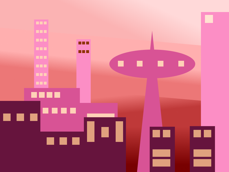
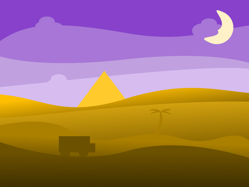
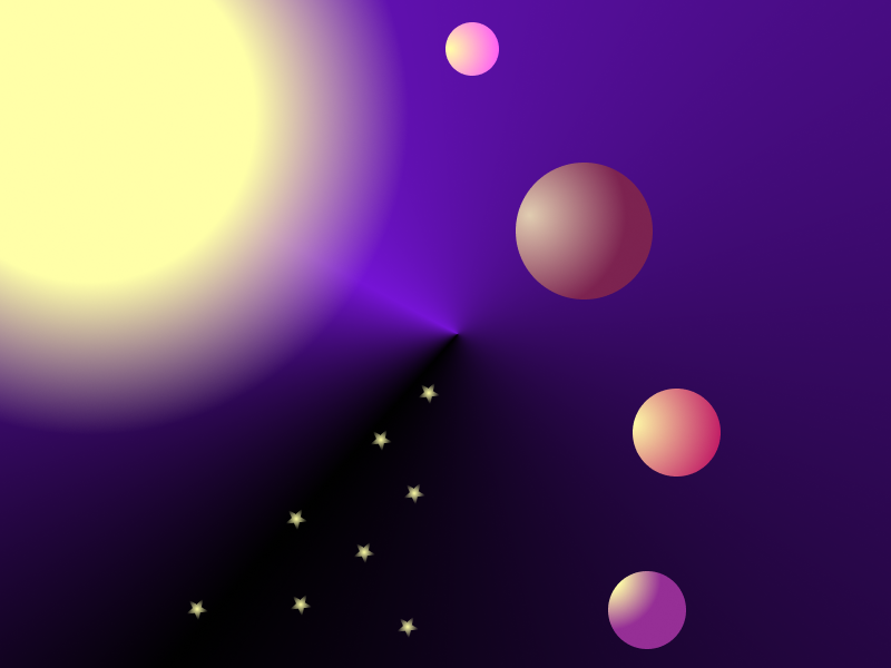
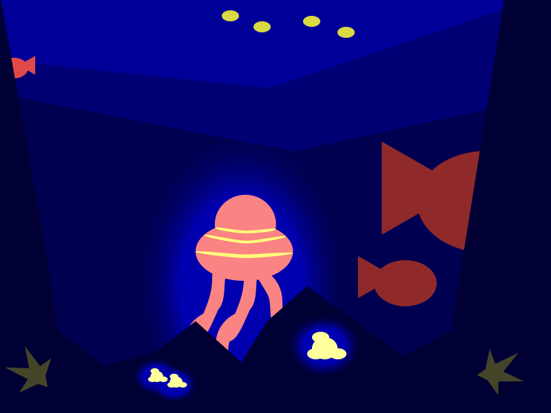
The project was simple enough – design four abstract landscapes using four different color schemes. The desert landscape required a complementary scheme – two colors paired on the perfect opposite of the color wheel; The city landscape required an analogous scheme – one color of varying saturation and lightness; The seascape required a triadic scheme – three colors equally spaced apart on the color wheel; and the starscape required a split complementary scheme – in addition to the base color and its complement, you also use the two colors adjacent to the complement.
The difficult part of the project, in my opinion, was not understanding the basic ideas behind color schematics; the hard part for me was making something dynamic out of just a color scheme! Abstract art is a difficult forte to master, and creating a piece with only colors – limited by the given schemes, none the less – is a difficult challenge! The hardest landscape for me to tackle, personally, was the starscape. I just couldn’t quite capture the feeling of ‘alone’ that I was going for. I decided pretty quickly that I wanted my background to be a deep purple, as that made the most sense for a space backdrop. I was a bit dismayed when my split complementary, then, was orange, yellow, and red orange. None of those – bar a dark orange/red orange, scream planets to me. They’re all very vibrant, even at some of the darkest hues I was willing to go. Anything darker and I felt the piece became muddled and murky. That said, I think the piece looks nice – it just wasn’t the image in my head.
The most fun part of the project to me was probably working on the city. I feel like using an analogous scheme for this piece helped me tell a complex story through the art. The spire – based on the Seattle Needle – stands above all other buildings in the foreground, giving it a feeling of an impressive stature. The color – a light hue of pink – only further adds to a radiant feeling as, with clever placement via Gestalt principles, allows it to be the first part of the piece the viewer sees or has their eyes focused on. However, this isn’t the brightest building, nor the tallest; those in the background, and the furthest, in fact stand not only taller, but also shine a much, much brighter hue of pink. The foundation for a story is present, and I believe it lets an audience start to piece together something without me telling too much. Analogous was certainly my favorite palette to work on.
– Edward Krauzowicz