

Well, we’ve made it to the last project, and it has been a fun ride all along! Taking everything we’ve learned through the year and applying it to a more personal project is something I always appreciate in a class. My heritage is something that is very important to me as I find it helps me gather inspiration and hope in the days to come, so being able to put even a bit of it into a creative project is special to me.
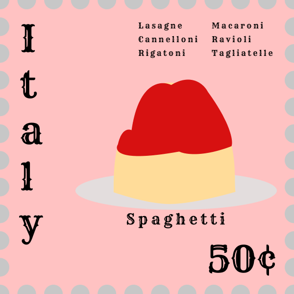
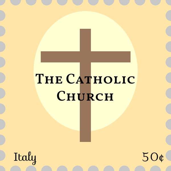
For this project I decided to pick the country Italy to base my stamps off of. For the four, I stuck to the idea presented – food, industry, and sightseeing, but for the four category of stamp I decided to do one based on religion, given that it’s such an important aspect of our culture’s identity. Fun fact: 79% of all Italian’s identify as Roman Catholic! That statistic goes up to a staggering 87% for all Italian’s living in Italy. The reason I stuck to food, industry and sightseeing is because in popular culture, these three things are quickly thought of if you asked somebody what they thought of fitting from Italy.
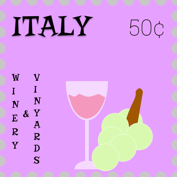
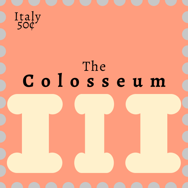
Of course these would be pasta, wineries, and the Roman Colosseum!
For designing the stamps, I went through a few different sketches for each. The only one I nailed on my first shot was the winery stamp, and even then I finicked with it for a while once I was actually in Figma! The other three took a couple of iterative designs to get through. The Colosseum stamp was originally yellow and pearly-grey! It was as ugly as it sounds, so that idea was quickly scrapped.
I was surprised to see the difference that choice of font could make in how your eye perceives a piece of information. For my food stamp, I originally had a very plain text for ‘Italy’ and more elegant texts for the pastas, but I quickly realized that the detail was lost in the smaller text and would fit the larger text much better. With a simple switch, some movement and some layout editing, bada bing bada boom, the stamp started to come together!
The tight to wide, thin to bold text really helped me push the sense of scale that the sightseeing stamp was trying to push. It’s as if it almost emulates the power and grandeur of the pillars under them and at the Colosseum!
Typography was something I took a bit for granted before this and the lab before hand; outside of positioning and the simple ‘feel’ of the font style, everything else felt very arbitrary, but even just looking at other adverts now (or prints in general!) shows more purpose in the designers choices.
This has been a fun and informative 5/6 weeks and I’ve had a blast with all of the projects, and am glad to have learned about Figma. It’s nothing like Photoshop but for a free, very beginner friendly tool, it is a wonderful thing.
Edward Krauzowicz.