

Our first project was a simple task, or so I thought. The earlier labs were easy to complete and made sense, although as most things in life go, that was only the first step to something more complicated. I felt as though I had a decent grip on gestalt principles of design, but explicitly imploring them in a design philosophy – and one as basic as this task presented – proved to be much more difficult indeed.
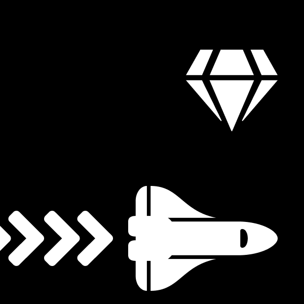
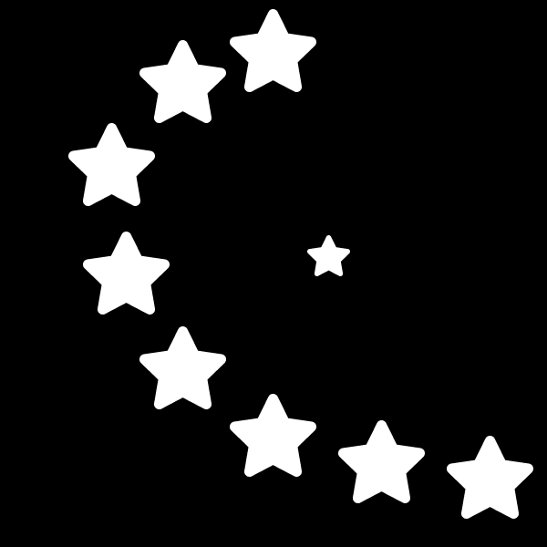
Without anything fancy to work with or mask my artistic efforts, I was forced to look upon the piece as something more primitive. The space – a black and white negative – provided me no color to lean on, and being locked into the primitive shapes of Figma for our first abstract drawings and then being locked into the given shapes in the toolkit left me with little to create on my own. Factor in the assignment where we must retell the story of a six lined (or so!) nursery rhyme and it became a difficult assignment.
In a twist, I found the abstract work a bit simpler than the representative work.
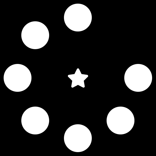
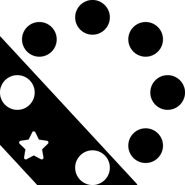
I leaned heavily on the gestalt principle of symmetry in most of my pieces – frames one, two, and six particularly implore the concept. One and two are both framed nicely in a mostly symmetrical fashion – the star that is the focal point is found at the center of the frame. Six also employs symmetry, although I broke the rule instead of enforced it, drawing the eye to the star that breaks the circle pattern with a contrasting stripe as well as the star’s placement.
Frame three uses the gestalt principle of uniform connectedness, linking the planet to the star via a simple line, placing them in a relation – the star is ‘up above’ the world, so to speak.
Frame four uses the rule of thirds to direct the flow of the viewer’s eyes. From the bottom across, the frame is nicely filled and allows for a natural flow over the piece.
Ultimately, this project was harder than I anticipated! I thought it would be simple as implicitly following gestalt principles is usually a mindless task – something designers such as ourselves do without thinking! It becomes much harder to do this when we have to sit down and pick our brains to design something in an unnatural way, breaking it down to the core psychology behind what makes a design good. That said, it was a fun experiment/assignment, and I think I’ve gotten a better grip on the principles that fuel the choices we make when we create a design.
Article Referenced/Referred To: https://www.smashingmagazine.com/2014/03/design-principles-visual-perception-and-the-principles-of-gestalt/
– Edward Krauzowicz