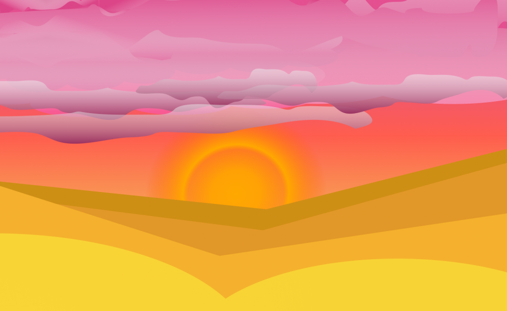
Desert
(Analogous)
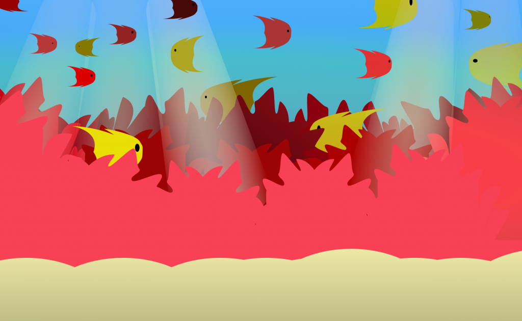
Aquatic
(Triadic)

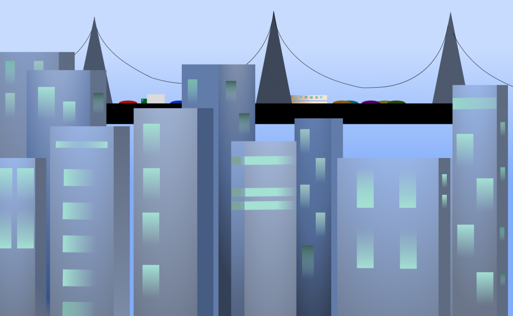
Urban
(Split Complementary)
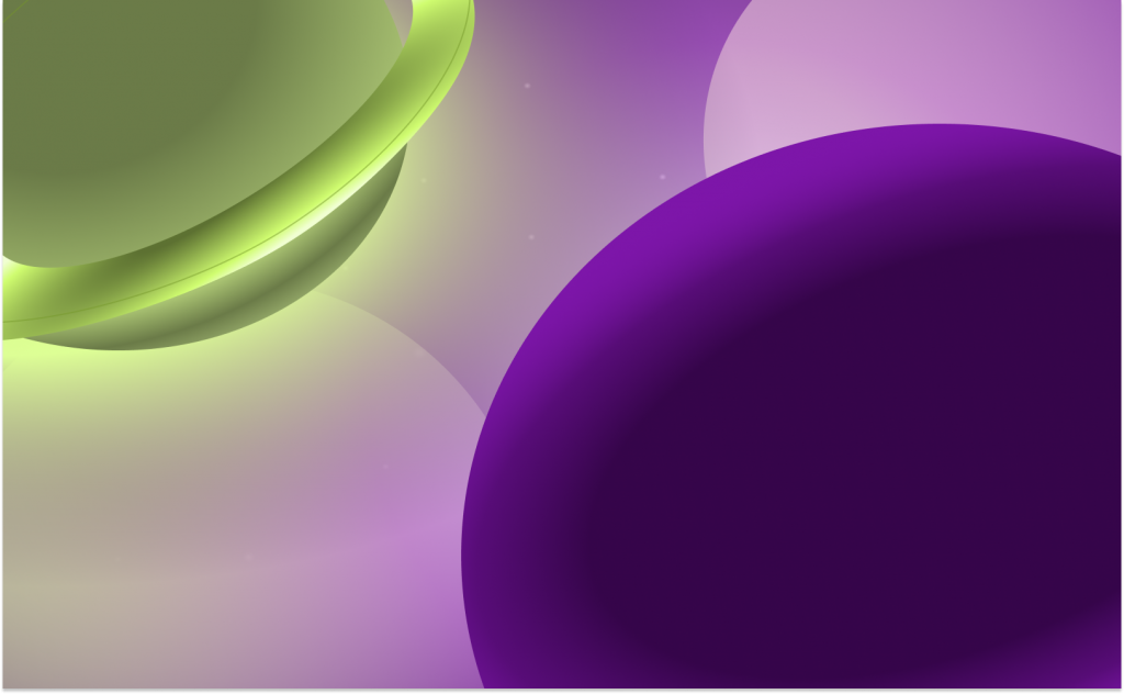
Extraterrestrial
(Complementary)
QUESTIONS-
- What did you learn?
When working on this project, I was able to learn about the different color schemes and how they can be integrated to represent different environments. Not only do the color schemes complement each landscape, but with the right choice, they can bring the landscape to life. Aside from the color side of things, I gained some more knowledge on how different tools work in Figma and the unlimited types of shapes that can be produced using certain tools at each given moment.
2. What was easy?
Compared to the last project, this one was much easier. Going into this project I had gained more confidence in using Figma, so as a result I feel that my shapes are “unique” and portray the landscapes quite well. Determining the color for each shape wasn’t all that bad, as my only rule to myself was to stick with the appropriate color scheme and not go overboard with the colors, mainly to keep things somewhat “realistic”.
3. What was challenging?
In my honest opinion and from my time spent on this project, I think the hardest thing was creating those “abstract” shapes. Compared to a more advanced piece of software such as Adobe Illustrator, Figma still has quite a bit of power when it comes to stretching/bending vertices or edges. The Pen Tool is what I’m referring to, and while it is able to set different points, there’s not a whole lot that this tool can offer unlike Illustrator’s variety of tools to select from. I still have some trouble with creating curvatures with the pen tool, which is why the bridge in my Urban Scene appears to be a bit out of place.
4. How could your submission be improved?
The biggest thing that could be improved would be the bridge in my Urban Scape (mentioned in Question 3) and the fish in my Aquatic Scape. The fish were super difficult to create, let alone being able to perceive these fish as being “realistic”. Again, I had to use the Pen Tool for this object, and I don’t think it turned out as good as some other things that I created in my other scenes (ie. the planets in my Extraterrestrial Scene.
5. How could I improve the assignment for the next class?
If I were to repeat this assignment, I would’ve definitely spent more time utilizing the Pen Tool in hopes to find myself become efficient with it. This would improve my fish and the bridge. Besides those two aspects of my scenes, everything else seems to fit in quite nicely with each scene. Overall, I am still content with the final product.
6. How might you apply your knowledge in future assignments or work scenarios?
For future projects or work scenarios, I will keep focusing and experimenting with the Pen Tool, as I feel that was my biggest weakness of this project. Also, I am inclined to spend more time on gradients since they are not only beautiful, but add the sense of “depth” to the design, something that has always fascinated me.
7. How did a specific reading or video inspire or help you?
For each scene, I would search up an image that corresponded with each scene I had in mind. For example, to get the “blueprint” for my Desert Outlook, I would look up something related to that designated scene, such as “sand dunes” or “desert sky”. Keep in mind that this only served as a starting point and I didn’t base my landscape from only one picture. Had I not done this, I feel that my scapes wouldn’t look as nearly as good, so taking the extra time to do some brainstorming and researching beforehand was a fabulous idea.