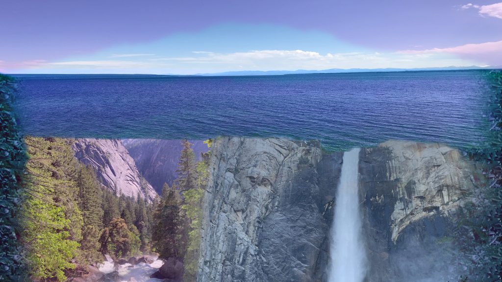
Desktop 
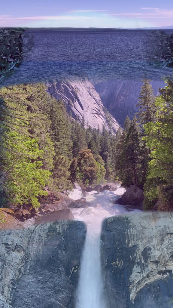
Mobile
- What did you learn?
While engaging with this assignment, I was able to learn more about layer masks and different tools to combine images into one “collage”. Mainly, I focused on improving with the Pen Tool. So far, I really like how universal and flexible it is, compared to the Magnetic Marque Tool.
2. What was easy?
Similar to the last project, modifying the images wasn’t bad, which involved filters, layer masks, and other tools to create a unique looking image. These steps didn’t take a whole lot of time since as with the last project, I’ve had multiple times to use these instruments and experience the process of trial and error.
3. What was challenging?
The biggest challenge with this project was being able to arrange each image and your texture/background so every image could be seen and distinguishable from the others. The issue with this is that it is difficult to make the whole picture look nice, since not every image “complements” each other. This is where the tools and other blending methods came into play, but even then it was not easy. Despite this being the case, I feel like my finished product fulfilled my expectations, but I think my collage could be improved.
4. How could your submission be improved?
Regarding this project, having to mask out an object with the Pen Tool was a bit strange. The only defined “object” was a mountain range in one of my photos. I felt like while it was good practice using the Pen Tool and the concept of negative space, I felt like the object didn’t really belong in my collage. With that in mind, I understand that it is a good technique to have in mind. Also, my texture could probably be touched up or exposed a bit more, but at the same time, I like the fact that it is partially “hidden” in my collage. If I had time, I most likely would’ve added some text or animation to bring my collage to life.
5. How could I improve the assignment for the next class?
There isn’t much that could be done to improve this assignment. However, I feel like we should try another technique to coincide with the negative space concept. For instance, maybe have a few other methods for different objects that are not “complete” or tricky to define, such as a mountain or cloud, to make these objects more “apparent”.
6. How might you apply your knowledge in future assignments or work scenarios?
In the future, I will keep in mind the idea of negative space and other techniques with the Pen Tool, as with most things in Photoshop or other software, there are tons of possibilities to create something that seemed beyond imaginable.
7. How did a specific reading or video inspire or help you?
For this project, I used the same images that I did for Project 1. The inspiration is pretty much the same, but for this assignment, I was going for a “postcard” theme. Even though it’s a screensaver, I loved the idea of merging/blending images which made me thought of a postcard that contained three images and had a gradient between each one. I thought this was such a cool effect, which encourage me to replicate it, as seen in this project. This makes you feel like you’re looking at one complete image, but with fading in/out each individual image, you attain the effect that every image is different in one way or another. I like to think of it as each image “sifting” into the next. It’s pretty difficult to explain, as it’s something that can be seen only when you look at this “technique” in action.