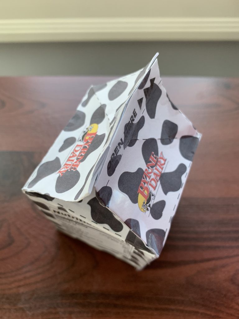
Aerial View 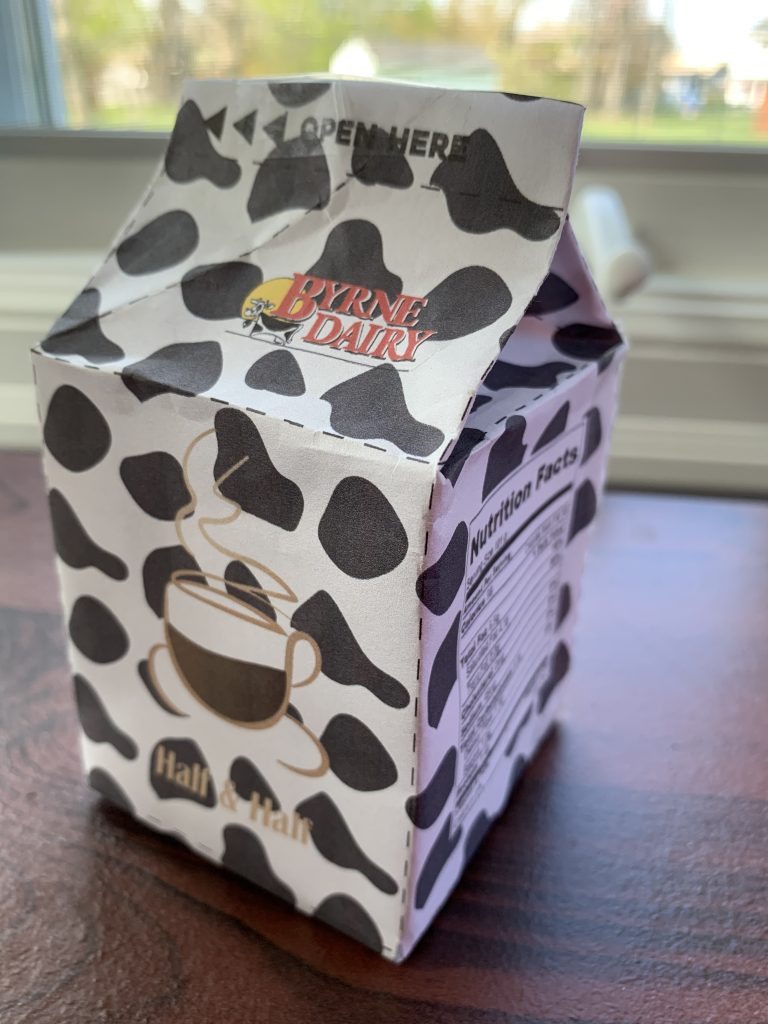
Angular View 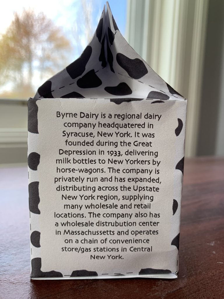
Side View
- What did you learn?
Prior to this task, I hadn’t touched Illustrator that much, so I was dipping my toes in when working with Illustrator. So far, I’ve learned how to trace layers, create textures and text fields, use the Pen Tool to trace objects, and the Pencil or Brush Tool to make strokes. I also was informed about some size-altering tools such as the Scale tool, which is another way to enlarge/shrink the size of objects and the Width Tool, serving its role for adjusting the width of strokes made with the Pencil/Brush Tool.
2. What was easy?
I found that using the Pencil Tool was actually very straightforward, mainly since there are options to smooth out your rough strokes, especially the edges and curves. This came in handy when drawing the coffee cup. At first, my drawing was very crude and wasn’t clean. After simplifying the path using Object > Simplify feature, my concoction began to look much better. The final touch was adjusting the width of the stroke to give it more of a paintbrush feel, rather than a geometric feel.
3. What was challenging?
There were two components of this project that gave me a bit of trouble, those being the pattern and assembly. Since the purpose of this object is to contain coffee creamer, I wanted to continue this theme throughout the carton and give the consumer the impression that this is a dairy product. In light of this, I decided to do a cow-based print. Creating the shapes wasn’t bad, however, making the pattern feel seamless was totally different. In the past, I’ve always had an issue with making a clean, consistent pattern. I had to rearrange my pattern multiple times in order to achieve this look. After messing with the opacity and modifying some of the shapes, I was finally able to produce a pattern that I was happy with. The other part that I struggled with was bringing this object from 2D into 3D. Building the base and the sides of the carton was pretty easy, but pinching the two top flaps together to form the top of the carton was tricky. However, I was able to work this out and while the top doesn’t look perfect, it still looks like the opening flaps are of that as a real carton. For this step, I’d recommend having an actual carton next to your “mockup” variant. That way, you can see how to fold the the carton so it looks as realistic as possible.
4. How could your submission be improved?
As mentioned above, I feel like I could’ve adjusted my tint for the pattern. The black cow spots don’t allow for much contrast between the pattern and text, such the “OPEN HERE” label and barcode. Aside from that, I think my carton looks fine. Also, if I had more time, I would probably tweak my coffee logo. I’m not all that thrilled with it as it doesn’t really stand out and the “half and half” text is a “coffee and cream” shade instead of a vivid color like crimson, but for the time being, it isn’t the biggest issue to me compared to the pattern.
5. How could I improve the assignment for the next class?
Just like the previous assignment, I don’t think much needs to be changed. Although the building process wasn’t easy, that’s something that can’t be altered that much, so overall I think the starter file and layout for this assignment was pretty straightforward and easy to understand.
6. How might you apply your knowledge in future assignments or work scenarios?
In future assignments or work scenarios, I would continue to focus on the pattern aspect of things as I feel like that’s my weakest point in this project. I would keep in mind useful techniques for the Pencil Tool to draw faster and more efficiently. Anytime I’m given a logo or something to trace, it seems that the Pen Tool should suffice for this step in design.
7. How did a specific reading or video inspire or help you?
As I stated earlier, the only inspiration for this project for me was the theme of a farm, consisting of cows and dairy. The company for this product is Byrne’s Farms, a long-running company, so something rustic like a farm, complements this packaging perfectly. This is why I did a cow-spotted pattern instead of something as simple as stripes or complex as coffee beans. While the coffee bean pattern is creative, the product is dairy-related. After thinking about this concept for the overall theme, I decided to apply it to my carton, hence the cow-spotted pattern. Other than that, I can’t really think of any reading or video that influenced my approach when constructing the carton.