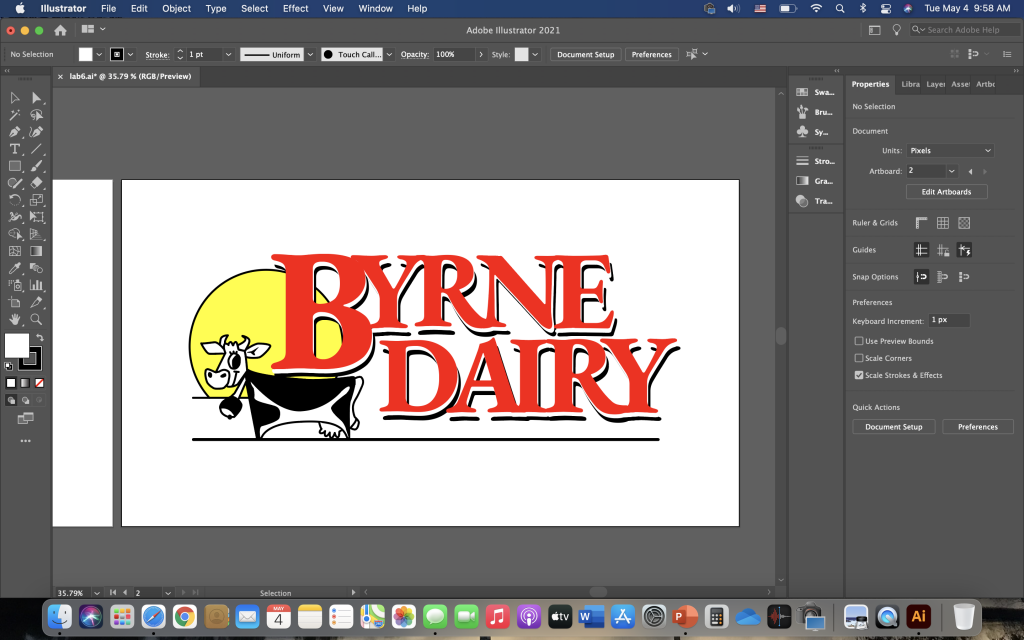
- Compare the versions (the traced logo, the one you did by hand, and the original logo, the one you used with the image trace). Which one is better quality? What are the differences and improvements you see? Why? How do you feel given that the one you did improves upon the one that was using image trace? Make a reference to the original logo and talk about why you think the original logo was not as high quality as either the image trace or the one that you did by hand.
The traced logo is the one that is better quality because when you zoom in close on the original photo (the one in the jpeg format), one can see pixelization, edges that have boxes and blocks, and the limitations of the logo up close and personal. In addition, one can also see artifacts, which is an indication that jpeg compression has happened to this logo. Artifacts mean that pixels that should be red in this Byrne Dairy logo can be different colors. Any time one might see a crisp edge, they might see light little pixels sprinkled around the edges. This is another instant sign that this is a jpeg image. In order to make sure that the image is as crisp as possible, one should convert the logo into a vector by creating an image trace of it.
Even though the image trace was clearer after it had been converted into a vector, the paths had been increased, the corners had been decreased, and there was more noise, it still had somewhat jagged edges. This would not be acceptable for a graphic designer to use, and so that is why the traced logo is better because the pen tool allows for one to curve the edges and make shapes in a more accurate manner. The image trace logo had shapes that were not precise, such as the left nostril of the cow being jagged and part of the line on the bottom part of the bell combining a little too much with the clapper of the bell. In the traced logo I completed, I was able to draw the bell and the left nostril of the cow myself with the pen tool so that these problems would not happen again.
I feel good about how I did on this project tracing the Byrne Dairy logo because of the improvements I was able to make upon the one that was using image trace. I think that the original logo was not as high quality as the image trace or the one I did by hand because it was a jpeg image instead of a vector image. Therefore, the original logo involves pixels as a jpeg image, which causes it to be not as high quality as the image trace or the one I did by hand.
