https://www.figma.com/file/rR6Ur341YyMQ5JkPIfRLvF/project-4-stamps-(Copy)?node-id=0%3A1
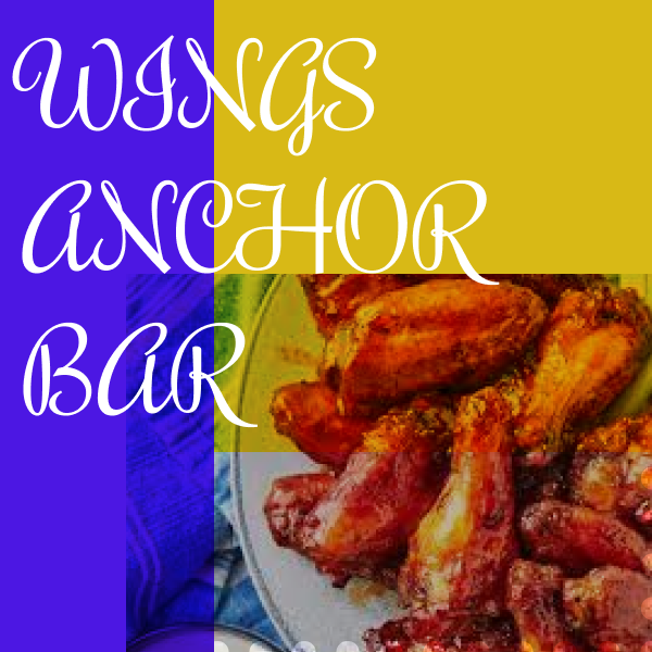
I really enjoyed this project because it allowed me to get creative all while admiring the beauty behind Buffalo, NY. I like the background pictures being used as well as the two different font’s
I learned about mixing font’s, but also choosing one’s that will get the attention from the audience that is being desired. I found it easy to include pictures, mess around with their saturation and contrast to sort of give a mixed artsyle look.
I found it challenging to use different color’s. Since I did my project on Buffalo I only really think of two different color schemes; Red and Blue, and Yellow and Blue. I didn’t wan’t to include any other colors because I felt like it would take away the feeling of Buffalo.
My submission could be improved by working on the different color schemes. I also think it could be improved in the aspect of the ‘history’ category. I don’t hold too much knowledge on Buffalo’s history, so I just included a picture of Canisius from the 1900’s.
I really enjoy this type of art because you can be creative and mix and match however you choose to do so. This project can help me out in the future if I wanted to continue to do this type of look. It blends together everything we learned about like color scheme and typography.