We worked in Illustrator to create four scenes using different color schemes. we made a desert scene, space, underwater, and skyline city.
For the desert scene I did analogous color scheme. Doing this scene I learned how to do opacity control for the shadow of the sand dunes. Doing the gradient was annoying until I got the hang of using it, then it got easy and fun to do. it instantly added depth to the 2D image.
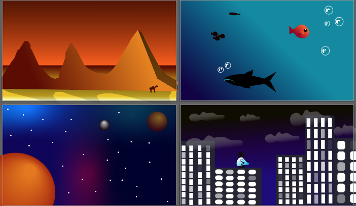
the underwater scene is the one I’m least proud of. I feel if I went to change it I wouldn’t know what to add, but it needs something to make it stand out more. the color scheme is complimentary with the one orange fish among the blue background and other in shadow fish.
For space I did triadic color scheme. The most challenging thing about this project was having a vision of what I wanted all the scenes to look like, but not knowing how to execute them. I need more practice in the program
For the city I did monochromatic. I learned how to create multiple windows using the blend tool. I could improve all the scenes by adding more depth, especially for the city and underwater.
For future projects working in illustrator I know how to implement some of the things I learned to make better scenes that look more professional.