below are my sketches for little miss muffet and the itsy bitsy spider
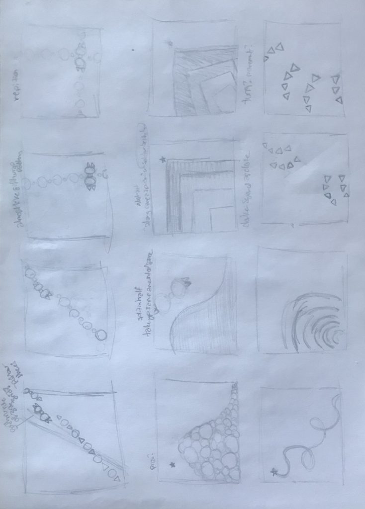
For my nursery rhyme I chose ‘Little Miss Muffet’. The frames are broken up by section: ‘Little Miss Muffet, sat on her tuffet, eating her curds and whey, there came a great spider, who sat down beside her, and frightened Miss Muffet away’.
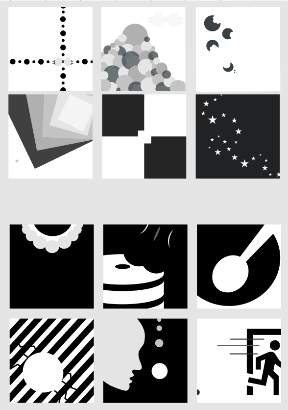
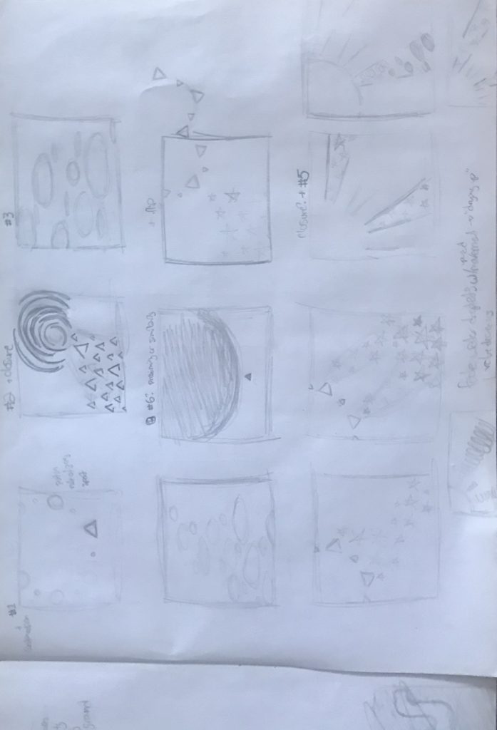
When I started to create the second set in figma, I realized I wanted to create clear contrast between the two sets. The representational set is more dramatic and fills in the majority of the frame with large imagery and stark contrasting color. The first set has more individual elements in each frame and is more playful.
I aimed to keep the rule of thirds in mind when I laid out each frame. I’m used to thinking of tuffets as those little round chairs, which I depict in the representational set. Apparently, a tuffet also means a small hill! This was likely what was meant in the lyrics of the nursery rhyme. I decided to incorporate both meanings. I think that second frame was the first one I drew. If I was to go back and tweak these again, I think I’d find a better way to space out the cookie-looking pieces a bit.
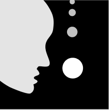
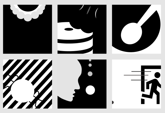
I feel like most of these are self explanatory. The first image is her collar with a string of pearls (it reminded me of RBG when I was done RIP<3). The second to last image is supposed to represent the spider dropping down from a string of web.
With regards to the last frame in the set, I wanted it to stand out from the others. I used white negative space to indicate distance from the spider that is almost out of frame. I also wanted there to be a bit of alarm. To me, the black-filled spaces are dramatic but more relaxing, whereas the white spaces create a sense of urgency in this set.
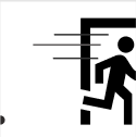
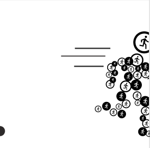
Initially, I experimented with some running icons for the last frame. I knew I wanted it to be different from the others and I think this particular amalgamation creates an even deeper sense of urgency. However, I think it left too much space blank and it didn’t really fit with the set at all. Also I didn’t think Dunkle would like it one bit lol
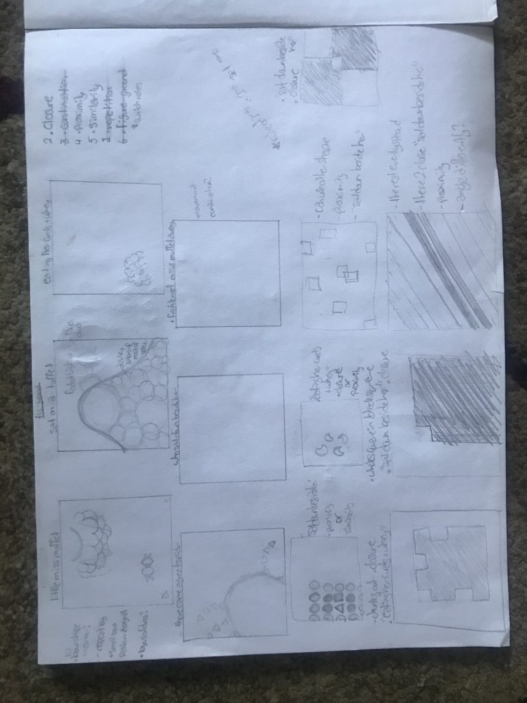
I’d say the hardest part about this project was doing one of each Gestalt principle. I had so many ideas but I had to keep the principles in mind and check which ones I had done already. Also making sure your image follows a principle correctly. As a whole, I’m happy with how the majority of things came out for this project. It’s an interesting project and one that makes you think and work within the given limits. The Gestalt principles along with the things we learned about framing and the rule of thirds can definitely be used in future projects and artwork in general. They describe a lot of things that are pleasing to the eye and break down why that’s the case.