I really appreciated all the links to different types of examples and places to get inspiration. I found some amazing artists and it reminded me to dip into the Procreate artist postings as well because it’s a great way to find new artists, look at techniques, and get some overall inspiration.
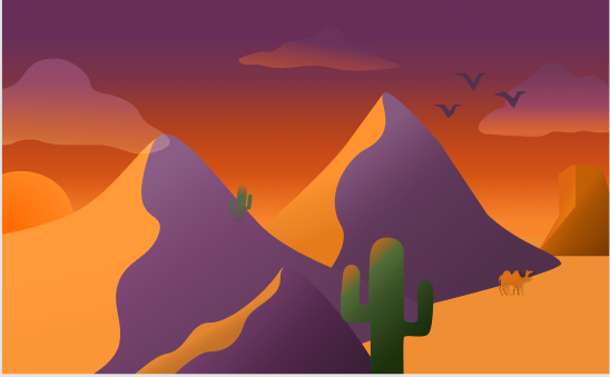
I think the desert landscape is probably my favorite out of the four I did. I loved these colors and I’m pretty happy with how everything came together. I had fun creating the shapes for the mountains and I like the purple as a shadow side. I tried to show depth and levels with each element I put into the frame. The closest, shortest mountain is darker overall because it’s partially blocked by the taller mountain closest to the sun. The cactus up front is the closest object to the viewer and it’s farther away from the short mountain so the setting sun still reaches the top.
I think I struggled the most with the position of the sun and picturing how that would affect the colors on all the other objects, and then executing that. Initially, I wanted a sunset desert scene and I once I solidified my colors I started with the mountains. I think this was part of the problem. I started with the mountains to establish where things would be and how I was going to use the space in the frame. Then I moved on to figuring out the coloring and shading without positioning the sun first and instead going off of where I pictured it would be. After I placed the sun I had to change things a bit and I think starting with those colors already there made things harder. I’m not the best at readjusting things that already look nice and changing things around so they look ‘correct’. A lot of times I know that something’s not quite right and I know, in theory, what it should be based on for it to be fixed, but I’m not always sure how to do that and don’t always fully reach that end goal. Overall though, I really really like the piece and I think it’s one of my favorite illustration-type things I’ve done.

I really wanted to step out of the box with the cityscape. It was hard for me to get started and keep it more simple even after I had an idea of what I wanted it to look like. Looking at it after, it reminds me a bit of cartoons in a way. – the use of simpler, flatter shapes to portray background buildings and show depth with color. I didn’t want to do traditional straight panels of windows, so instead I used different shapes and colors for a funky representation of windows. Overall, I’m happy I got to try something different that strayed from my usual inclinations.
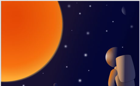
The space scene was the first one I did. When thinking of my outer space scene, I immediately thought of movies and pictures where and image or color is reflected in an astronaut’s helmet. Since we needed to use gradients, I knew I wanted to do something with the sun or a planet having an effect on the helmet. We were reminded not to get too ‘illustrate-y’ so I kept this one simple and used simple shapes for the astronaut. I also used a dark gradient that blended with the background more so instead of creating a back to the helmet, I used the contrast of colors.
Originally, I just had a bigger helmet without a body in the corner of the frame. I liked how it was starting to look but I thought that was too simple. So I wanted to build a basic body and play with the sun’s effect on the suit. On the body, I brought a second shadow forward to account for the shadow from the backpack and also matched the gradient line on the backpack as well for the effect of the sun. To make this one better, maybe I could’ve done something different with the stars? I’m not exactly sure what to do, but I wasn’t happy with them.
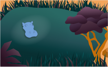
The aquatic landscape ended up being the hardest one for me to complete. I wanted to approach the aquatic theme in a different way. I was kind of tired of seeing fish and underwater stuff. So I thought about doing a swampy area with a alligator head sticking out of the water and ended up settling on the idea of a peak into a watering hole scene. I was happy with my hippo head and the overall shape of my tree but I didn’t know where to go with the water’s edge from there. And staying within the color constraints while trying to think of what to put there was difficult.
This is probably the one I’m the least happy with. I found it really difficult to stay in the color requirements and make all the elements look right. By the time I’d gotten to this frame, I wasn’t overly confident with the linear gradients and all the different tools we were using, but I thought I had a better understanding of things. Applying the gradient tools to an object is never the same. It seems so simple and yet I repeatedly found that I must not have fully grasped it because I couldn’t achieve the results I wanted – even if I’d successfully manipulated the tool for something else. I messed around with this frame ALOT. I tried playing with the fill behind the gradient layer on objects, I tried adding a ripple effect to the water,
The main things to improve on would be fixing the colors and gradients on my tree and doing something different with the water’s edge. I didn’t want to expand the water all the way out, but maybe I could have and added a frog or another hippo or some other things to the water. I don’t feel like the piece has a lot of movement and I struggled with how to fix that and execute it well.