“Life is like a box of chocolates, you never know what you’re going to get.” – FG
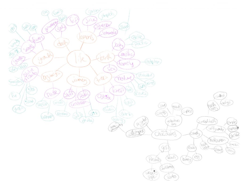
I know this is ridiculously hard to see, I’m sorry. This was my extensive brain web to generate concepts using the base words ‘life’ and ‘chocolates’. Those are the two main elements in the quote and there were some pretty interesting ideas that stemmed from this brain web. Eventually, I came up with the idea below.
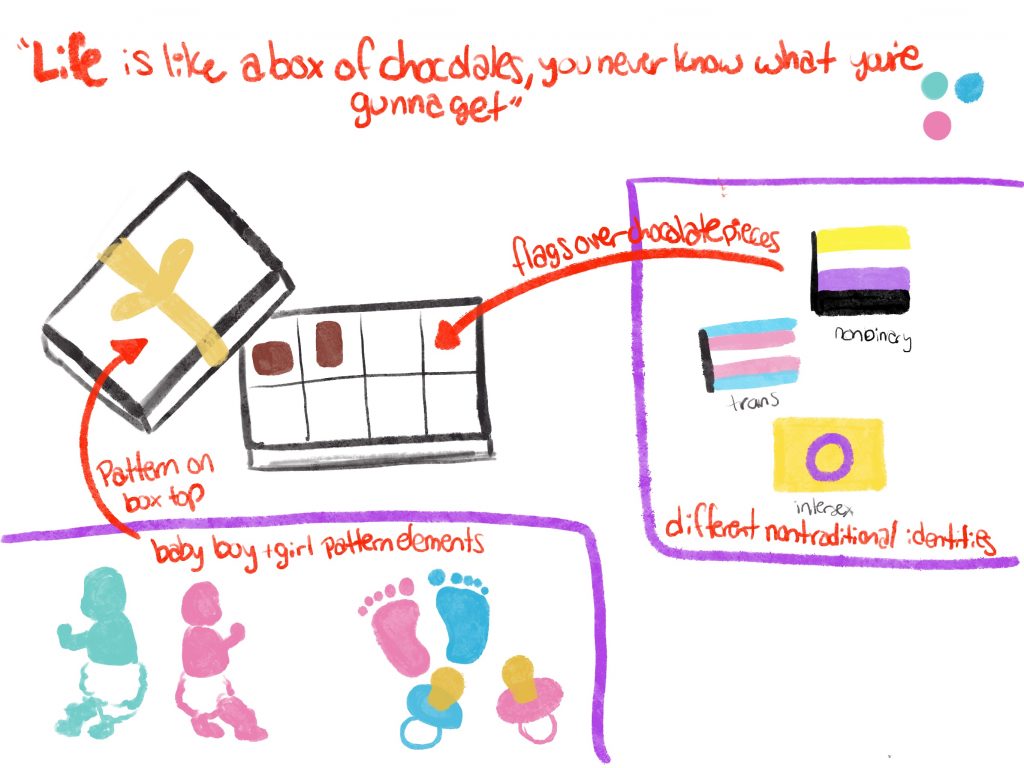
The concept for the project compared traditional socially-constructed gender labels to other non-traditional gender identities. ‘Life’ is symbolized by the various images representing baby boys and girls. The outdated concept is illustrated on the lid of the chocolate box via a giftwrap pattern complete with a bow. However, once you actually look inside the box, you see other gender identities represented by their flag colors overlaying each piece of chocolate. These identities defy the expectation and labels on the outside of the box. You don’t know what they are just by looking on the outside, each chocolate is different and “you never know what you’re gunna get”.
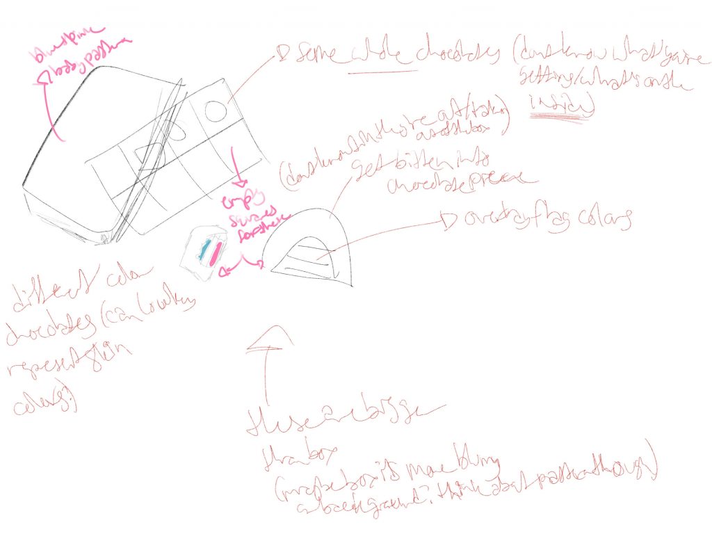
After talking to Dunkle about it, he thought it’d be weird to overlay the flag colors on the chocolates themselves. Instead, we decided to have pieces outside the box that showed the colors (representing non-traditional gender identities) once you bit into them. He also talked about playing with the size of the pieces and making them bigger than the box. I think the hardest part about the concept change was figuring out how to lay everything out. If I was drawing everything, it would have been easier to draw sections for each color in the bitten chocolates and I could have sketched the angles of each element by hand. However, this was more difficult, for me, to do when I’m working with base images from different points of view and trying to find a tablecloth image that would also fit so the pieces weren’t floating and there was a baseline for the different perspectives I was trying to achieve.
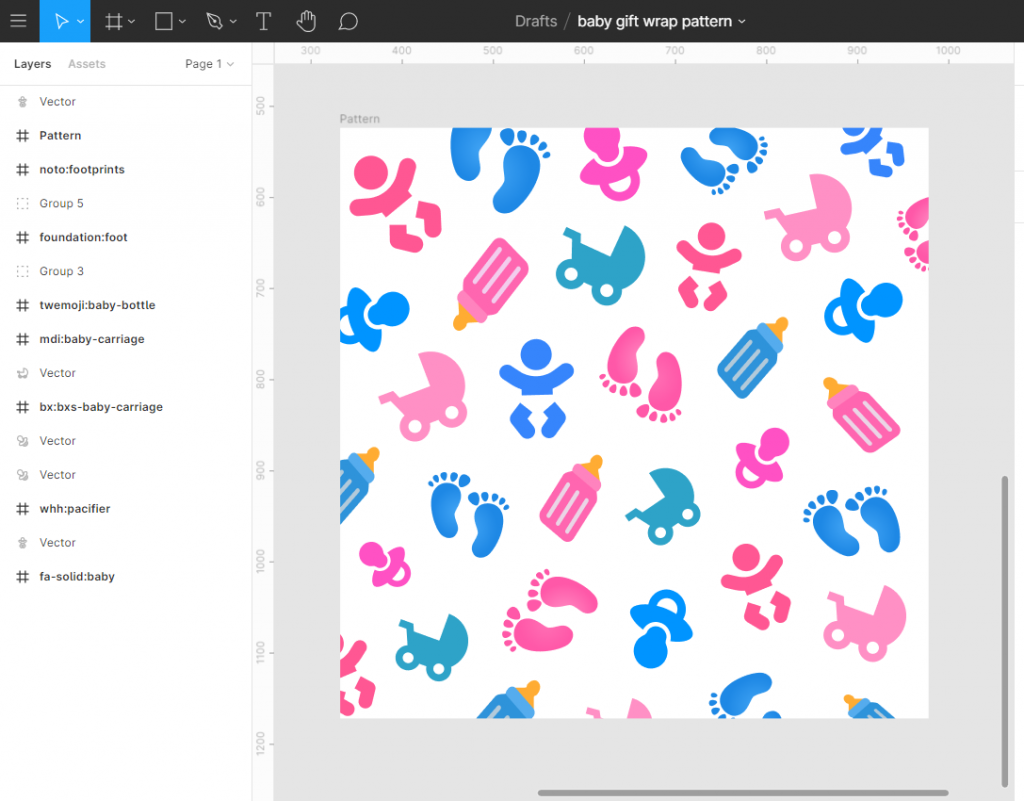
I think designing my pattern was my favorite part of the project. I wanted things a little more spaced out mainly because each item is more than just a basic shape and I didn’t want things to get too congested. As you can probably tell I sized, placed, and positioned each element myself instead of using the Pattern Hero plugin in Figma. It was a little time consuming but I tried to make sure there weren’t repeat elements right next to each other and I was happy with the results. Having some of the shapes go off the page really helps sell things.
I’d just like to say, GIMP sucks. Okay, not 100% true but that program stopped responding and crashed multiple times. When I tried to preemptively save my work at each stage, it would crash then as well. It worked a bit better for the piggy bank lab but for this project I ended up re-starting it five or six times. I wasn’t at school so I couldn’t go to the lab and I had to wait to get someone’s computer to do it on photoshop so for that…GIMP sucks.
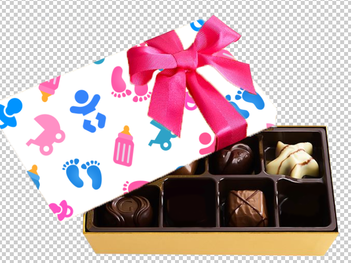
For this part of the project I photoshopped out pieces from this box which was fairly simple. The most difficult part of this project was getting the pattern onto the lid. The usual methods weren’t working and I searched a million different explanations and tutorials to try to problem solve but the options weren’t available for me in photoshop. My roommate and I finally figured out a way to get it at least to this point and it wasn’t perfect but after hours of trying to get it to work, I was happy I at least had something to work with. I was I definitely was not anticipating this taking as long as it did. BUT there’s always that one unexpected thing in a project that just takes a long time.
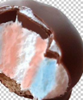
I had a hard time laying in the colors on an all-chocolate piece. I found that darkening with color in certain places to emulate the shadows in the textured insides helped certain pieces. However, the filling really influenced the way the colors would show up and the brushes and techniques I had to use. In a way, I think it may have been easier to overlay the flag colors over the pieces themselves but the overall image probably would have also been less dynamic.
Originally, Dunkle and I thought of maybe using a table cloth or a table as a background but I couldn’t find the right images for what I needed. Some things I could improve would be a better background, a better angling of the chocolate pieces to match the box, and I’d probably try to make more of my pattern show on the box top. After I finally got it on there and adjusted it, I realized I’d probably have to make the pattern bigger in figma? I’m not sure. Free transform was being weird so that didn’t work out as well when I tried one method that way although it did show more of the pattern.
Overall, I really liked the concept I came up with and maybe some day I’ll revisit it and try again. I’m happy I refamiliarized myself with photoshop. I don’t use it regularly enough but I like it much more than GIMP and I’m excited to get back into it again.