Featured

Project Two: Color

City-Split Complementary

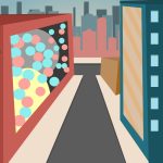
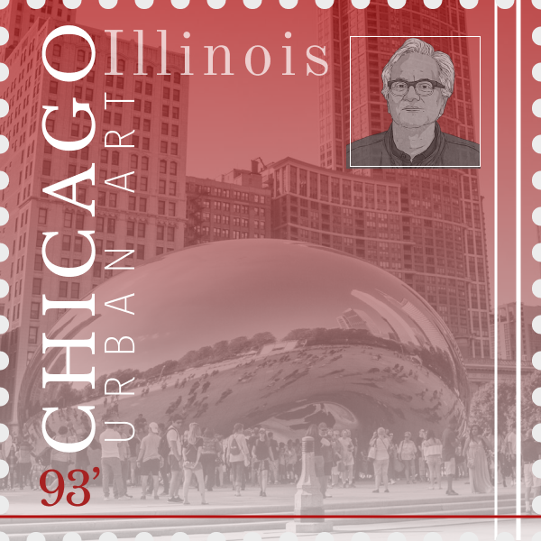
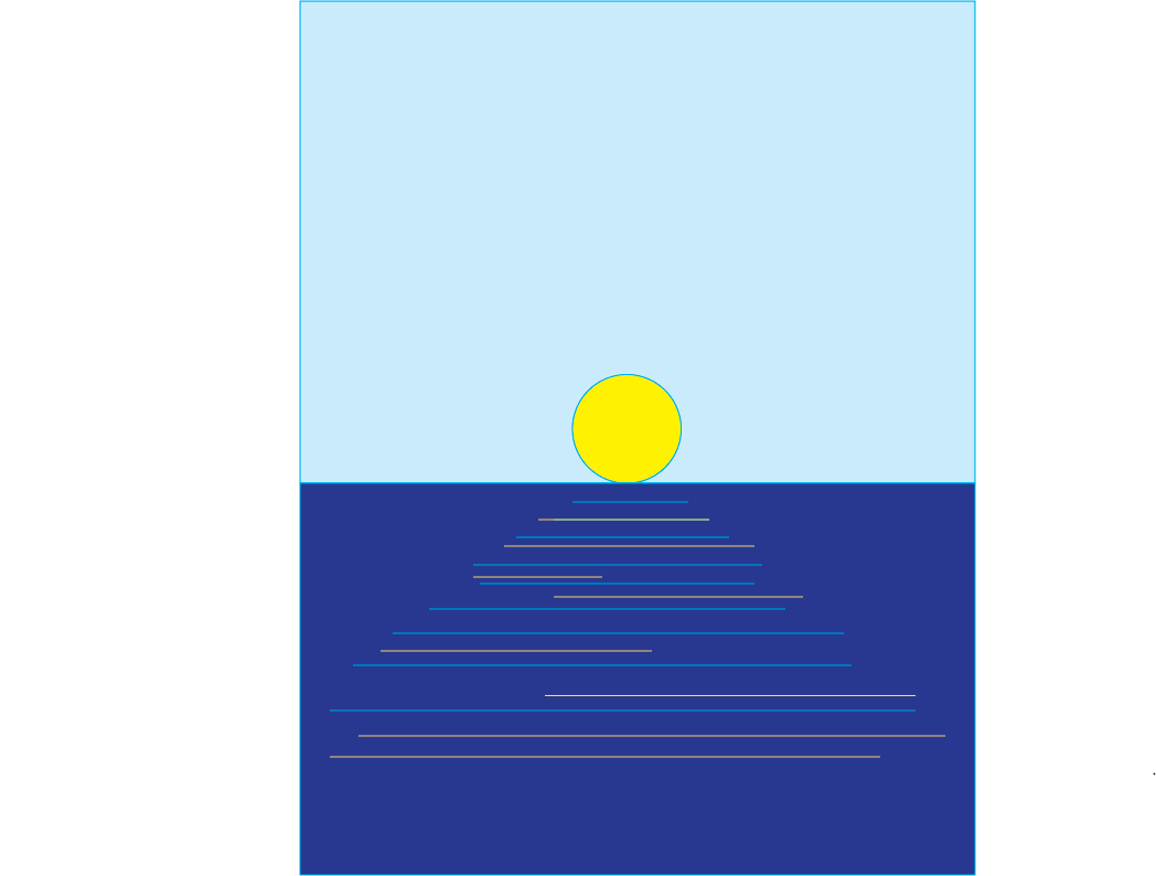
For this project, we were given the task to create landscapes following one color scheme for each. For the city, I used the split-complementary colors. I found this made the city look bright, hip and high energy. I also notice Buffalo has been taking this same approach in a few of the developments. I enjoyed making this one but I do feel as if it is lacking something. Hopefully one day, I will have enough experience with Figma to create more realistic art.

Seascape-Analogus
Space-Triadic
Dessert-Monochratic

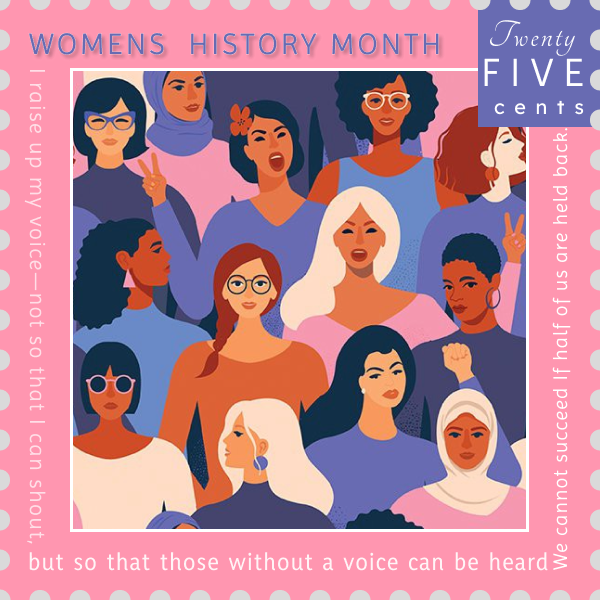
Overall, I really am satisfied with my color choices for this project. I even started learning about the psychology behind how colors make a brand look more business, creative or expensive. Looking at other students work, helped me adjust and gave me ideas. The spaceship is one of the ideas from looking at other students work. If given more time, I would learn more ways to use figma. Ive found myself at a stand still with using this software and its definitely me, not the app. The most difficult thing was staying inside the color scheme. It wasn’t extremely hard but there are times I wanted to use a color that didn’t belong.My designs, in general could use some touching up.

Project Three: Event Display

Project three required us to design an event display as well as a drink carton. Sadly, I believe this is one of my worst projects. Perhaps it was due to a lack of time management and inspiration. I’m not sure what I could do to improve my project right now. If I had more time, I would have observed more students and sought Professor Dunkle’s advice. Life Water and their designs provided some inspiration for me. Their designs are always vibrant and lively. I was satisfied with that aspect of the project after using it to create the gatorade logo.

Merchandise Printing

For project two, we were given the task of designing two pieces of merchandise for our favorite band, artist, or group. 3-D prints, stickers, posters, shirts, and CD covers were some of the choices available. It took me a while to decide what I wanted to do, but after some thought, I realized how much of a fan of Maverick City I am.

Maverick City is a multi-award-winning Christian band best known for their hit single ” Jireh.” I’d like to recreate their merchandise now that I’ve gotten a sense of their style. My original plan for the shirts was to have a white print on a black shirt with bleach sprayed on it. I was going for a graphic rockstar look with this shirt. I had a few issues while trying to make the shirt, such as running out of white paint, messing up on three shirts and having to go out and buy three more, and then realizing they had front pockets when I got home.

The shirts were overpowering, and if I had more time, I’d recreate them exactly as I imagined them. I’m going to do it anyway just to be comfortable.

The stickers, on the other hand, were a lot easier. I had never used Curcit before and made some rookie mistakes, but after getting the hang of it, I was printing in less than 5 minutes. Youtube was really helpful in making these stickers.

Overall, I’m proud of my project, but I think I’d be even happier if the shirt turned out properly. The shirt I made or imagined was inspired by Maverick City and their singer’s clothing style.

Joe Barnes, one of the singers in Maverick City. Used his asthetic as inspiration.

Restaurant Menu

The first project required us to create a restaurant menu for Miko. When I first started working on this project, I realized I wouldn’t be able to complete my intended menu design, but I realized it would be a good opportunity for me to learn the basics of InDesign. I believe I was successful in learning to use InDesign well enough to complete these projects and improve in the future, but my designs are not as good as I would have liked. If I had more time, I would devote more attention to the design aspect of the project and attempt to create a multi-folding menu and better visuals.

I like the color scheme I chose for this project, so I try to think of new ways to use color and design to make things look more elegant. Learning the technical aspects of Indesign was the most difficult part. Indesign has a lot of useful tools, especially the character and paragraph tools, that make writing and formatting a lot easier.When I saw my classmates’ work, I immediately thought of several other approaches I could have used for this project, but I’ll save that for our next one. Overall, I’m not happy with the final product, but I’m glad I have a better understanding of  Indesign.

Project Four: Typography

For project four, we were tasked with making stamps for food, architecture, sports and history-with typography being the main focus on this project.Unconsciously, I choose Chicago. I started with the Chicago beam and didn’t realize the Bear’s team was from Chicago. All other ideas came after realizing this pattern and trying to continue it.

I would say this is one of my favorite project to do and I think it turned it out very well. Executing my creative thoughts have always been a problem. I would say the cuisine one was one where I wasn’t able to do what I hoped. During this project, mentally, I was a little more creative than other project.

I like the aesthetics of the architecture one, its very subtle- which I enjoy. If given more time, I would try to think of more ways to make my stamps look like from one creator through style.

I find myself always avoiding grids for everything and I try to eyeball everything. After using grids, the stamps looked way more acceptable.

I appreciated the feedback from Ben and using the student examples were some of my inspirations.

Project Three: Metaphor

Combine Images and Pattern

This was not my first choice of metaphor when deciding what to do for this project. “A man’s conscience is his compass,” was my initial pick. During the early stages, as I was experimenting with different methods to place images and shapes, I realized it was impossible. Sometimes Google and Unsplash don’t have the perfect image at the proper angle. If I had more time, I would consider shooting my own images from the angles I needed. In the end, I was forced to restart from scratch. It wasn’t until I looked at past students’ work that I calmed down and understood I was maybe thinking too large.

They launched an IPAD version of Photoshop, which I was pleased with since it allowed me to create the second image. Adding fire flames to his eyes, lowering the opacity, and making the flames fit inside his eyes. I’m happy I still have enough Photoshop skills after not using it in a long time.The image was then imported into Figma, where the pattern was applied. I believe I wil receive some criticism for the lack of pattern, but I was striving for a very subtle look.

Overall, I’m pleased with the outcome of the project. I wish I had more time for comments so that I could generate more ideas. Past student work and present students are my major sources of inspiration.

DMA 214:Project One

Project One seemed very simple at first but after starting I realized things were much harder. Trying to make a story out of very simple shapes was very hard. Using the examples from previous students, it gave me a little guidance.

The most difficult part of this project was trying to create a new theme for each line. If I had more time, I would search for an easier six-line rhyme. Some rhymes actually describe things that can be created.

From this project, I learned gestalt principles could be used for logo design and commercial use. The slides Professor Dunkle posted made it easier to identify each theme.

Gestalt principles uses human eye perception to make simplistic designs seem complete. This can help with marketing and quick video messages. I could see myself incorporating this techniques into other projects like commercial filmmaking and app design.

Lab Zero Pt. 2

I know how to use all three platforms: figma, photoshop and illustrator. This exercise made me freshen up on some of my skills with photoshop and illustrator. Now that I have started using Figma, I think this platform is what is best. Not only does it allow me to work in groups but it very user friendly. The most difficult task was remembering how to use photoshop. I noticed start up companies are using figma. I regularly draw in my sketchbook so that is one of the four drawings which I saved to my dma214 folder.

Mobile Design: Project One

For Project One, we were given the option to create a media player or a plugin. I decided to act as an Apple developer and created two plug-ins. The first was screen share. Since the pandemic, the share screen feature on zoom has allowed teachers to successfully share their lessons. I think this feature can be useful in everyday life. Sharing screen can let students/friends and family members share how-to videos, photos and issues they are experiencing on their phone. Secondly, I created a Apple Assist app. I understand there are times others can not help or just do not know enough to help. If you login into apple assist, you can find the problem you are having. Apple then takes over your phone and then directs in the way to fix it. It focuses on the buttons that should be pressed to guide you and solve your issue.

I do think my idea is great but the presentation does seem as great as I would have liked. I think my design  should be more consistent with Apples’ and better mobility. I just couldn’t figure it out using Figma. One thing I am proud of is the animations like loading buttons. I think it is a neat and realistic touch.Overall, I am proud but I would like to see other opinions and 

make those changes.