
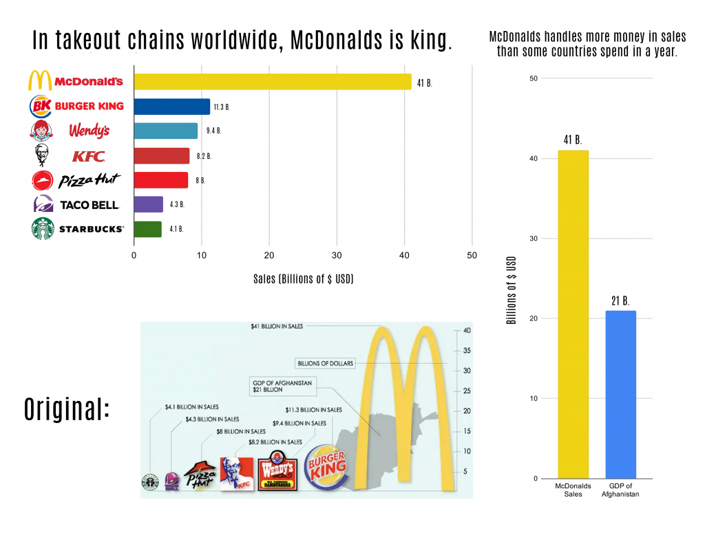
This image is a redesign of a bad chart, one which at first might not seem too bad but gets worse the longer you stare at it.

The first thing you’ll probably notice is that each of these companies are represented by their logos, and that those logos vary in size. However, these variations in size tell you basically nothing whatsoever about the chart itself, and therefore the values of each are explained by captions. Each of these also forcibly explains that they are “BILLION IN SALES”, something which not only could be unified by just putting a label on it, but also by not just randomly sticking the GDP of Afghanistan in the middle of your chart comparing fast food earnings.
The second thing is that the McDonalds logo is absurdly stretched, and whoever the designer was had the brilliant idea to stick it on the top left corner for no apparent reason whatsoever. This also interferes with the graphic of Afghanistan, which for some bizarre reason they half-covered with the other fast food logos. This makes the label for its GDP appear in the middle of the McDonalds M, which is a bizarre design decision overall.
There are quite a few odd decisions with those labels, honestly. For instance, why was it decided that the label for the vertical axis would appear in the middle of the work? Even if they were working with limited design space, rotating this text and putting it on the outer edge of the page would barely reduce the viewing area and still be legible.
Also, why is the Afghanistan GDP boxed? No other object is boxed except for the scale. At best, it’s redundant – the “BILLION IN SALES” text mentioned earlier already separates them – but at worst, it causes the unnecessary appearance of correlation with the (also unnecessary) “Billions of $” label. (Confusingly, this also appears in the middle of the chart, despite it being a label on the vertical axis. There is no connection between it and the other aspects of the chart, and it all in all just becomes more confusing.
But most problematic of all is that there is no consistency between the labels. Each zigs and zags wildly across the page, with no rhyme or reason in terms of height or structure. My chart attempts to make this information more legible, by adjusting the formatting of much of the work and making it far more legible.
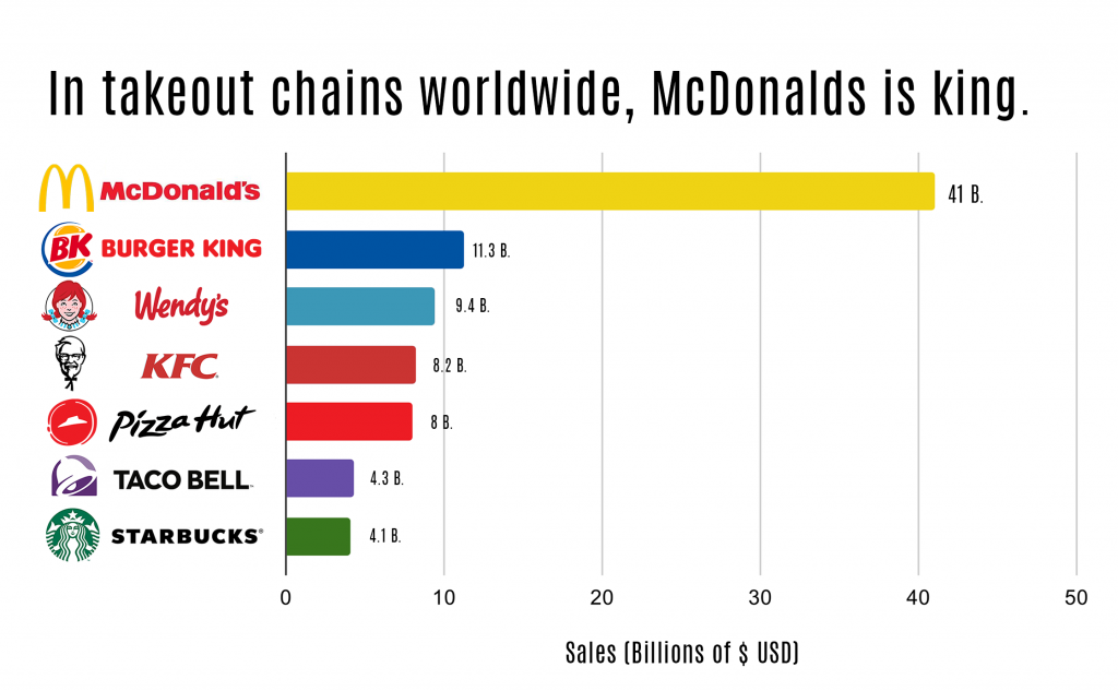
While keeping the stylistic usage of the logos, it now follows a much more traditional bar chart. All of the logos have either been manually adapted to fit this new format or recreated from scratch using their original designs, like as is the case with the Burger King logo. The graph is also far more clear and legible, being obvious what it is depicting and demonstrating a clear point with its values.
However, to keep it in line with the original design, I had to integrate the usage of the Afghanistan GDP. In doing so, I considered what its real purpose was in the design – all it really proved is that the GDP of the country was smaller than the value of the largest companies.
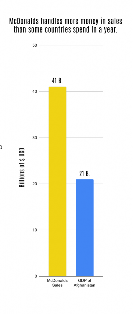
Logically, then, I thought it must be there to provide a sort of scale comparison – but in doing that, it only really needs to compare to McDonalds, as all the other major players are tiny values in comparison.
That, in part, was the idea behind using a vertical bar graph like this – the idea really needs its own section when displaying the information, and as such it utilized a larger bar graph which displayed it.
In addition, both to give precise values and to give the strict data presented in the original graph, each bar is labeled with its exact value in billions of dollars. All of the labels in these graphics also use the font Antonio, a classy sans serif face which has a very professional edge.