
Edit: The final version, in comparison:
The write-up below was done for a 2D graphics class, originally featuring a much earlier version of the design. It exists here for posterity.
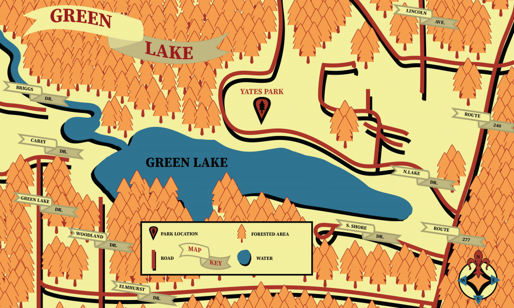
The title banner will feature a bit more of a curved over appearance of depth, as you can see from the rough mock-up. The general lines of the streets will feature a sort of depth effect as seen there, giving them a sort of look of floating in front of the rest of the document. This will be true of all elements in this design, including the compass, which will be in the lower left corner of the image with a serif typeface using stencil-like cuts between the serifs of the letters. (I’m not sure of the exact way to word this, but it’s common in a lot of modern serif fonts.) The top of the compass will be accentuated with a fleur de lis design.
Underneath the banner will be a tree pattern which comes underneath the title banner and up to near the edge of the lake. I’m still going to experiment some with fonts for the street names, but I’m thinking an uppercase sans serif. I might back down on that and go with a serif font if it conflicts with the design, though; we’ll see how legible it is once the final design comes together.
In addition, the legend will go in the bottom center of the design, in the empty area where the street runs across. I’ll put more trees in that area, with a square box going across.
The biggest things going forward are cleaning up some rough edges – most notably on the lakeside – and adding the street names, as well as the aforementioned tree elements which will be added to many clear areas of the design.