
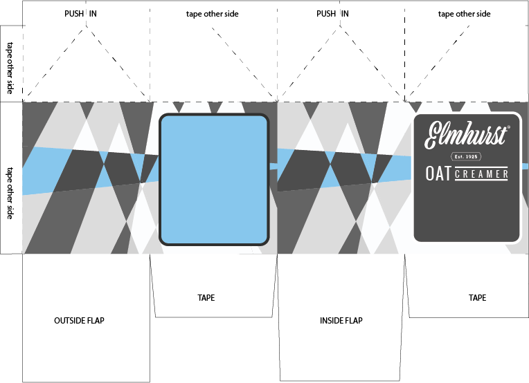
The background on each side of the carton are designed using a custom 60’s inspired pattern. The front of the packaging will feature a pie slice with a retro-inspired crosshatch, and a title in the same font as the custom oat creamer logo reading “APPLE PIE SPICE”.
However, I was having some notable scaling issues with the graphic – when it’s reduced in size, for some reason it gets strange artifacts. Here’s a demonstration to show what I mean:
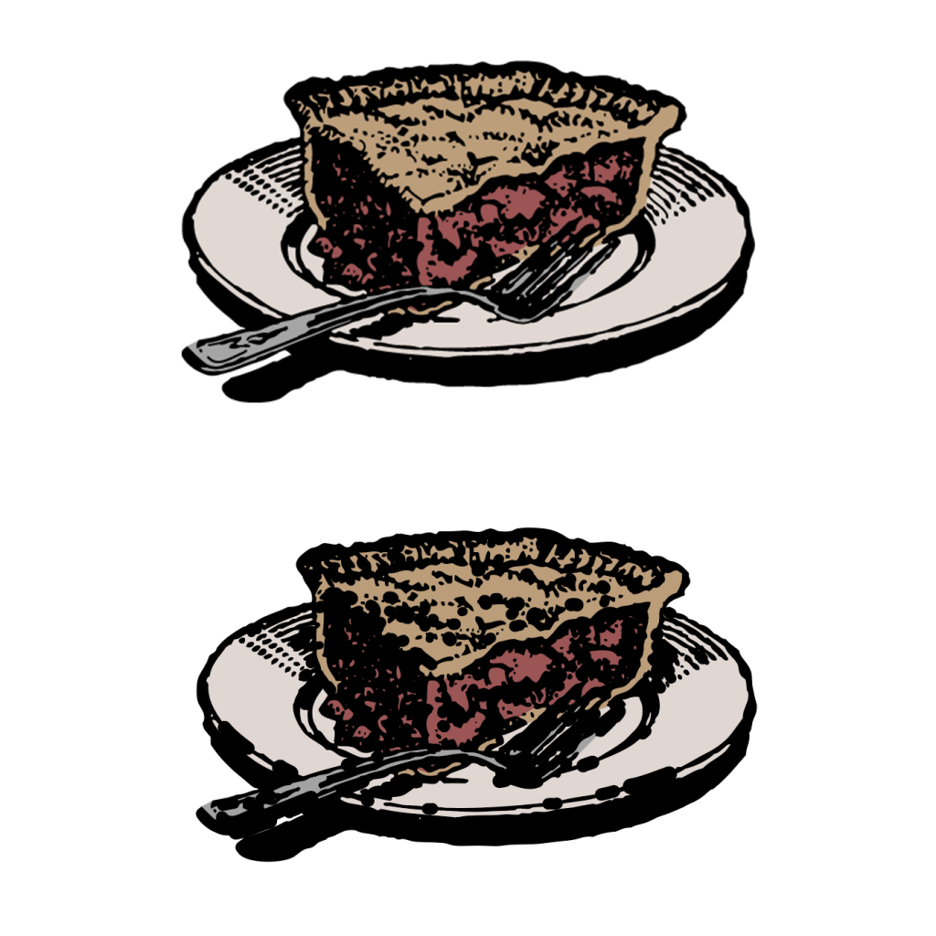
If anyone knows how to fix this, let me know. The blue box on the back of the container will have a product description, as well as another image in the lower corner to reiterate the general theme.
The first side panel will feature the circular designs accompanied by either a white or black stripe, off of which will be similar text blurbs to the official product describing its individual aspects. I don’t think I’ll use the hemp cream one – that seems like a bizarre thing to advertise putting in your oat milk – but I’ll put the “plant-based” aspect on the front cover as the third circle.
Finally, the last side will feature nutrition and ingredient info. Again, similar to the official package, though I’ll likely do some tweaks to it for legibility on the sharply-detailed background. I’m also considering expanding the points on the design up into the edges of the box – again, opinions are appreciated on that.