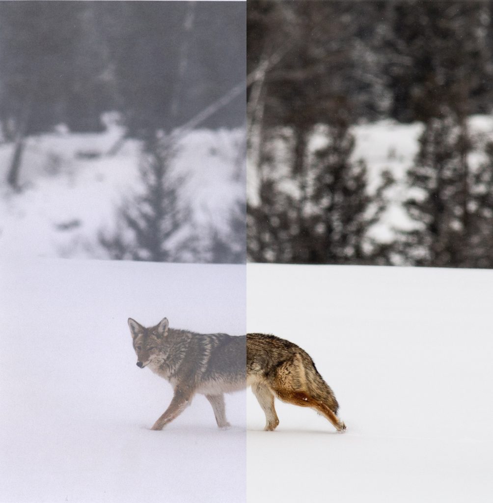
When it comes down to it, knowing Photoshop is knowing what to do with your images. Here’s a few basic observations to start off the class with:
1. Different cameras produce different results.


If you take two photos with different devices of the same image, you would initially expect that you would find the images to be for the most part identical.
However, that simply isn’t the case. Different cameras have different strengths and weaknesses, and working with each is an important piece of the puzzle. For instance, my parent’s wonderful Canon DSLR looks great in majestic, outdoor vistas, but under low light conditions, its colors look yellow and unrealistic, characteristics which might have to be tuned in a photo editor before using the image professionally.
In comparison, the image has far more blotchy grain on the iPhone 6, which leads its images to look more smeary as a result. This is caused by multiple issues – most notably, the iPhone camera has some significant post processing done to all images taken on the device. It also doesn’t feature the same adjustment abilities as the Canon camera, with a flatter lens which lacks the ability to do the kind of depth-of-field tricks you can with the Canon.
2. Work as close to the source as you can.

The idea of generational loss might sound like an old problem – in an era of digital things, it seems so easy to just download a copy of something and have a lossless duplicate of the future. But even with all of the technology we have today, there is often still a difficulty in finding the highest quality sources for a project.


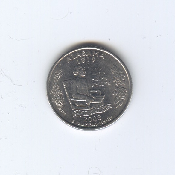
Certain images, however, will have minimal losses when scanned. Generally, image objects (read: text or art documents) will not lose significant fidelity if scanned under optimal conditions, as their contents are essentially put together in lines or curves.


Also, be aware that a damaged image will be harder to recover information from, as it will require more work to get it in a completed state. Magazine images are notoriously riddled with these issues, requiring heavy processing to look decent in a digital format. (To name a few processes: descreening, despeckling, crease/damage/dust removal, color correction, noise reduction, and (in the case of extensive damage) segment perspective warp and correction. Here’s an example of almost all these issues in this 80’s aestheticized Sears catalog:

