project 4 – DMA 214

I learned how to make a stamp using simple colors and shapes.

It was not easy, the small space made It hard to think of ideas to fit everything into it.

It was challenging trying to fit everything into that small of a space, also it was hard choosing a color scheme that was fit for each stamp.

My submission could be improved by making the images look cleaner and have everything come together more.

I don’t see anyways to improve this assignment.

I could apply this knowledge of color schemes and simple shapes for the future.

watching football games and the colors that they use inspired me.

Project 3 – DMA 214

In this project I learned how to make a metaphor into an image

This was easy for me because I have had a lot of experience with photoshop in the past

It was challenging trying to make “angry” into a visualisation, this took time and I had to think outside the box

My submission could be improved by making the faces in the bottle look angrier or the faces stand out more.

You could improve the assignment by making the students add more than two photos together

I can apply my knowledge in the future by apply two different photos to make one image for a company or a job.

Looking at different metaphor images on the internet inspired me to make this.

Project 1 – DMA214

In this project, I learned how to use Gestalt to visualize nursery rhymes.

This project was slightly difficult because it took time to think and visualize how it would look to the person who was looking at it. I had to think about how the person looking at it would see it.

It was challenging using the simple shapes to describe what I was thinking, without using custom shapes it made it a lot harder to show the viewer what I was thinking about.

My submission could be improved by having better custom shapes to describe what I was thinking. The shapes I was using were very basic and I had to think of different uses for them.

I think an improvement would be having more advanced shapes to use, it would help with the execution of the project.

I will apply the knowledge I learned by using the basics of the Gestalt to help me visualize what to make and how to make it,

looking at logos on bottles, boxes, store, etc. helped inspire me on what symbols to make. I would look at the logos at try and picture how they used Gestalt to make the logo.

Joy Video

Joy Video

In this project, I learned how to film and edit 4K videos using Adobe Premiere

This project was not easy because it was time-consuming and I ran into a lot of issues involving the program not doing what I wanted.

The challenging part of the project was editing the videos. The program was new to me and it was hard to understand and would constantly crash losing all my work.

My submission could be improved by having more of a variety of videos.

You could improve the project by helping the students understand the program more.

I could apply the knowledge I learned by allowing myself to have more time to edit, I learned there’s a lot of problems and you need time to sort them out.

Things that inspired me were the Youtube videos I watch and how they edited them.

Unity Project

In this project, I learned how to design a map and make a game out of it using unity.

I feel this project was pretty straight forward and easy for me, although I didn’t run into many bugs as other people did.

It was challenging designing the map. Trying to figure out the tools and making it look cool with textures was a challenge. Also, making the coin have affects and being able to be picked up was hard.

My submission could be improved by making the map textures look cleaner and not go up the walls.

You could improve the project for the next class by adding more things to do with the game and not making it very simple and straight forward.

I could apply this knowledge in the future when creating games by knowing the basic layout for making map designs.

My Resume

In this project, I learned the different ways to format a web page. I learned how to make a page look professional and use different color schemes.

I thought this project was easy. Most of the web text was already laid out correctly for me, all I had to do was fill in the text. Changing the styles and colors was the only challenging part of the project.

The challenging part was changing the style and colors. The most difficult thing was adding a shadow-box element. This allowed making the text boxes to look as if they were floating.

My submission could be improved by using a more creative logo or changing the colors to look more professional.

An improvement would be making it have more freedom on how the page layout was, yes this would be harder but I think this would be more creative and original.

I could apply this knowledge by knowing how a professional resume looks and feels. This would help me in the future by looking professional while I trying to get into a job.

The color scheme of Spotify the app really inspired me with my colors. I prefer everything to be darker because it looks cleaner and is easier on the eyes.

Card Project

I learned how to use a new tool in Photoshop. It allows text to follow a set path. This makes it a lot easier to make arcs and letters to follow a path.

It was easy for me personally, I have a lot of experience with Photoshop though, so for someone new to Photoshop, I think it would be challenging.

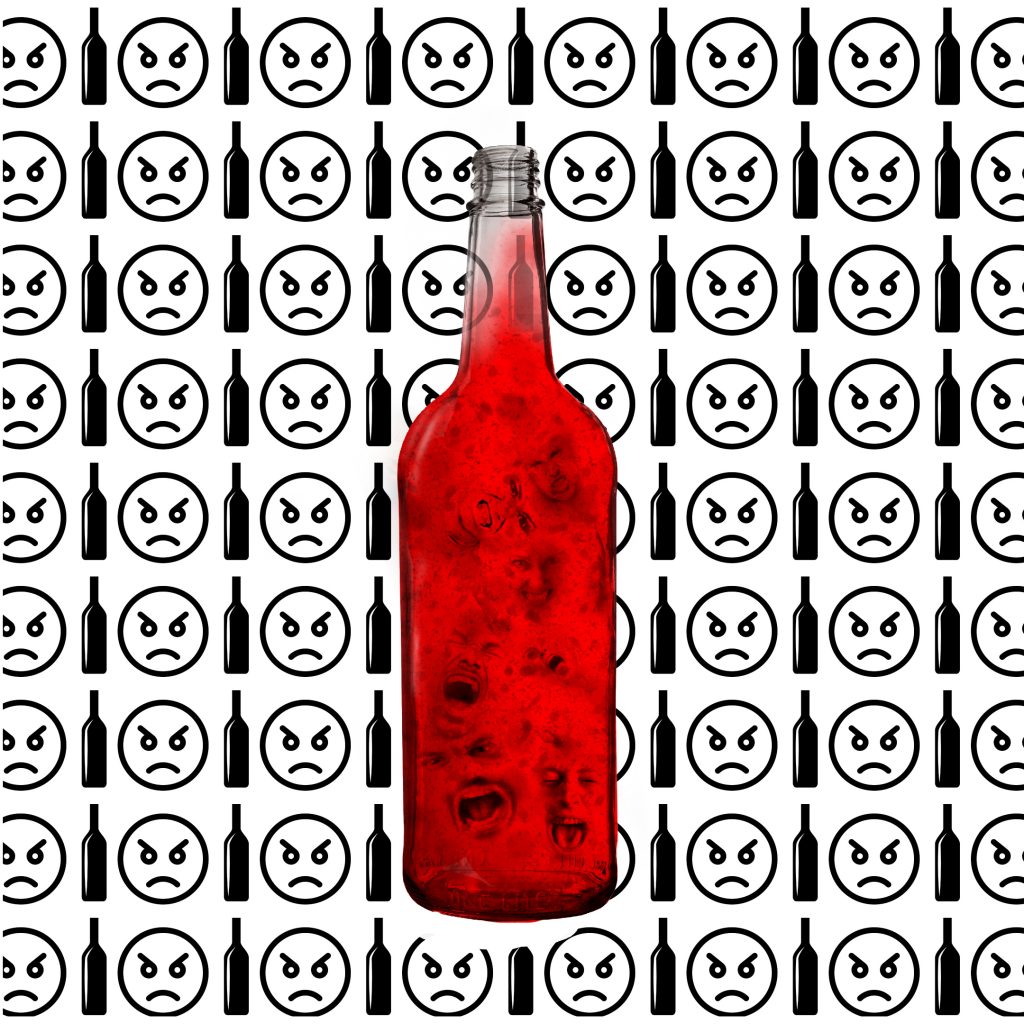
What was challenging for me was making the guy in the back look as if he was looking through a hole. I had to use a lot of shading and make the colors correctly match the theme. The guy in the photo in the back is also me, which I think is cool.

My submission could be improved by making the inside have more complexity in it rather than the simple style, also the picture on the right side could’ve been better. The print out could’ve been better too because I did not use CMYK colors.

I think the project is perfectly fine the way it is. It provides a challenge for beginners and a good way to improve skills for experienced users.

I would definitely use the text to a path tool in the future, I wish I knew about it earlier it would make life a lot easier, especially for not perfectly round object to trace around.

The movie “IT 2” inspired me a lot, especially for the colors and theme. I liked the creepiness and theme the movie you feel so I wanted the card to express that too.