Okay first I just want to say how much Elmhurst Milk ads I have been seeing since starting this project. I went on the website one time and now every YouTube video I watch has an Elmhurst Milk ad.
Anyways, while doing this project I found it not challenging at all. With the labs as practice, I found it quite easy to complete this project. There is only one thing that I struggled with… REMOVING THE WHITE BACKGROUND FROM THE LOGO! I figured it out in the end, but there must be another way to remove it because the logo is not as clear and crispy as I would like it.

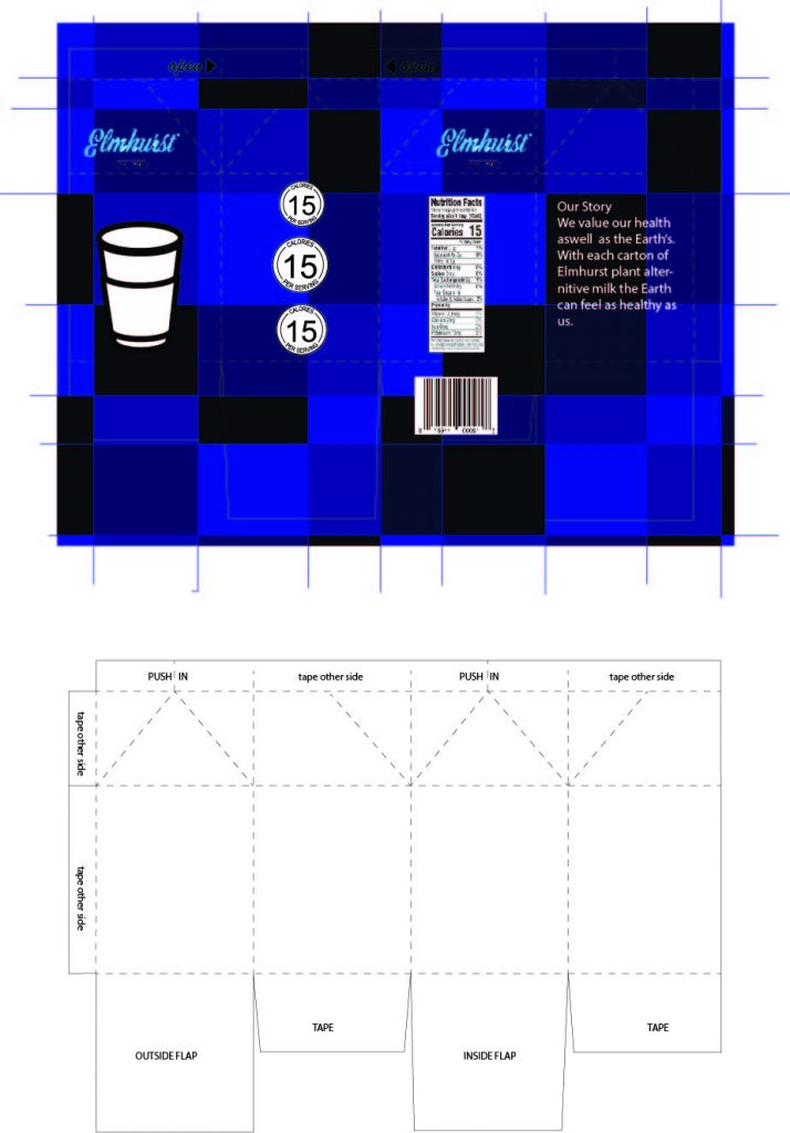
I definitely think that the color palette I chose for this project could be improved. Its is way too dark for the Elmhurst aesthetic that is bright and simple.

I also tried to keep the design photos super simple but there is already a second version of this in the works because I just do not like this design at all. More greens and creams I am hoping for the next color palette.