In this project, we learned about the color schemes, gradients, and how they can be combined to be visually pleasing. Some color schemes we learned about were analogous, triadic, complimentary, and split-complimentary.
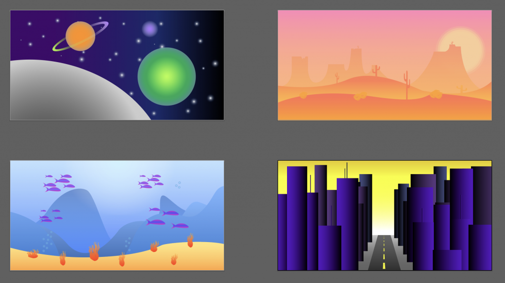
The easiest part of project two was choosing a color scheme for each scene we created. For example, a desert scene would be best suited with a warm based color scheme. I used an analogous scheme in my scene that included shades of red, orange and yellow. I found it simple to match each theme to a color scheme.
The hardest part of this project was constructing each scene including different gradients and proximity for scenes with depth. I found it challenging to come up with ideas for each scene.
To improve my project, I could have provided more detail to the city scene, a better color scheme to my underwater scene, and better use of opacity for proximity on my outer-space scene.
This assignment could be improved by incorporating the basics of proximity into our lab assignments for a better sense of how to use them.
I wold apply my knowledge of color to future projects by creating themes according to the main color schemes that we studied because they truly do provide the viewer with visual pleasure if the scheme is executed correctly.
To further enhance my knowledge of color, I visited coolors.co to see which colors went well together with their computer generated swatches.