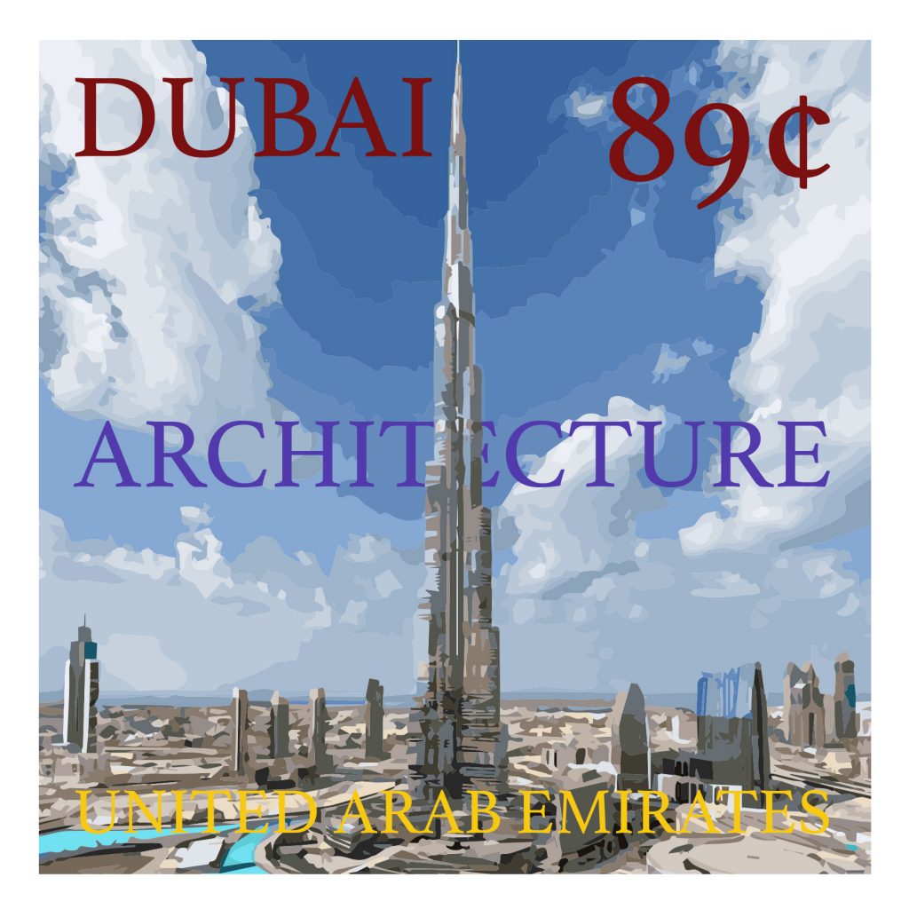
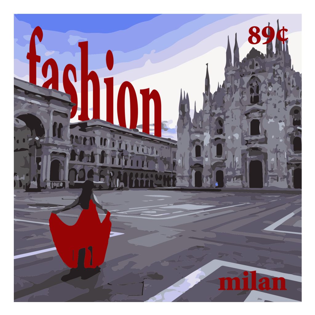
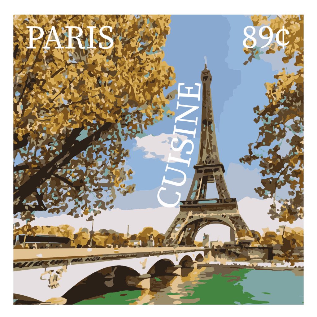
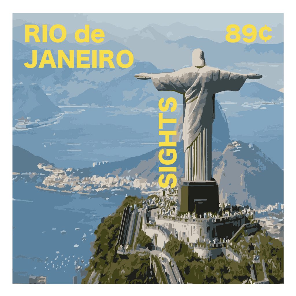
In this final project, we learned about the power and importance of type in graphic artwork. We created four stamps of locations around the world and included their cultural specialty and the price of the stamp. My locations were Dubai for its architecture, Milan for its fashion, Paris for its cuisine, and Rio de Janeiro for its sights.
The easiest part of this project was carrying out the Image Trace functionality for each image I used. Illustrator’s Image Trace gives the user the option to make a photograph look as if it’s been drawn or painted in black and white, up to four color options, and up to thirty colors for more vibrance.
The most challenging part of the project was choosing and placing the text to look pleasing on the stamp. Below is each stamp and the font that is used.


To improve my submission, I feel that I could have varied fonts a little more. I Believe that they are all pretty solid fonts, but I used three serifed fonts and only one sans serif. I also could have incorporated more strong color schemes to each. My favorite schemed stamp is the Milan stamp.
This assignment could be improved by requesting one of each of the types of fonts we went over in class. This would increase the number of stamps to six, but it would include every class of fonts to better understand.
I will apply my knowledge of type to every project I do in the future because graphic design very often includes type. I will also never use the font Papyrus in my career.
Mr. Dunkle, thank you for an incredible semester, this class has impacted my views on how to tackle design projects in such a powerful, positive way.