Categories
DMA 212

Project 4: Map Infographics

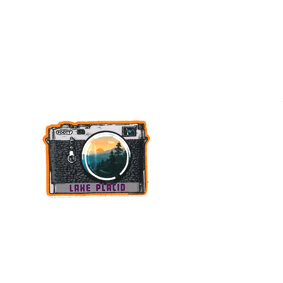
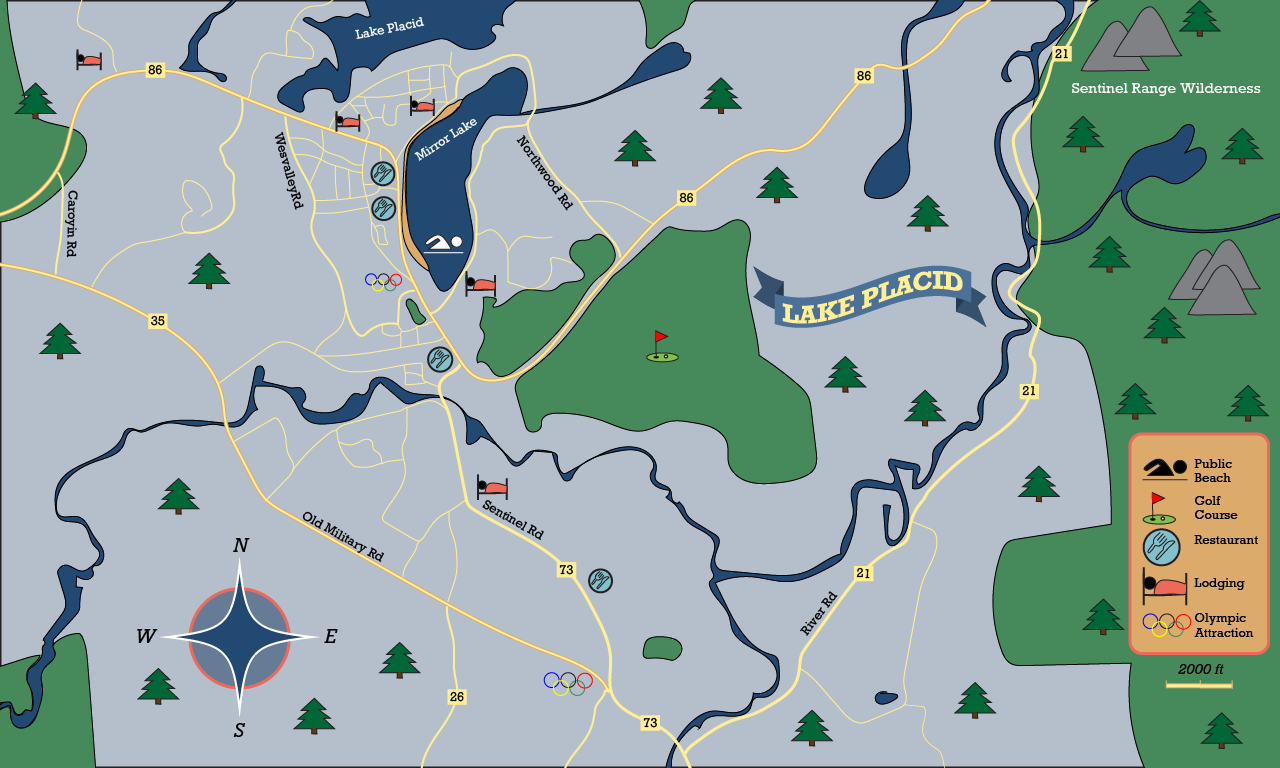
I chose to create the town of Lake Placid for Project 4. After the critique, I changed around a few items in order to make the map more readable. I changed the “Lake Placid” sign from blue to red to help it stand out more, made the Olympic symbol easier to view, added a few more icons, and made the text curved for the lakes and wilderness area.

This project was by far my favorite of the year and I learned a lot from it. I learned how to create a map from start-to-finish, including creating symbols, a compass, a flag, and other geographical aspects with the pencil tool. It was easy to draw the roads, rivers, and lakes. I honestly found it quite fun and would have gone into greater detail if I had the time. I also really enjoyed creating the symbols, I didn’t realize it would be so easy to accomplish. It was challenging to find a map area to create, as I struggled with which town and how zoomed out I wanted it to be. However, I ultimately chose Lake Placid as I really wanted to draw winding roads and aspects of nature. My submission could be improved if I made it more zoomed in and actually focused on the town, however, the region was much more exciting to do, so I wouldn’t change it. The professor could not change the assignment, every video was very helpful! The step-by-step instructions also greatly helped me through the project and made it quite easy to follow. I can apply this knowledge learned to future map-making projects and scenarios. I learned that I really enjoy this area of design so hopefully I get to do it again.

Categories
DMA 212

Project 3: Package Design

This is my product package for Elmhurst’s Apple Pie Spice Oat Creamer. I went for a natural and earthy design, as the company is plant-based and strives to reduce their environmental impact. I choose natural shades of green, yellow, brown, and reds for the background and the logo. I continued this theme into the other design elements, choosing oats, coffee beans, and apple, and cinnamon. I combined my design elements with simplistic type to make Elmhurst’s brand come off smoothly.

After the critique, I kept most things the same, however I changed the stroke on the logo and changed the apple detail. The stroke change was recommended by my classmates as it allows for “Elmhurst” to be more visible. The apple is also now more of a drawing, fitting the rest of the images. Through this project, I learned how to image trace, create a pattern in Illustrator, and cut out arcs of a circle. I also learned how to place many components together in Illustrator. It was easy to create the pattern. I found it very fun to choose the colors and create interesting lines. It was challenging to create the 3 calories circles. They wouldn’t duplicate correctly at first, but I eventually got it. The professor couldn’t really improve the assignment. The time allotted was adequate and having both screencasts and directions was very helpful. I was able to complete the project with ease. I will apply this knowledge in the future, as creating patterns and type is definitely needed within advertising projects.

Categories
DMA 212

Project 2: Image Compositing

Reflection: I loved this assignment a lot. I love making collages and determining which objects fit best in a place, so this was so fun to do. I wanted to mix reality with illustrations, hence the different image compositions. Mixing these two worlds is especially seen with the sun, as it is both real and a sketch. From this project, I learned how to combine images together and create a focal point. I also learned how to resize and alter my images to fit within the different frameworks. It was easy to cut out my images and place them together in a cohesive manner. It was a bit challenging to create a second image, as I accidentally layered everything together. However, it was a decent fix as I just placed all parts together again. My submission could be improved if I masked a bit better, however, I had already layered everything, so I’ll deal with it. Additionally, I like how the masked edges of the actual pictures evoke sticker-like qualities. I don’t think the professor could improve the assignment, as we had a good amount of time to work on it. I can apply the knowledge learned in the future as I know now how to create focal points and compositions. I can easily make collages now. the D2L instructions greatly helped, as they provided guidelines.

Categories
DMA 212

Project 1: Portfolio

Reflection: For this project, I choose to follow the theme of travel. Wherever I travel, I get a sticker representing the place I visited. I choose to scan these stickers. Additionally, I took photos that relate to travel or that relate to the corresponding sticker. I think I followed the theme pretty well. In this project, I learned a lot about resizing. We did it previously in the last few labs, but I definitely got better and developed a process for it as I did this project. I also learned how to manage my images in my folder well, as I was dealing with so many different files. It was easy to optimize into print and screen (large) images, as the resizing process was simple and routine. However, it was challenging resizing into thumbnail images. My scratch disk kept filling up and was not cooperating with me. However, I found a way to circumnavigate this error message, allowing me to get better at Photoshop. My submission could be improved if I got better at the rubber stamp tool. The scanned stickers would look clearer and more clean once my skill is developed. The professor could improve the assignment if we were given more time in class to work on it. However, it was definitely doable outside of class. I can apply my knowledge in the future, as I have learned good file management skills, as well as resizing. This will be helpful in longer and more complex Photoshop assignments. I was helped greatly by the step-by-step instructions on D2L. I really appreciated how every resizing step was detailed out, making it an easy process to follow.