What did you learn? I learned how to deconstruct and reconstruct a previous design in order to create a packaging design that I was satisfied with.
What was easy? The easiest part of this project was deciding what the color scheme and logo was going to be centered around/based off of. The logos and posters used for the merch originate from my own social media brand online.
What was challenging? The most challenging part was the tedious process of being able to successfully deconstruct a package in illustrator.
How could your submission be improved? I think my submission could be improved by maybe upscaling my final design and being more precise with the cutouts.
How could the professor improve the assignment? I think the assignment could be improved if more unique designs were shown off or modeled in class.
How might you apply your knowledge in future assignments or work scenarios? I now have an understanding of how touse the proper layout and formatting in Illustrator to achieve a folding design that can be completed to form a package design.
How did a specific reading or video inspire or help you? I watched this video that walked through the steps of creating a design in Cricut for inspiration:
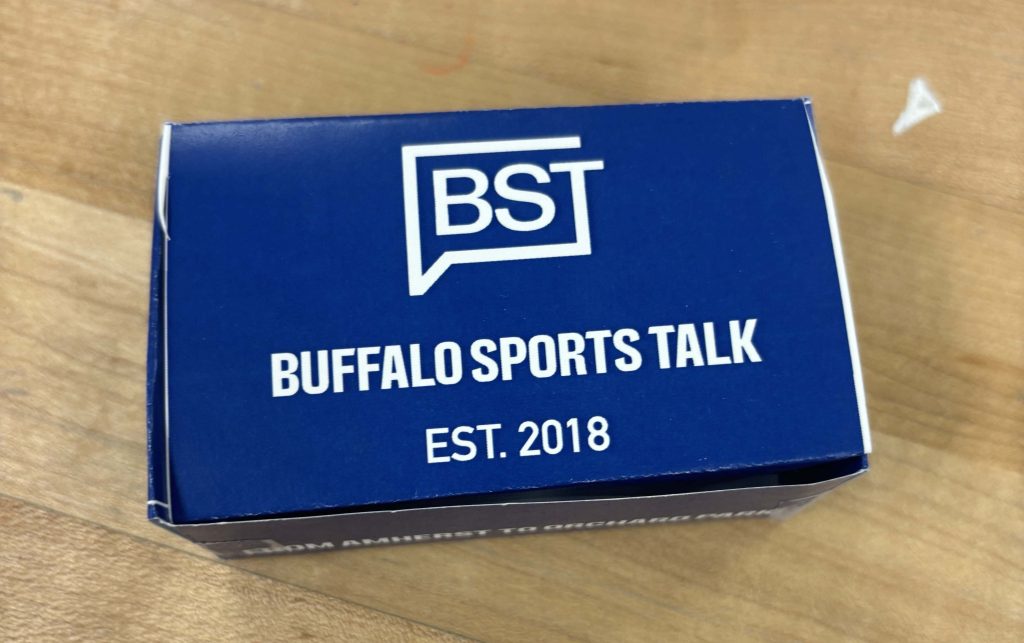
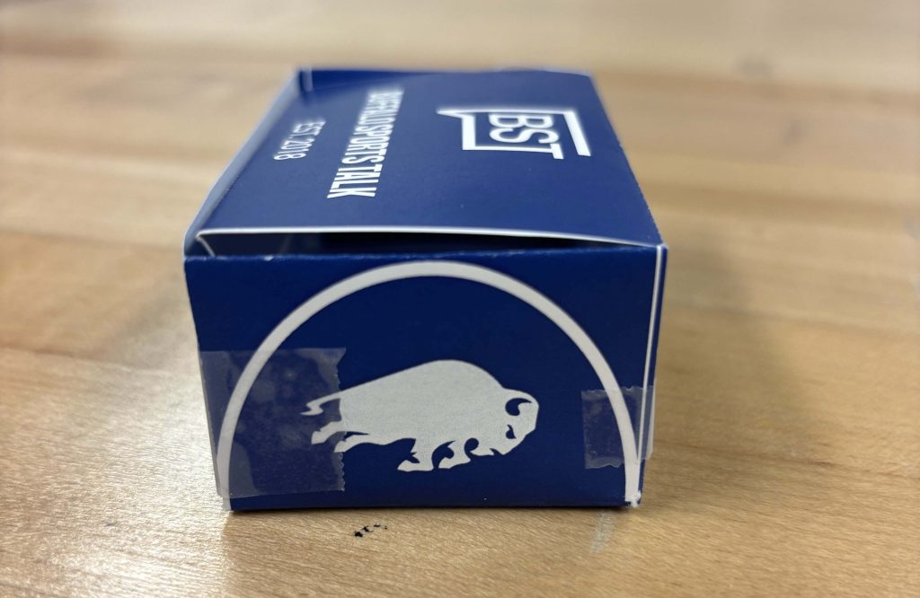
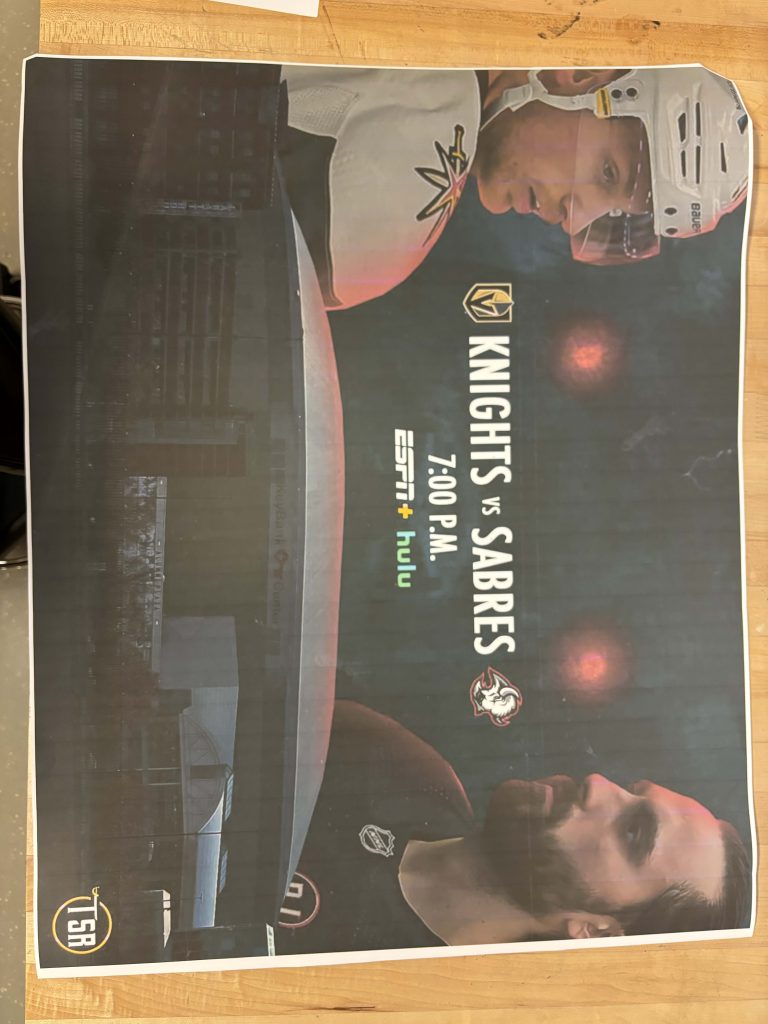
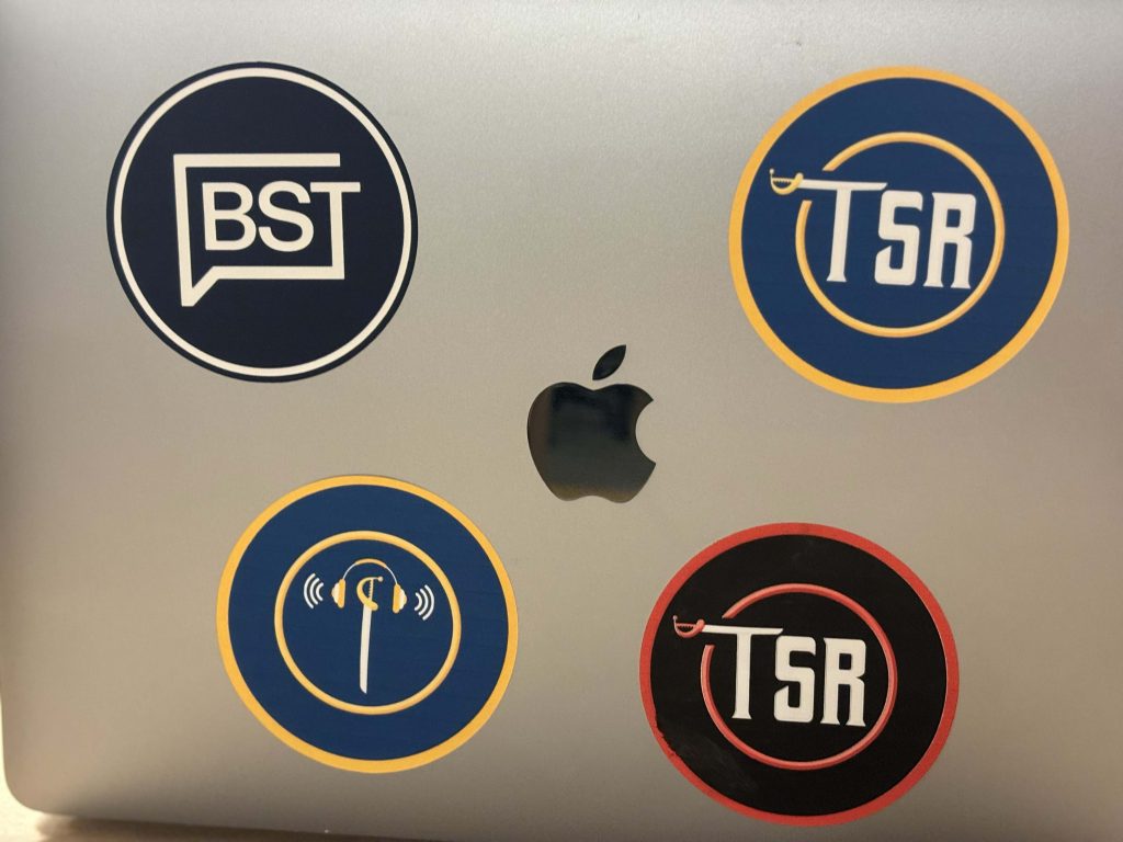
What did you learn? I learned how to use the various printers/machines in order to create the merchandise I desired, a poster and stickers.
What was easy? The easiest part of this project was deciding what the merchandise was going to be centered around/based off of. The logos and posters used for the merch originate from my own social media brand online.
What was challenging? The most challenging part was the process of learning how to create the stickers I desired, and how to use the Cricut machine. It too a lot of trial and error in order to get the result that I desired.
How could your submission be improved? I think my submission could be improved by figuring out a method to make my poster more clear and crisp. It looks good the way that it is, but the quality of the artwork could’ve benefitted from an upscale.
How could the professor improve the assignment? I think the assignment could be improve if there were video demos for some of the machines used to create merchandise, just so that there’s a way to go back and look at the correct method.
How might you apply your knowledge in future assignments or work scenarios? I now have an understanding of how touse the Cricut Maker machine and the Canon poster printer, so in the scenario I’m working on a project in tandem with those machines in the future, I can apply that knowledge.
How did a specific reading or video inspire or help you? I watched this video that walked through the steps of the CricutMaker simply, and made it very easy to understand how to use it: https://youtu.be/dnHleVqPRgU?si=6OuP_0arraK1TkBx
What did you learn? I learned how to use InDesign in order to create a restaurant menu and table tent. I have never used InDesign before, so this was definitely a new experience.
What was easy? The easiest part of this project was picking a color scheme that I thought looked good and was appropriate.
What was challenging? The most challenging part was learning the ins and outs of InDesign in order to create a menu that I found satisfied the task I was given.
How could your submission be improved? I think my submission could be improved by finding a way to make the text pop on the table tent a little bit more. If it were used in real life, I would imagine that it would be difficult to read for some people, so I think attempting to alter the look would be a good decision.
How could the professor improve the assignment? I think the assignment could be improve if there were more real life examples brought to class to demonstrate a final product.
How might you apply your knowledge in future assignments or work scenarios? I now have a fairly solid understanding of InDesign that I can expand upon as I involve myself with more projects. Also, in the scenario that I am tasked with designing a menu for a restaurant, I would now have the experience necessary in order to take on that project.
How did a specific reading or video inspire or help you? I watched this video designing a good menu, and tried to keep some of the tips in mind while designing my own: https://www.youtube.com/watch?v=UWTiT25joYw
Over the course of this final project, I was able to learn how to use video in Figma, and how to use infographics for the purpose of constructing a mock app/tool.
What was easy?
The easiest part of this project was the concept that I settled on. It wasn’t too long after I was given the brief overview for this project that I had a run-in with a friend that had recently transferred to Canisius, where they asked where a certain spot on campus was located. Even though they’d been attending Canisius for a few months, some locations are still a mystery.
So I decided to create a tool based on helping new or confused students navigate the campus.
What was challenging?
The most challenging part was attempting to synchronize the infographics popping onto the screen in my navigation proposal. It took a lot of trial and error to line it up correctly.
How could your submission be improved?
I think my submission could be improved if I were have added a wider map of Canisius University that a user could utilize in the app. Trying to shrink the map into a mobile app may prove to be a challenge (especially given Canisus’ unique campus structure), but if I could’ve achieved that my project would’ve definitely been enhanced.
How could I improve the assignment for the next class?
I think this project could be improved for next time if we were given a few more in-class tutorials on how to improve the appearance (or even animation, if possible) of the infographics.
How might you apply your knowledge in future assignments or work scenarios?
Having the ability to utilize video in future Figma projects will prove to be very useful moving forward.
How did a specific reading or video inspire or help you? Refer to a specific reading or link for this; do not reference a class video or lecture.
Although it’s very quick, this example of AR technology that could be applied to education was helpful in providing some inspiration for my own mock app: https://youtu.be/g9FPnVJX0gw?si=6x_3rIXQDhc84twf
I was able to learn how to use local variables and apply them to the creation of certain features in my app, such as the temperature gauge.
What was easy?
The easiest part of this project for me was being able to simplify the features I believed needed to be simplified. Being able to use my own experiences and thoughts from being in a vehicle gave me the push to brainstorming these ideas.
What was challenging?
The most challenging part of this project was learning how to use the Conditional feature, and having to set up all the ‘What-If’ situations.
How could your submission be improved?
I think the theming for the interface could be improved as a whole. For example, I wanted the backgrounds in light/dark mode to reflect day and night skies, but I wasn’t able to add detail in such as clouds or stars.
How could I improve the assignment for the next class?
A few more in-class tutorials of certain features you could add to enhance the interface could improve things, such as sliders or dragging.
How might you apply your knowledge in future assignments or work scenarios?
The Conditional feature will help in any future assignments that require me to modify the current aesthetic based on how a user would be utilizing the interface or which prompts they may be pressing.
How did a specific reading or video inspire or help you? Refer to a specific reading or link for this; do not reference a class video or lecture.
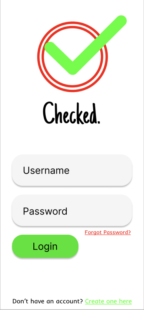
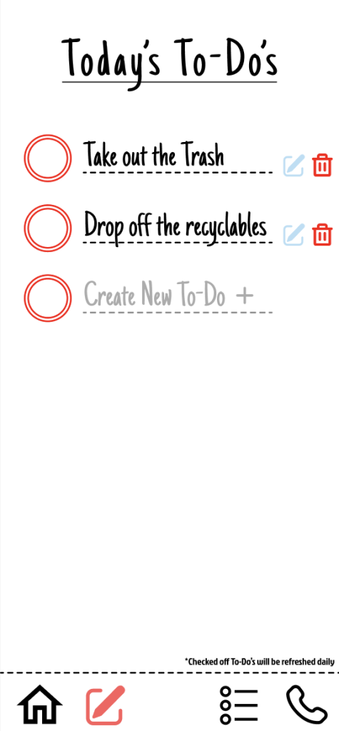
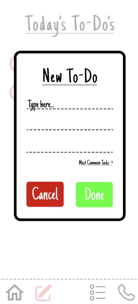
Learning how to create components in Figma in order to use them in a flow chart for my app. It quickly became a skill that was useful for how I wanted to structure my project.
What was easy?
The easiest part of this project was coming up with the idea/theme for my app. I knew from the start that I intended to have an aesthetic of a lined sheet of paper that an average person would write their daily to-do list down on be the theme/color scheme for this app.
What was challenging?
The most challenging part of this project was finding a way to accomplish my main objective with the app, which was to make the process of creating a to-do list as simple as possible. Brainstorming ways to achieve was the most challenging portion of this process.
How could your submission be improved?
I think my submission could be improved if I had created a way to add multiple to-do’s to a user’s list as once, instead of only being able to add one at a time.
How could I improve the assignment for the next class?
A good idea for next time could be partner up students for this project, that way there is a healthy mix of ideas going together in order to create a polished final product.
How might you apply your knowledge in future assignments or work scenarios?
If there is ever an assignment in my career based around app design/user interaction, then I’ll be able to apply the skills gained through designing in Figma to that project, whether or not the software I utilize is Figma itself or not.
How did a specific reading or video inspire or help you? Refer to a specific reading or link for this; do not reference a class video or lecture.
This article was a good dive into another person’s process for designing a to-do app, and gave myself some good insight into what to consider if another person were to be using my app at that specific point in the creation process.
With this being a summative project of everything that I’ve been introduced to up to this point in the semester, there wasn’t much for me to learn. It was definitely more of just taking the concepts that I’ve already gotten a handle of and applying them to this last creation.
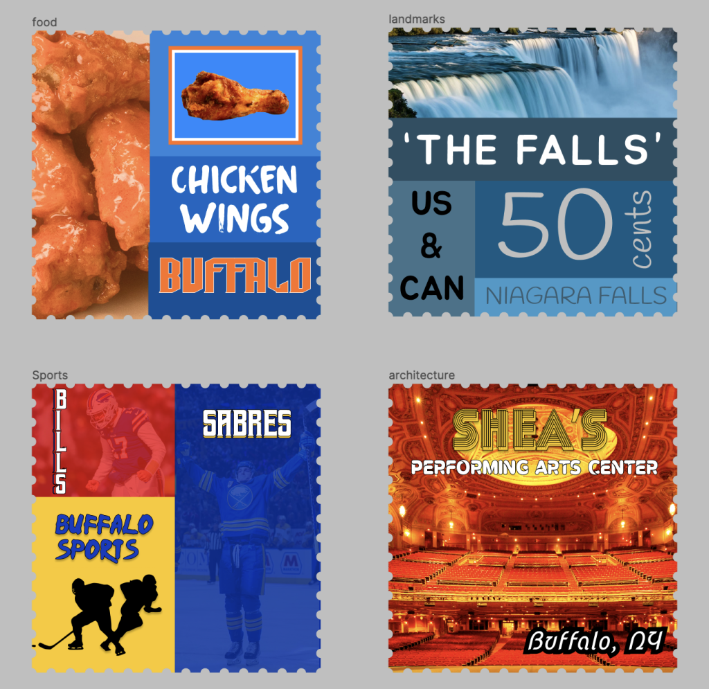
With this stamp collection, it was really easy to come up with four subjects of interest that represented the city of Buffalo as a whole, and to stylize them in a very creative and unique way. If there was anything that was challenging, it was narrowing the list down to just 4 entries, as there were many other different idea and directions I think I could’ve gone in.
If I could improve my submission, I think I could’ve spent more time cataloging through different fonts to make these stamps pop more. I’m satisfied with the ones that I ended up choosing, but I think there was possibly even more (if allocated more time) that I could’ve chosen from.
I believe the project could’ve been made even better if students were possibly given the option to combine two different places. Perhaps the scale of the project would increase, but putting two places that really differ from one another together could be a fun twist on this project.
Using different elements, pictures, fonts, and effects on the stamps in order to create a cohesive project that showcases a place like Buffalo in frames is a great set of skills that I’ll be able to take forward with me through this experience.
One reading that I really enjoyed reading was this article: https://www.canva.com/learn/how-different-fonts-speak-to-you/ Breaking down how each font creates a different feeling and vibe really helped contribute to my search for the correct fonts for each stamp.
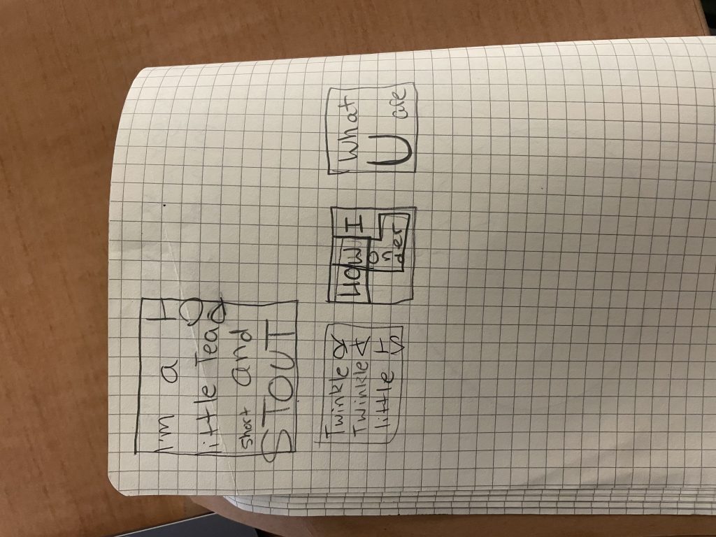
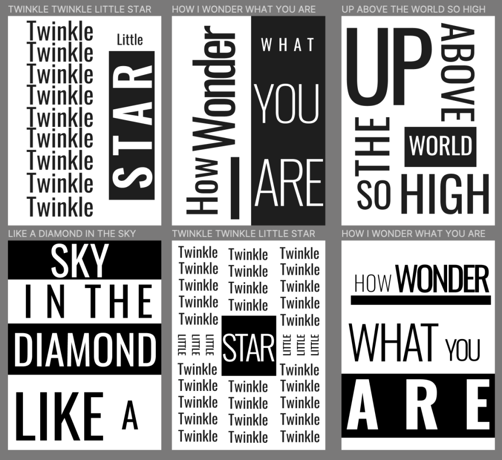
Finding new and inventive ways to make a nursery rhyme be visualized with just words is a really intriguing project. It allows for some real creativity to shine through with the ability to use different fonts and different fills on those fonts to make separate verses really pop and stand out from one another.
During the process of this project I learned how to manipulate fonts in different ways, such as thinning letters or space them out. The most challenging part of it all was trying to not be repetitive in my designs, but it was also fun to try and come up with new ways to make each frame stand apart.
I think if there was anything that could’ve been improve from the project, it was that I don’t feel I even touched the surface when it came to discovering different fonts that each allowed for different effects to be performed with them. If there was anything that could be improved for the project in the future, I think allowing for more than one universal font to be used in different frames could be a lot of fun.
If there’s ever a future project where I am required to make a graphic really pop with words, then I’ll be able to draw back to this typography activity to help me out.
I really liked this blog post: https://creativemarket.com/blog/what-is-typography. It gave me a really good understanding and foundation of typography as a whole, and benefitted how the final product came out.
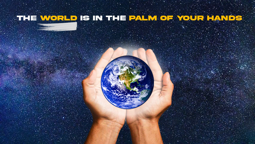
Being able to visualize a metaphor into something of your own is a very fun process. Since I was working on this project primarily in Photoshop, it gave me a lot of creativity in using different filters and effects to create the perfect concept. Photoshop is something that I would definitely consider myself more efficient in than Figma, but there were still a few things that I learned through trial and error, such as layering and cutting out different parts of an image.
While I’m sure for some being able to find a good metaphor to dabble with may have been a struggle, this one came right to me while I was brainstorming.
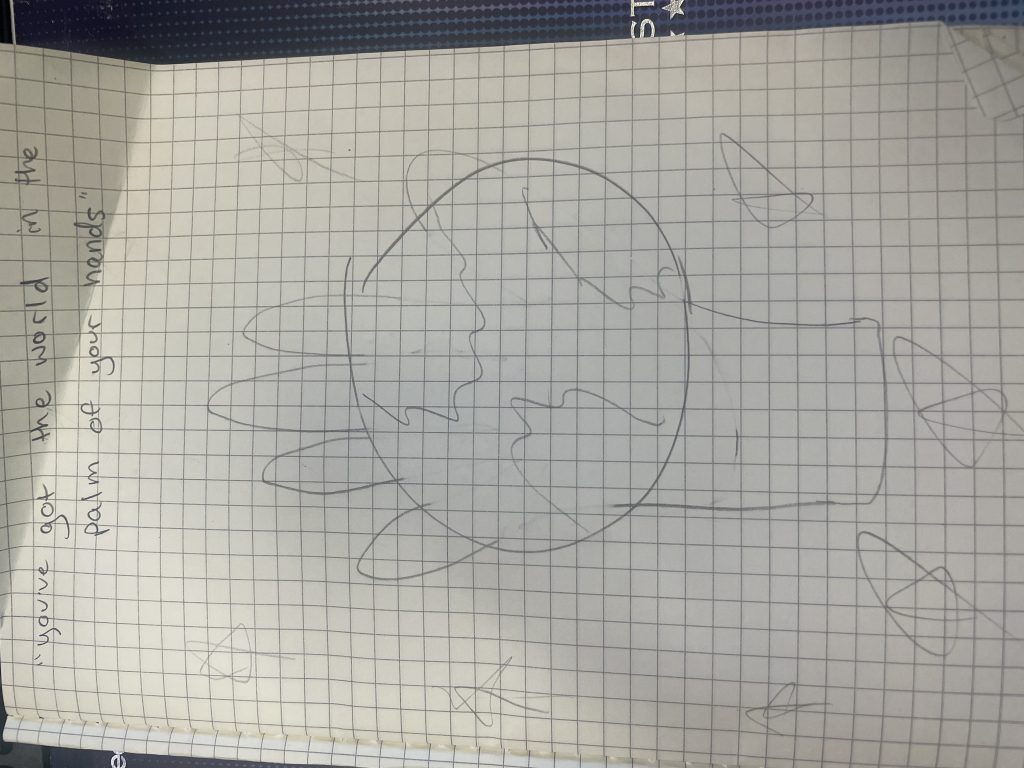
The idea of placing the globe into the palm of a person’s hand is pretty self-explanatory, so the most challenging part of this whole project was conjuring up or obtaining a background that I thought really fit the scene; and I think I did so with the image of space.
If there was something that I think I could improve with this image, it would probably be making the palm and the globe on top of it looking like it came from the same image. To me, I think I can tell they are two differently cropped images placed into one shot. It isn’t jarring, but it could be improved. The only way that I believe the professor could improve this assignment for next time is showcasing even more of the ideas and images that other students created, I think it could really be more of a creative spark for current students.
This project could really help me moving forward because if graphic design is really an avenue I would like to continue to go down, then I’m going to need to be able to combine images into one complete project such as in this display. John Saito’s article detailing how metaphors can add to your designs really put into perspective how detailed, yet simple to understand my project needed to be.
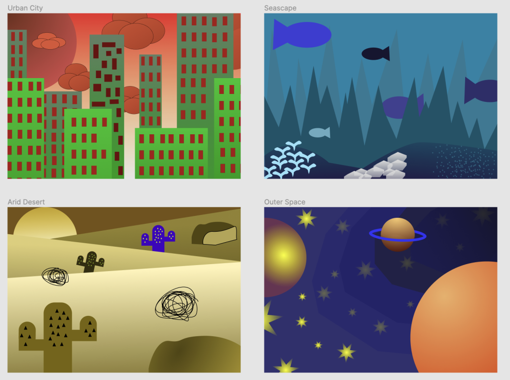
Urban City – Complementary l Seascape – Analogous l Arid Desert – Split-Complementary l Outer Space – Triadic
While with this second project I am getting more and more comfortable with the basics of Figma, there are just as many new skills that I’m learning, and that continued with this project. The important skills that I picked up doing this was how to use linear and radial fills, and the different relationships between colors themselves (complementary, analogous, split-complementary, and triadic).What was most easy with this project was using the different shapes to construct different objects such as buildings, fish, or planets; now that I’ve gotten accustomed to parts of Sigma, that part came easy to me. What was definitely most challenging was being able to apply each color theory to their respective environment; it tested my creativity and ability to be able to integrate them effectively. I think some frames could be improved by adding more detail, such as the barren landscape in the Arid Desert or the buildings in Urban City. I think this project could be really improved if there were more landscape choices to choose from, maybe scenes like a jungle or forest. Using the color knowledge I’ve gained from this project will surely help in the future to flesh out another project’s look and make it pop. An article that gave me a better understanding of color while working on the project was Cameron Chapman’s article that detailed areas such as color families, and primary and secondary colors.