- What did you learn?
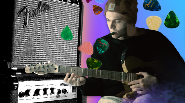
During project 2, I learned a couple of new techniques for image compositing that I was not familiar with prior. For instance, the marquee selection and “blowing up” of a piece of an image is a great way to get an abstract-looking background, or to pull colors from the image you want to retain in your new composite. I ended up using this technique on my landscape composite image. To accomplish this, I first pulled a tight selection of my original self-portrait shot to get some cool colors. Then, I used those colors, a blue and purple, as a gradient in my final composite.

2. What was easy?
The easiest part of this project was the lack of structure, which sounds counterintuitive, but actually really helped me think of my photos more creatively. To come up with my idea, instead of worrying about exactly how I wanted to arrange things, I just looked for objects throughout my Proj 1 portfolio that all had similar characteristics: the guitar, the guitar picks, and the guitar amp. In this way, I could create a surreal-looking world in this composite where the perspective and scaling of such familiar objects are warped and altered to fit around the subject (myself) in a new and interesting way.
3. What was challenging?
The challenge of this project came with layer management. When you have a lot of layer masks within a single Photoshop project, things can become disorganized quickly. When I have an idea, my workflow usually gets pretty messy; I like to execute on ideas as fast as possible in real-time so I can see if whatever is in my mind will look good or not in practice. Because of this, there were times where I looked back and realized I forgot to properly name a layer, or misplaced an adjustment layer, etc. This being said, I am happy with how both of the final images turned out.
4. How could your submission be improved?
Typically, there is always a stronger image and a weaker image when you’re creating multiple artboards. I think, in my evaluation, that my mobile background is weaker than my landscape. The landscape does a better job portraying how far you can stretch the boundaries of compositing, and I think I could have taken it a little farther in my mobile background. At any rate, though, there is definitely a time and place for adding more elements and leaving some out, and in my judgement, I took my mobile background as far as it could go without looking just outright messy. If I could go back on my submission, I might try a completely different mobile background (I will note that I still used the elements of compositing in my mobile, such as a custom pattern, text, etc., but it is much more subtle).

5. How could the professor improve the assignment for next class?
As I mentioned in my last feedback for Project 1, I wanted Professor Dunkle to have us incorporate more graphic work into our first project so it wasn’t just photography. Now that I have the hindsight of this project being the next in our class sequence, everything has come full-circle, and I think this was a great second assignment to build off of. For the next class, it might be interesting if we had to incorporate a vector design or logo as a part of the deliverables, and put them in both the landscape and mobile background, but employ them differently in each composite (just an idea).
6. How might you apply your knowledge in future assignments or work scenarios?
I’ve always really liked the idea of image compositing/collages as projects to take on, and I could definitely see how something like this could be used in a digital media department for a company. Professor Dunkle showed us in class during his demo how this kind of design is used all over corporate media, whether it be in websites or on social media pages, and it makes perfect sense. The combining of photography and texture serves as a great template for a visually-engaging company website or social media profile banner. I hope to work in this field after I graduate, so this project was definitely eye-opening when it comes to knowing how to work through a project like that for an employer.
7. How did a specific reading or video inspire or help you?
When I was looking through some other examples of image compositing, I came across some band websites that I thought had some really cool examples of texture and photography combined. Here are a few that are worth checking out:
https://www.imaginedragonsmusic.com/
https://www.twentyonepilots.com/
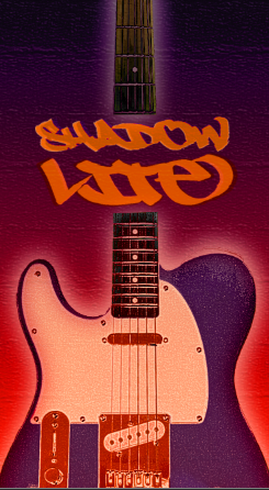
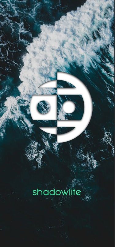
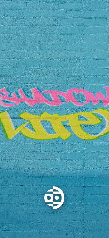
I was also inspired by some previous work I did for my own band, Shadowlite, where I actually did a very similar project, making phone backgrounds for fans on Pinterest. Here is an example of those backgrounds:

