- What did you learn?
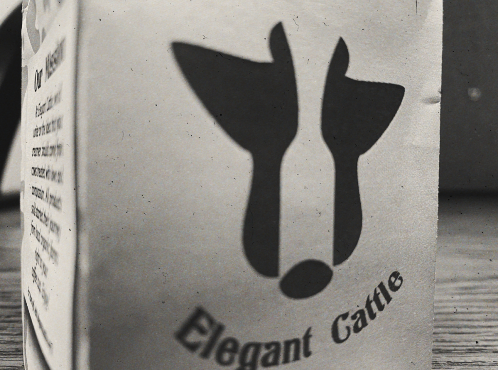
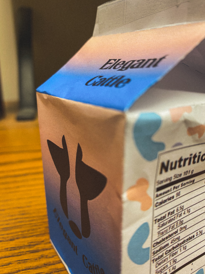
Throughout the project’s creation, I learned how to utilize negative space for logo design. Specifically, I was able to get a logo made with the pen tool to create the shape of a cow’s head and face, then I made a path for a bottle-shaped space and used the subtract function on the pathfinder. Overall, I was really happy with the logo, as it came out with good symmetry and communicates the brand really well.
- What was easy?
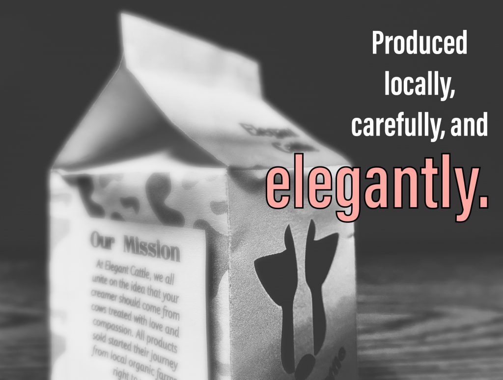
The concept of the project was really easy to work with. A simple milk carton template was fun and interesting to design for and then, eventually, to make into something tangible. I would also say that the color scheme was easy for me, because I wanted to come up with colors different from what you’d normally see in a coffee creamer product (warm reds, oranges, brown, etc). I decided to go a bit unorthodox with the pink/red/blue colors.
- What was challenging?
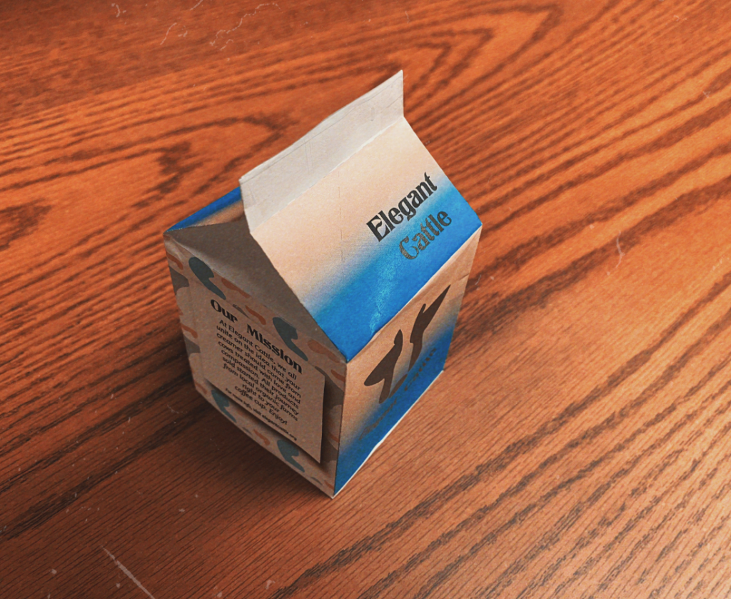
For me, the challenging part was folding up the net shapes into the actual carton. I had some trouble with some of the edges and taping them together, and unfortunately my paper got crumbled up a bit in the process. Nonetheless, I was able to get some shots of the final product that seem good enough for a mock-up advertisement.
- How could your submission be improved?
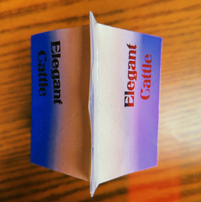
I think I could maybe try another print on the carton. Other than that, though, from a design standpoint, I kept the main logo page pretty simple, with just the logo and company name along with a gradient background. Even though it’s pretty minimalist, I like that it contrasts with the patterns pages on the other two sides of the box.
- How could the professor improve the assignment for the next class?
Professor Dunkle does a great job with this project in getting us to think like designers for a real product. The only thing I can really think of is maybe printing on some poster paper or even using cardboard to mitigate some of the structural damage suffered when assembling the carton.
- How might you apply your knowledge in future assignments or work scenarios?
I hope to work on a graphic design team in my future internship, so I could definitely see the logo design and overall spacing out of vectors to be a useful skill to apply to future projects I could be paid for.
- How did a specific reading or video inspire or help you?
I was pretty inspired by simply the idea of organic farmers and local business around Buffalo to create my company for this project. I would refer to a documentary like “Food Inc.” as inspiration for the concept. As far as the designs go, negative space logos really inspired my own logo, and I have a couple references linked below:
https://www.pinterest.com.au/pin/530791506082582902/