- What did you learn?
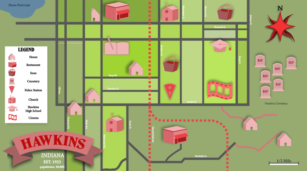
For the final project of the class, I feel that my largest takeaways were the banner process and creating typography in the form of titles, as well as organizing the space of a location in an aesthetically sound way. The text, first of all, was created with attention to what fonts I wanted to use, how well certain fonts did (or did not) work together in communicating visual consistency, and overall, placing each piece of text in the right area to balance the weight of the map and also allow for easy recognition of what text is connected to what vector graphic. The process of choosing and creating outlines for my text was likely the most time consuming part of the project aside from creating icons.
- What was easy?
The easiest part of the map creation for me was the location. As the project was assigned, I was in the middle of re-watching Stranger Things on Netflix, and the idea seemed too opportune to pass up. I immediately surfed the web for different reference photos of the infamous setting of Hawkins, Indiana, and I was really inspired to create a map that would be (mostly) accurate to Hawkins in the show, with some of my own artistic input for the style of the infographic.
- What was challenging?
The real challenge of this project for me was a surprisingly tedious and rather secondary part of the bigger picture, which was the Live Paint tool used to create areas. For whatever reason, possibly the way I set up my roads and my overall workflow on this piece, the live paint tool was extremely uncooperative in painting definitive sections of the map. To compensate for this issue, I actually went in with the pen tool and made my own manual sections for every colored green piece visible in the project, which worked pretty well as an alternative, even though it definitely added to my time to complete this project.
- How could your submission be improved?
The one thing I really wanted to do with my final on this was to bring in some Photoshop corrections to the piece to add to the theme of Stranger Things. I had the idea to add an overlay of a crumbled or distorted texture under the graphics to make the map look real. Although I didn’t get to do this for my submission, I still might go back and see what texture/color corrections could be made to really make the map feel like it’s a part of the Stranger Things world.
- How could the professor improve the assignment for the next class?
Professor Dunkle made this project really straightforward, and his tutorials were more than helpful to me for setting up this project as far as layers, reference photos, banner creation, etc. If I had to give any constructive feedback for this particular project, I would say that maybe Ben could have us create a completely fictional map from scratch as an added challenge, but also as a way to invoke even more creativity and see just how realistic of a destination students could envision and bring to life.
- How might you apply your knowledge in future assignments or work scenarios?
I definitely see the subtle typography in this project as a great piece of knowledge to apply to future assignments. There are so many examples of typography in graphics, and especially in advertisements. Since text is so ubiquitous and such an integral part of the visual art we see today, I think understanding how to incorporate text, when to make it prominent or subtle, and what fonts to use and pair together are all skills that I learned throughout the project creation process.
- How did a specific reading or video inspire or help you?
I used a reference fan photo of Hawkins, Indiana for my own map, and also looked at a lot of Stranger Things art and concept art to create my own piece of Hawkins and get an appropriate color scheme:
http://thechessboardfactory.blogspot.com/2016/08/stranger-things-map-of-hawkins-10.html
https://www.pinterest.com/pin/570479477792740328/
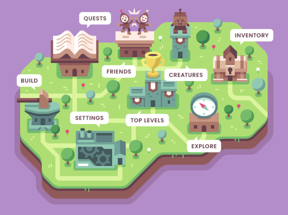
For the icons, finally, I used a reference photo that Professor Dunkle posted on the project tutorial slides:
