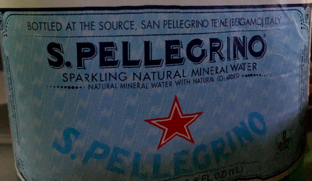
For my second Typehunt, I chose to feature the label on San Pellegrino sparkling water. I honestly do not know why this font has such an appeal to me, but if I had to guess, I’d say this font is personal. For me, it is evocative of my childhood and spending time at my grandparents’ house, because my grandfather always had these bottles around. Fonts and typography in the context of graphic design definitely carry emotional appeal, be it through personal experience or just the font’s essence, which is admittedly a difficult element to describe. Further, I think this font really does feel like a piece of Italy in text, and the borderline “historic” era type really helps in accomplishing that. Finally, the pairing of the title with the sans serif descriptive line is a really functional and aesthetically pleasing combination of fonts.