- What did you learn?
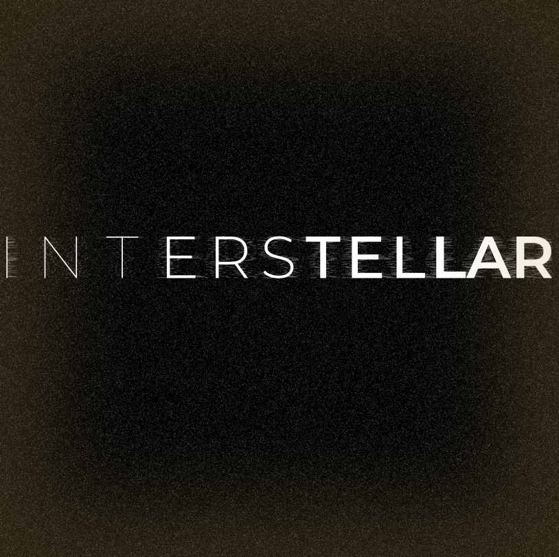
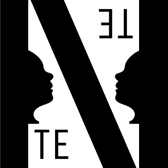
The power of well-made typography is not always displayed through the font itself; rather, the placement, kerning, and space of the text relevant to its background can really communicate a message. I think that for my project, which are takes on the Christopher Nolan films, “Interstellar” and “Tenet,” I wanted to incorporate the type in such a way that it looks as if some transition is happening. I learned how to accomplish the design using Figma, and specifically, using some of the community plugins available. The basic idea is the aforementioned “transition,” as the plot of Interstellar is based around looking for a new home for humanity across galaxies while Tenet is about technology that can instance a “reverse time” in order to save humanity. To communicate this in the first image, I played around with some spacing of the word to give a visual that the letters are moving towards the right end of the screen. Also, the word gets bolder as it is read from left to right to strengthen that idea. I further emphasized this by adding a noise distortion filter behind the title on a separate layer to give the effect of the text in a transition phase. In the second, I used the “N” as a split between what would represent regular time and reverse time on either side of the frame, so as to “transition” from one linear timeline to another alternative, reverse one. The second piece also works with “duplication” as the film’s reversal of time creates multiple instances of events happening in both timelines (it’s a very confusing movie, so I did my best to connect the word here).
- What was easy?
The easy part of this project was the workflow with Figma. I think that with a project where the only real manipulation to the text allowed is addition, subtraction, kerning, etc., Figma provided the most straightforward and simple UI, so I used my constraints to open up more possibility with my imagination. I also think the words we were given narrowed down the conceptual part of the project enough so that we could really interpret those words in any way we wanted without having to worry about finding our own word to visually display.
- What was challenging?
The challenging part of this project was similarly what made it easy to accomplish: the broad interpretations associated with the words we had to choose from. For instance, once I picked “Interstellar” and decided transition would be the best word that follows the plot of the film, it definitely took a while to figure out how to design around that word. “Transition” can be ambiguous, and at the end of my project, I felt the concept was portrayed, but if somebody had to guess what word I used without having a list to choose from, I cannot be certain they would be able to discern the word being communicated.
- How could your submission be improved?
My submission might be improved with more design in the background. I did add a small effect to the background of the first image that created a linear tunnel effect to add to the theme of space travel. I thought about taking the designs even further, adding things like the director’s name and lead roles’ names at the foot of each frame, but ultimately decided not to interfere with the main concept of the text and accost it to an over-designed background. Perhaps, however, there are some other possible additions that could take the submission to the next level and turn it into a “mock” movie poster.
- How can the professor improve the assignment in the future?
I think it would be cool to make an actual movie poster. Although it may be less feasible, it would be really fun to design and print out our own movie poster with the title still communicating the expressions we choose. Then, maybe a part of the assignment could be to show the original movie poster and compare it to our version.
- How might you apply your knowledge in future assignments or work scenarios?
The knowledge I gained from this project was mainly the use of different tools for text in Figma, and I definitely would use those methods on future graphics or assignments and/or for a graphic design internship, which I am hoping to earn this upcoming spring.
- How did a specific reading, video or example inspire or help you?
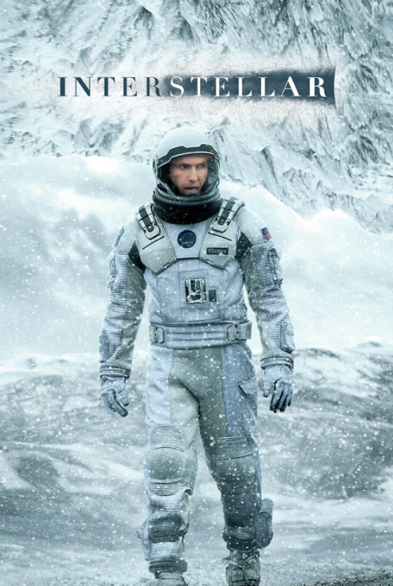
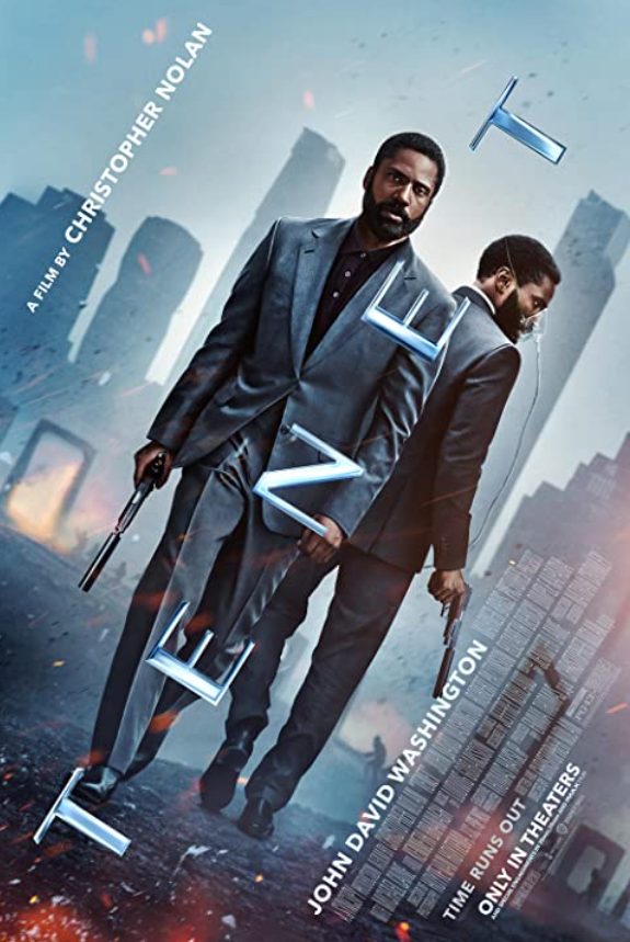
Along with the past work from students who took this course, I also browsed some movie posters to see how professional designers advertised certain films. Here are a few examples of posters I found to help inspire my own idea: