- What did you learn?
Throughout the process of building a brand-new, original typeface, I learned that fonts are not easy to create. Understanding the rules a font must abide by, namely a set cap height, x-height, ascender line, descender line, etc., there are a lot of things one must keep in mind when building a font. It was nice to have some preface from lectures to comprehend exactly how a font should operate. I learned that one of the most important details or qualities of a font, furthermore, is its legibility and readability. By this, I mean that a font that is decorative or experimental, perhaps strictly geometrical, like with this project, must be easy to identify by letter and character. Extra details can make a font look quite beautiful, but in the worst times, it may take away from the functionality of it.
- What was easy?
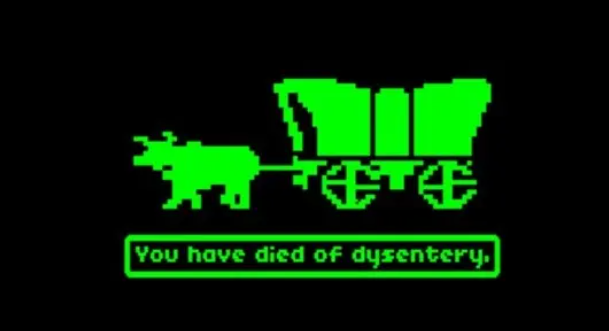
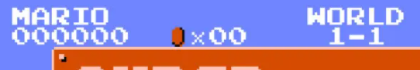
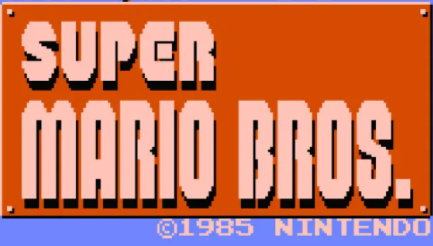
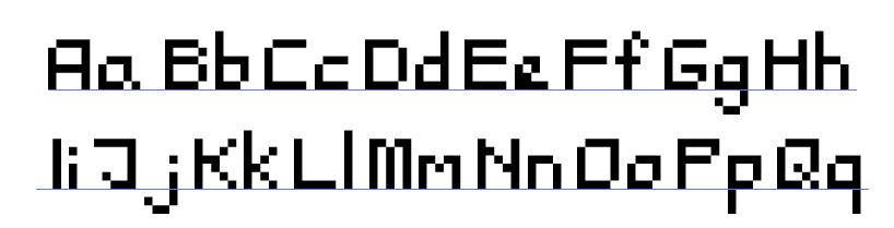
The easiest part of the font-building process was the workflow that resulted in getting through the first and hardest couple of letters. Once I had a plan in mind, which, in this case, was to base my font off of the period of 8-bit video games and texts that would appear on old, analog consoles, I was able to move through the letters fairly quickly. There was definitely a point where everything “clicked,” and I was able to chug along through the tedious characters and symbols that followed the letters. However, getting to that point took many failed attempts and unsuccessful experiments.
- What was challenging?
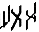
The most challenging part of this project was deciding that the first font I had in mind was simply not going to work. My initial idea for my first font struck me when I was looking at a 3D cube. It was actually a Rubick’s cube that I have in my room. As I stared and pondered at the cube, I wondered if a font could look such that its perspective reflects a side of a cube if one was staring directly at an edge of the cube. As I began working in fontstruct, I was really enjoying the products of many of my letters. It was when I arrived at a capital “X,” though, that I knew trouble was afoot. Even when working with Professor Dunkle, our attempts at a remedy for this stubborn letter just weren’t coming together with the limitations set by the program. Alas, I scrapped the project and moved to my second idea, which I eventually turned into my final project.
- How could your submission be improved?
Although I would really like to go back and make my first idea come to fruition, I’d probably consider doing so with another program like Illustrator or Figma. The geometry of the cube font is one that is very complex and cannot be created with the basic shapes of Fonststruct, so I would revisit that first idea in another program. In regards to my actual font, the 8-bit-inspired basic sans serif, I would say my only issue is with some of the spacing of each letter. It was difficult to discern what letters/characters would need an extra block of empty space and which should be left alone in order to have a monospace font. This was initially my goal, but the font does have some spacing issues that were hard to overcome.
- How can the professor improve the assignment in the future?
It would be interesting to explore what other font-building programs might be available on the internet. I think fontstruct.com is great for what it offers, but it definitely has some glaring issues with the user interface. I would say, albeit, that this assignment was a great intro to font-building.
- How might you apply your knowledge in future assignments or work scenarios?
I will probably try to use the basic understanding from lectures as well as the history of fonts to apply those concepts with my own projects. I have a band called Shadowlite, and typefaces are often a point of contention when it comes to creating covers for my albums, so now that I understand and certainly deeply appreciate fonts and their origins, I can proceed with such work with my best foot forward and better judgement about which fonts could communicate which messages.
- How did a specific reading, video or example inspire or help you?
I used most of Professor Dunkle’s articles on D2L for inspiration, but my actual font was inspired heavily by old games like Super Mario and Oregon Trail. Here are some images of type in those games: