- What did you learn?
The most significant lesson of this project for me was that designing a booklet or a typography project that contains lots of text requires one to keep the big picture in mind. Oftentimes throughout this project, I would find myself stuck in “hyper-designer” mode, trying to create different paragraph or character styles to fit a certain page or section, only to end up being lost in the tedious details such as: What should the indent size be? Is this the right font size for this heading? And so on. In short, I think that understanding the broad concepts of the project, like: what two fonts give you the best consistency, when to create a paragraph style that can standardize prose, etc. are extremely important to always come back to if you get lost in the fine details.
- What was easy?
The easy part was picking a color scheme I could stay true to. Ironically, the color scheme was difficult to apply through inDesign, but it is what I used to keep the look and tone of the booklet consistent. Using coolors.co, I picked a color scheme I thought would give the Quadrangle issue a new, yet retro feel, and used it on all my type headings and titles. Since I see myself as a graphic designer predominantly, I think having a good base for a color palette actually helped me visually organize the rest of the text.
- What was challenging?
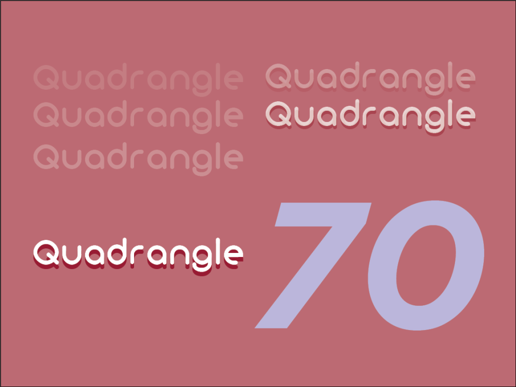
The hardest part was easily curating paragraph styles. For instance, the many sub-categories of parameters you can apply to the style you’re creating can become very cumbersome, and constantly, I would find myself stuck on what parameter I added that worked in one place and accosted the text in another. Here are some examples of the styles I ended up with in my final:
- How could your submission be improved?
I think my biggest area for improvement is refining the paragraph styles I ended up having at the end of the designing stage. I ended up creating variants of other styles to achieve certain nuanced styles that were still consistent with the rest of the text, but overall, I think I ended up with too many for a practical application. So, if I had to go back and revisit the project, I would try to standardize the styles a bit more and end up with less variations.
- How can the professor improve the assignment in the future?
It would be great if we could print our mock-magazines just to see what they look like in-hand. There is certainly a benefit to holding a booklet after the binding and printing is all done, and I would honestly like to see how mine would have turned out if it was tangible.
- How might you apply your knowledge in future assignments or work scenarios?
If I ever have to use InDesign again on a future project, I am glad to say I know my way around the program adequately, as opposed to prior to starting this project. Using paragraph and character styles may be tricky, but I think with more practice, I can improve on my efficiency and create some really consistent typography work in the future.
- How did a specific reading, video or example inspire or help you?
I referred to the 2015 Quadrangle often for inspiration on pages, and I will cite these websites for assistance on the visual hierarchy and typographical organization parts of this project:
http://guity-novin.blogspot.com/2012/04/modern-newspaper-magazine-layouts.html#Seventeen