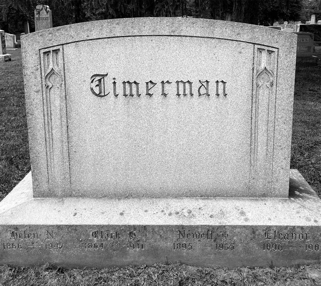
The first font captured in Forest Lawn was quite a remarkable example of blackletter. The first letter, the “T” in Timerman is probably the most obvious indication that this font is blackletter. Similarly, each letter has very defined edges and points that are essential elements in a blackletter font.
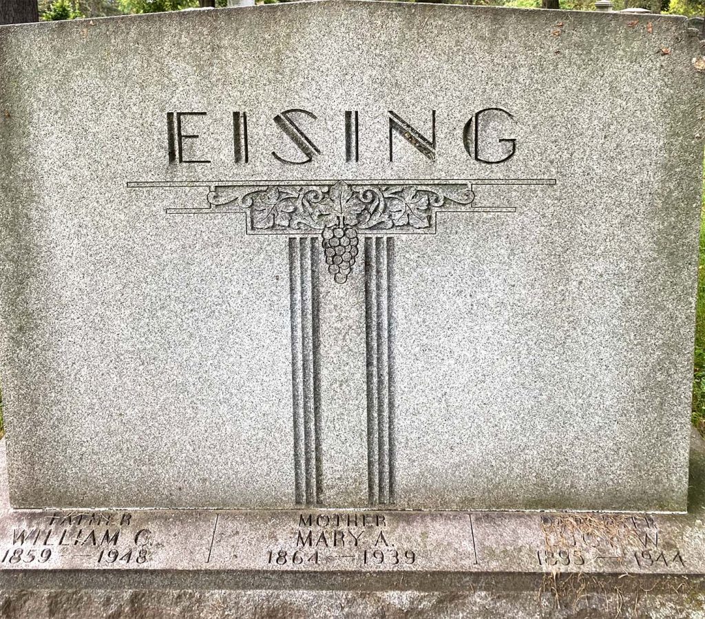
This next font is an example of a decorative historic typeface. Upon my discovery of this gravestone, I was immediately reminded of an old theatre font or “Ritz” font, and after doing research, it seems this font is exactly within that era and family of typefaces. Dating back to around the 1930s, the thick and double-lined columns qualify this font, in my opinion, to be something out of the 1930s decade. It was a very intriguing find and I enjoyed researching its origins.
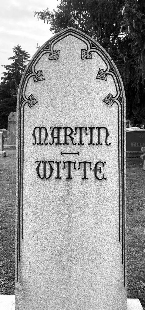
Further, I’ve included another example of a serif decorative font. This font is honestly so unique that it’s hard to pinpoint exactly what period it comes from. The font resembles qualities within a blackletter, but there are some differences. This font has more curves and script features, but albeit, it’s probably a variation of some blackletter font.
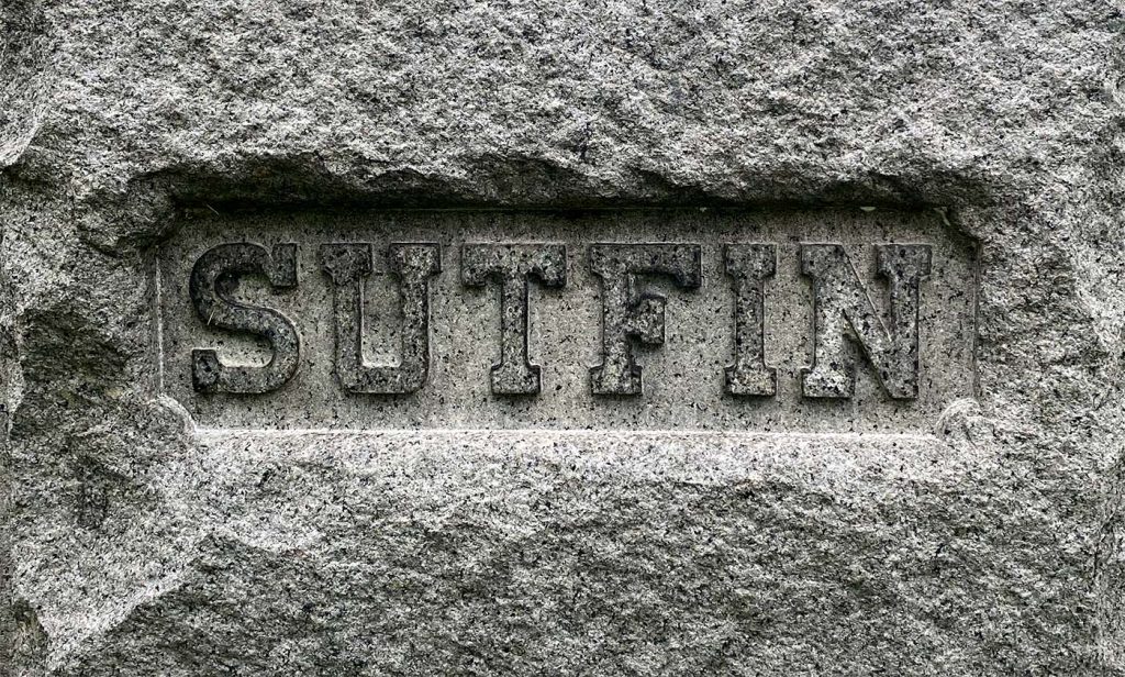
As we move down the gallery, this next tombstone attributed to “Sutfin” is a prime example of a slab serif. The thickness of the columns and rows have equal weight, and the serif tails are defined and blocky. This was, in fact, just one of many slab serif fonts I was able to find during the trip to the cemetery.
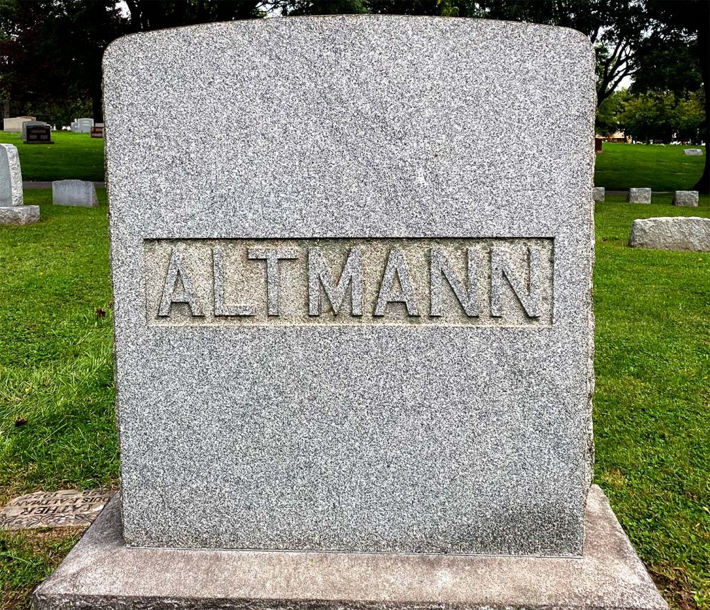
Onward, this next font for “Altmann” is easily identifiable as a sans serif typeface. The minimalist nature of the letters, all easily legible and clean-cut, make this font a really great fit in the sans serif family.
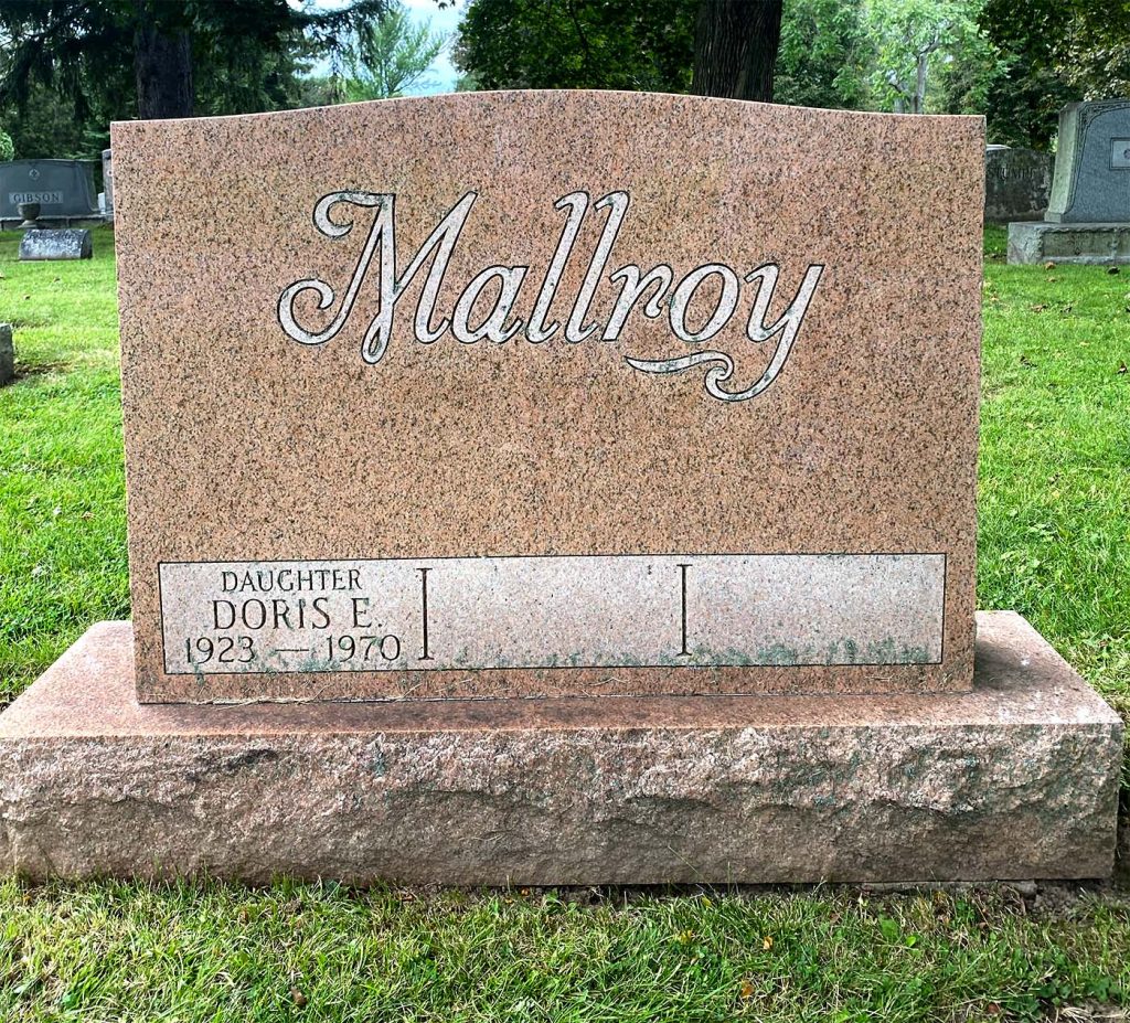
Next, we have a script font that is dated 1970. this font is interesting because it looks to be created by etching stroke lines into the stone rather than carving out the entire letters. I thought this was a simple, yet elegant script font, and my favorite feature here is the elongated and decorative descender on the “y.”
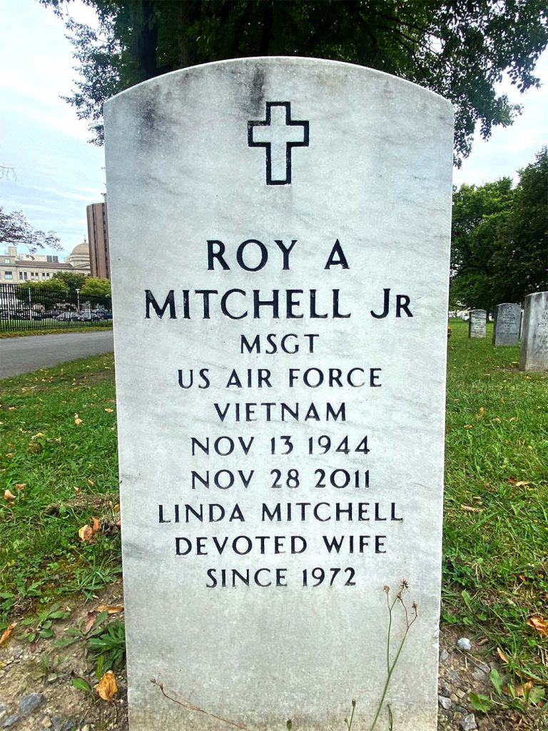
Finally, the last font to share was ironically the first one I saw when walking through Forest Lawn Cemetery. This font classifies as a serif font, due to its serif tails that are subtle, yet detectable with a close examination. It seems this font is one of the more classic fonts visible on veterans’ tombstones not only in this cemetery, but in many around the United States. I think the tone of this font and tombstone is formal, and it’s clearly ubiquitous within memorials.