What did you learn?
Working on the halloween card really helped me to learn and sharpen my skills on photoshop. I had prior experience with the program but learned new techniques that improved my work and efficiency.
What was easy?
The easiest part for me was removing the background from photos. I used the magnetic lasso tool and was able to very quickly and neatly cut out the image. I also found the font process to be simple. Downloading them was easy and then adding effects to make the words pop was also a very simple process. The fonts and effects came together well to make the card look better and scarier!
What was challenging?
The part I found most challenging was working with many layers. At some points it was confusing and took me time to file through all the layers I had. For my future projects I am going to take more time to name and organize my layers.
How could your submission be improved?
I believe that a little more imagery and text could improve my card. Although many people prefer the more minimalist approach in design nowadays I still felt that there was to much negative space in my card.
How can the professor improve the assignment in the future?
The professor can improve the assignment in the future by adding in more time for in class work. Also I believe that some more options could have been helpful, teaching us more ways that professionals use to create cards.
How might you apply your knowledge in future assignments or work scenarios?
This project really helped me to commit many techniques to memory and learn new ways to solve problems. In the future many of these foundational techniques will help me to improve my work and enable me to learn advanced techniques.
How did a specific reading, video or example inspire or help you?
The one thing that inspired me the most was when there were examples shown form former students. Showing me the physical product really helped me to understand the project and gave me idea on how it will look in my hand. The examples shown also gave me the idea to use black as the dominant color. The color black really highlights the other elements on the card and helps it to stand out.
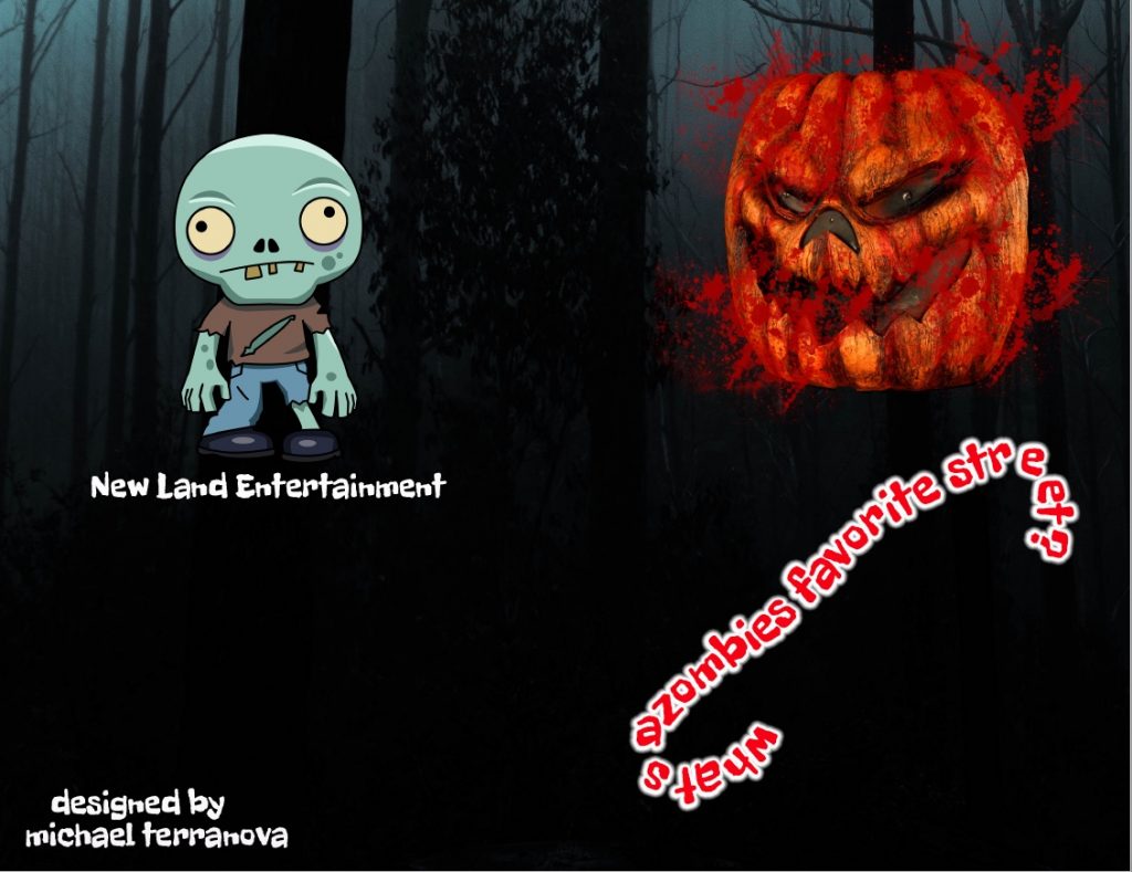
Front and Back of Card:
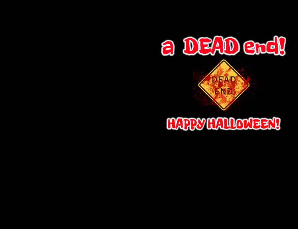
Inside of Card:
Michael Terranova