Categories
Uncategorized

Project 1: Point of Sale

By Brandon Scott

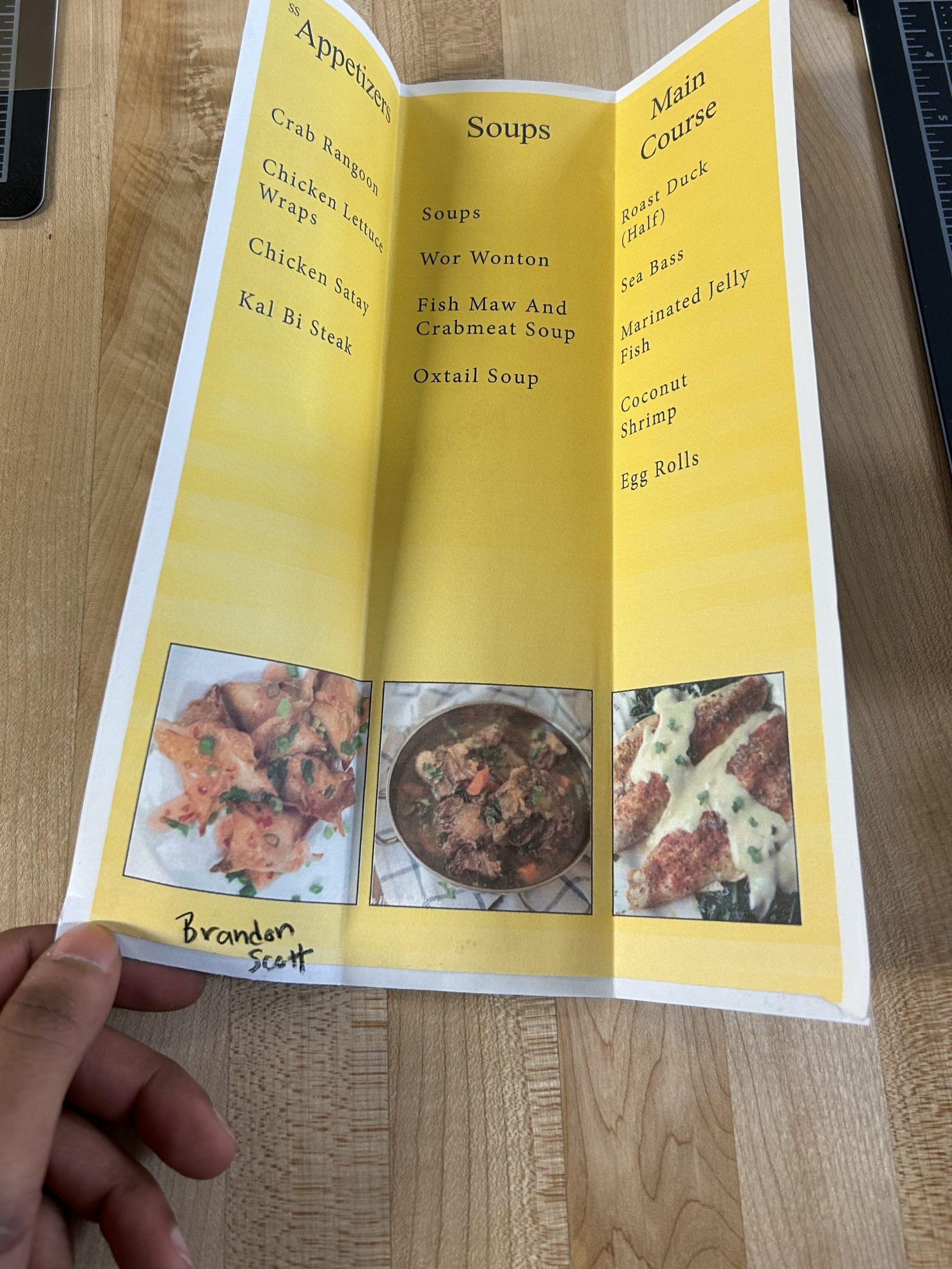
1.) In this project, I learned how to create a menu for a restaurant and how to use the tools from labs 1 and 2 to create a whole menu. I never created a menu before, and it was an experience that I would like to explore more outside of the classroom.

2.) The easy part was moving around in the indesign program. With this being the first semester and the time I used to create, after this project, I feel a lot more confident in knowing what I want to do and how to do it within the program.

3.) The challenging part was creating the proper bleed strikes and filling up the empty space. I had a hard time adjusting the text and using the information I had creatively in the menu.

4.) My submission could have improved if I had found a way to put what comes inside the dishes under the main dish. There was a lot of empty space in the menu that I could have filled up with more information or pictures. If I had come up with a mood board of inspiration for different menus, I think it would have been easier to come up with an idea for my menu.

5.) I don’t think this submission could have improved, as it was pretty straight-forward.

6.) I will apply this newly formed knowledge to my future work scenarios because I will now take the idea of this project and build upon it outside of the classroom. I have family members who own small businesses and restaurants; I could create menus for them using what I learned in this project. I will admit I have to spend more time flourishing out my ideas, but I definitely understand the gist and understand the different ways I can apply these tools to real-world scenarios and use my creativity to help others. Whether it be increasing brand awareness or creating a point of sale, this project has paved the way to a path that I plan on embarking on, even though it is nothing I thought I could do before.

Categories
Uncategorized

Project 2: Merch

By: Brandon Scott


1.) In this project, I learned how to turn my graphic into a real-sized poster. Growing up, I loved hanging posters in my room, but as I grew older, I really stopped hanging things on my wall unless it was my artwork. When this project was announced, I was excited but also taunted because I didn’t know which one I was going to do. I have printed on shirts before with my uncle on his screen printer, but I never made stickers or a poster. So, I decided to make the poster, and in the process, I learned how to use the poster printer, how to size my graphics in inches for print, and also, along the way of creating the bills graphic, I learned a couple new techniques that I now use in my daily design routine.

2.) The easy part was creating a cool graphic that I liked. I’ve been doing designs and graphics in Photoshop since high school. I enjoy it with passion, and I feel like it is something that I can use to put me in the places I want to be. As I have already started to see that idea fruition, I decided to do a Buffalo Bills graphic because I have friends that work for New Era and people close with the Bills associates. Since I am graduating this year, I thought, why not do something super dope that I could put into my demo reel or portfolio, which I can show to my colleagues?

3.) The challenging part was as simple enough, getting the printer to connect to my laptop. But in all seriousness, I wouldn’t say that it was challenging, but it definitely took some time to figure it out, but at the end of the day, it was completed. I wanted to create a nostalgic feeling of old legacy and times to new day. I didn’t want to use too many graphics or subjects, because I didn’t want to clog up the space. I also didn’t create the graphic with it being just a graphic design. I had the intention of making it into a poster, which I think really helped me during the creation process due to my love for posters.

4.) My submission could have been improved if I had done the stickers too and made some that matched the poster. I will definitely get to that idea though, as I think it will be really cool. My submission could also have been better if I had a frame to put it in, but I am going to buy one and give it as a gift to my uncle to hang in his office.

5.) This was such a cool and fun project, I don’t think it could have been improved.

6.) The project has given me the ability to know how to create marketable merchandise. Posters can be hung up anywhere from the public outside on buildings to the intimates inside homes. I will use this information and these techniques  for my production company. I am going to create posters that I will have my friends and family members hang up. The goal is just to promote awareness and get the vision of the brand in front of people’s faces. It is something that is inexpensive and can be done easily since I can create the graphic and all I have to do is print it out to a certain size in inches.

Categories
Uncategorized

Project 3: Packaging Design

By: Brandon Scott

1.) In Project 3, I learned how to deconstruct an original box and recreate my own. As an intern graphic designer, this project taught me a new way of creating that I had never done before. It’s one thing to design a graphic, but to be able to bring that design to life will allow me to creatively separate myself from other designers. Since doing this project, I have implemented the tools that I learned in three recent designs. The graphic feels and looks different when you can actually see what the final product could actually look like. I noticed that it also allows me to think about the realism of the graphic as I design it; it’s not just going to be a graphic; it’s going to be an item that is physical.

2.) The easy part was getting the measurements of my original box that I used for inspiration. It was also easy to trace the image and create the boxes to match the original. As I’ve gotten more comfortable with the rulers and creating in indesign, I feel like it was more about using the different tools from the labs and putting them all in use with one project.

3.) The challenging part was coming up with a new idea that was original. I didn’t want to just pick something and throw it together; I really wanted to create something that could be useful, whether it was the idea of it or the actual thing. This is the first time that I created a package design that I had to put together. Even though I had my original inspiration on hand, it was still hard putting my new box together. I had to tape some pieces, make new cuts, and adjust the box so it looked presentable and was fairly put together.

4.) My submission could have improved if I had taken more time in the last steps of putting it together. As it was my first time using my craftsmanship to create a new design, I realized I had to develop more patience and really design the packaging. I’m happy with my submission because I put my all into it, but I think if I had spent the same amount of time putting it together as I did designing it, it would be way better.

5.) I don’t think the professor could’ve improved the assignment.

6.) I will apply this knowledge in future work scenarios, as this project helped me gain an understanding of the way a package is defined and made, as well as implement another creative ability in my own. I believe that if I keep practicing after graduation, these tools will grant me opportunities that wouldn’t be there if I hadn’t learned them, because I had never had this in mind. That is what I really appreciated the most about these types of projects during my college career. They allow me to embed them into real-world applications; it’s never something that goes unused.

Categories
Uncategorized

Scott Project 4: InfoGraphics

1.) During this project I learned my way around illustrator more than ever and in the end was able to obtain the knowledge on how to create infographics, map are something that will always be needed so that it why I feel like during this project I learned a “lifelong trade”. I also learned how to be more precise with the pen tool.

2.) The easy part was picking my location for the project and as well as the color scheme. But the challenging part was trying to get a fluid non cluttered layout.

4.) My submisiion could be improved if I included the golden gate bridge in the image.

5.) The professor couldn’t have improved the assignment to b better than it is now.

6.) I will apply my knowledge from this project to create infographics maps for music covers as well as maybe be able to sell them to people.

Categories
Uncategorized

Project 3: Package design

1.) I learned how to create a background texture and apply it to the package design, as well as assemble the design for a milk carton from the layout to the assembly of the carton

2.) The easiest part was tracing over the original image and adding the parts that makeup the carton because of the layout that was given.

3.) The challenging part was trying to get the lettering of the logo to look a little cleaner and create a sense of depth from the overlay. It was also pretty challenging drawing the coffee mugs.

4.) My submission couldve improved if I wouldve used the pen and tablet to draw the coffee mugs.

5.) The assignment doesnt need to be improved

6.) I feel confident enough to create my own carton or packaging of some sort and I plan on using the knowledge I got from this project to do just that one of these days.

7.) The project demo helped a lot in terms of understanding what to do

Categories
Uncategorized

Project 2: Image Compositing

1.) During this project I learned how to combine different images, apply layer masks to transform them, and remove their backgrounds to make a type of collage.

2.) The easy part was selecting the photos that I wanted to use, I chose to go with the things I use on the weekends, it was also easy placing the images together into one layer.

3.) The challenging part was trying to incorporate the background textures into the image, underneath the texture layer of the carpet I have a filtered layer so I placed some of it around certain items but on the controller fill I tried to create a form of texture within in as it sits ontop the carpet.

4.) My Submission could be improved if the cut out of the controller was filled with the filters layer background.

5.) I can apply the knowledge I got from this project to complete other assignments in photoshop as well as possibly create another collage of my own or for someone else.

6.) I was inspired a lot by Erick Johnson’s surreal photography

Categories
Uncategorized

Project 1 : Portfolio

Scott Blog Post

Retouched
Retouched
Retouched

1.) During this project I was able to learn how to take an original image and turn it into a thumbnail and put it on the web. I also learned how to clean the images up using the techniques we learned in the previous labs.

2.) The easy part of this assignment was choosing the theme that I wanted to go with. I chose music because I listen to it everyday and I have a passion for it.

3.) The challenging part was resizing the images the correct way and setting up the indesign print. And also uploading the original images onto the comdma site.

4.) My submission could’ve been improved if I turned it in to the dropbox earlier to get feedback to receive help on what was challenging, which I will start doing moving forward.

5.) I will apply this knowledge for future endeavors if I was to create a project I can present the images and pictures on a website that anyone can access with the link.

Categories
Uncategorized

Dma217 Lab0

Categories
Uncategorized

Project 2: Color

Split Complementary
Triad
Analogus
Complementary

During this lab, I learned how to create different landscapes using different color schemes. For the desert landscape, I used a split-complementary color scheme, adding a linear gradient for the sky and a linear and radiant gradient for the sun to present the feeling of an evening oasis. Next for the city landscape, I used a triad color scheme using different tones and saturation of red to show the distance between them. The three colors I used were red, blue, and green. For the underwater landscape using an analogous color scheme, I showed the contrast between the seaweed and used different shapes to give a more underwater experience And lastly, the easiest landscape was outer-space, I used a complementary color scheme using different sizes of shapes representing things you would see in space. The most challenging part was trying to create a realistic feel within the landscape using different tones of color and shapes. My submission could’ve improved if I would have sent my project into the dropbox a few days earlier to receive feedback and wanted criticism from my professor and classmates. I don’t think this assignment could be improved because it was super fun and I had to use knowledge from previous assignments to be able to convey the ideas of what I did. For future assignments, I will apply the knowledge that I gained from this project by remembering how I showed distance, contrast, and similarity to create a realistic visual landscape for the first time. I was able to get inspiration from different photos of real landscapes and from examples shown in class to get a better understanding of how I can create the visual effects and use colors to show different moods and environments.

Categories
Uncategorized

Twinkle Twinkle By: Brandon Scott

Twinkle Twinkle little star
How I wonder what you are
Up above a world so high
Like a diamond in the sky
Twinkle Twinkle little star
How I wonder what you are

During this project I was able to learn a lot about visual perception and how to reflect illustrated principles in design. For each principle I was able to learn how to present each in different frames using the form of shapes. I also learned throughout this project how the “gestalt principles describes how the mind organizes visual data.”

I am a visual person so creating the shapes and finding ways to represent what was being said in the nursery rhyme was very easy. It was also easy to use the principles because I can understand what each principle means and how they can be shown in the illustration. For example in the second frame “How I wonder what you are” I used the moon as the I that is wondering while having the star be the focal point of what object is being wondered about. In the third frame “Up above a world so high” I made the star look like it was shooting up away from the earth and the other stars by using lines as a representation of upward motion. In the last slide, I used the twinkling star as the focal point in the thought bubble and I used continuous stairs leading back to the moon in the representation of the small bubbles that are underneath thought bubbles coming from the thing that is thinking (the moon).

The challenging part was the process, I had to redo my project because my safari had crashed and my progress wasn’t saved after I had to force close it. It was challenging because I had to recreate my ideas knowing they weren’t going to be exactly like my original. But on the good side, I was able to learn from my mistake of not making sure everything is being saved as I work and I got extra practice in the software.

This project was very fun and interesting and I don’t think anything could have been improved with the assignment. On my end however I could’ve improved my submission if I knew more creative ways to represent the nursery rhyme with primitive shapes.

“Gestalt Principle Applied in Design” and “Design Principles:Visual Perception and Principle of Gestalt” were the two sources I used for inspiration during this project. It allowed me to understand the meanings and representations of the Gestalt Principles. I will apply my knowledge in future assignments or work scenarios by keeping in mind the Rule of Thirds, Layout crimes and the basis of what Gestalt Principles are.