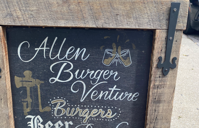
The first font style that really caught my eye was the above picture of the “Allen Burger Venture” restaurant, hand-written on a chalkboard sidewalk sign. The appeal for this style comes from its extravagant and elegant cursive writing. It’s clear that the artist who drew this had a still hand and was attentive to very small details: the placing of each word, the thickness or boldness of the font, etc. I think a cursive type works well here in context and the style definitely gives the board and presentation of the restaurant a “classic” feel.
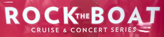
The next typeface that was noteworthy enough to capture is this “Rock the Boat” concert series paper advertisement. I’m drawn to the simple, sans serif style here that gives the poster a clean and dignified look. Another great feature of this font is the spacing; the letters are not cluttered and have equidistant space in between the letters that comprise each word. I also like the subtle outlining of the text to make it look three-dimensional.
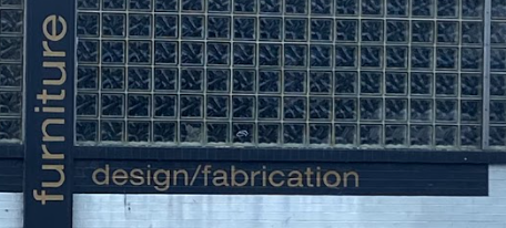
The final typeface I chose to include in this lab are shown in the “furniture” and “design/fabrication” titles for a store in downtown Buffalo. Admittedly, I thought this was Helvetica at first glance, though some subtle differences do distinguish this typeface as something slightly different. At any rate, the placement of this type on the walls to frame the window make it appealing to me, and I thought I’d feature it to highlight the influence Helvetica has on its successors and close iterations in the contemporary world.