Project 4

When fist beginning the project I was very confused on what location I should even focus on and even what was so special about that specific location that I did end up choosing.

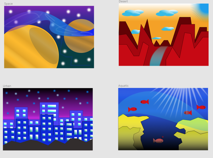
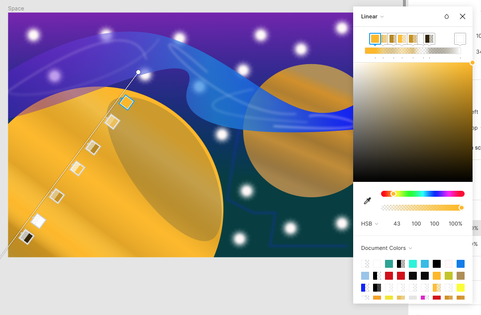
I decided that I should go with my home town of Eden which had all four topics that were included in the project. I essentially, learned how to do the whole image tracing on illustrator which was rather difficult at first it became more and more simple as I continued forward.

As you can see that the tracing on these stamps turned out to be much better than I thought that they were going to be.

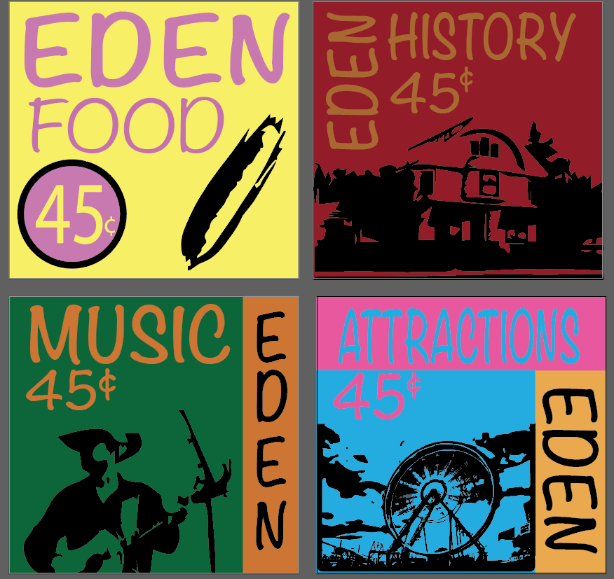
The food tracing is of corn, while the second one is kind of hard to tell but it is of Eden’s kazoo factory, the third one is a country singer, and the last one is of the Eden corn festival which in my opinion. they all turned out to be rather perfect in a certain aspect, to me at least.

The easy part of the project was establishing all of the color schemes that I used for each stamp, they may not match all together but if one looks at it in the way of the stamps individually they look rather pleasing to the eye.

The challenging part of the project was space management which turned out to be harder than I thought and upon working on that for an extended amount of time I still feel as though my spacing is still off. There is only so much that you can do it all begins to look the same when you are staring at the screen for a couple hours.

My submission could be improved by maybe having some type of peer reviewer to make sure that spacing is perfect or at least close to the borders where everything fits perfect without actually looking like they are jammed together.

There isn’t really a way for the professor to improve how the project is played out it is very to the point and although intimidating and first it is a lot easier when actually getting into the motion of things.

In the future this can definitely help me in the process of colors and the possibility of utilizing the tracing aspect of illustrator.

The videos that the professor made of the tracing part of the project definitely helped me save time in the process of trying to figure out how to do the tracing part of the project.

Project 3

When I was first introduced to the project and I heard that I had to work with photoshop to create something that if any normal person looked at it they would immediately assume that it was in fact a real thing. I was very nervous and worried about something like that because I have zero experience with working with photoshop and I have little to no artistic ability.

My choice for the project ended up being “time flies” and I began my initial search of trying to find a clock that would conform with the a set of series of wings that I went through and I ended up choosing the following pictures.

These are the two pictures that I decided that I was going to bring together to make the whole “time flies” thing all together.

But overall I learned how to do things like blend, paint, crop and even learn how to use a magnetic lasso to cut out the background of both of the pictures that I found somewhat fun to do.

The things that ended up being rather easy was the brining the whole picture together at the end which ended up looking like this:

This is what the overall finished product looks like, personally I think it turned out great I spent a lot of time working on the edges of the wings and smoothing out the clock.

The more challenging side of the project was when I was working on using the magnetic lasso grabbing all the way around the edges of the clock and the wings, since there was to many defined edges and what not the lasso kept going towards the inside of the watch which kept messing up to whole thing while I was cropping out the background.

My submission that could be improved by maybe having a little more knowledge and more work with using photoshop because there was definitely times where I was lost and didn’t really know what I should do to either progress forward or to fix some type of mistake that was made.

I mean in my opinion there really isn’t really anything that the professor could do to improve this project mainly because everything that he showed us in class helped fully, even with him providing us with examples, help along the way and even with the ability to have the class critique the projects really goes a long way to help us really get down to the needle point of our projects and really perfect them.

Well with my new knowledge of photoshop I will really be able to work more indepth with photoshop and really be able to know what is going on and be able to have the knowledge to fix a potential problem and so on.

The majority of the videos that were posted helped me along the way because when I got stuck or lost the videos were there to help me out along the way.

Project 2 Color

Initially when I first started working on this project I was originally working on adobe illustrator but I did not really like the way everything was setup and I increasingly became more and more confused as I was working. So, I ended up switching to working on Figma because the way everything is setup more fluently.

Overall I learned how all the types of colors work together through ways like triatic, complementary, and even split complementary.

This is how my overall project turned out, and if I can say I don’t think that it is to bad.

The easy part about the project was really deciding what color scheme I wanted to use for each layout and it slowly came together into something rather really good that I am really proud of.

On the other hand the part that proved to be on the more difficult side was working with the planets in particular and trying to setup a gradient (mainly because Figma does not have a radial gradient option like Illustrator). So, I ended up using a multitude of different gradient layers to create somewhat of a radial gradient on the planet which took a very long time.

As you can see, there is quite the number of gradients that have been placed on the planet on the left to create somewhat of a radial look on the planet, it is not just on the one planet but it is on both of the planets.

The ways that my submission could most likely be improved is if I actually did it on Illustrator rather than working off of Figma, or even improve my aquatic layout because I don’t feel like that is my strongest one.

The professor could maybe have us do what we did with the first project by having us print out our layouts and then placing them on the foam core, because I personally found that part rather fun and exciting.

The knowledge of how colors do and don’t work together will definitely help me when working on future projects or even in the real world when I could maybe be designing clothes and such.

Lastly, just attending all of the classes and requesting help when I needed it definitely helped me while I was working on the project and even being able to refer to the videos to help me out while working on my project was very helpful t0 me.

Project 1 Blog

By: David White

When I first was introduced to this project I was very confused in fact I was nervous with what I was even going to begin to do. I went back and forth between Humpty Dumpty and the itty bitsy spider. I ultimately decided to do the itty bitsy spider because it seemed that it would provide me with the most creative approach or more to do in a sense.

I learned how to use the website “Figma” rather well it was very very slow at first with me trying to figure out what to do I also learned that layering your shapes and such was rather important and I honestly didn’t know that you had to drag each layer up and down on the side bar to pick where each layer was placed on the surface.

Once I actually figured out how to work Figma properly since it was my first time I was really proud with how my first little 600×600 square turned out:

I was excited and proud of what I created even though it is really nothing to really brag about it was something that I created which left me with a feeling of accomplishment

Furthermore, the parts that I found the most challenging of the project would to have had to be the part where we had to actually print out all of our 6 pictures and place them all on foam board and such but once I got help from fellow class mates it became a much more of a easier task and I found quite interesting and fun.

This is the final and completed work of my project I think it didn’t turn out to bad if I say so myself.

My submission could most likely be improved if I had a more imaginative approach as well as a above par artistic ability because it does not look to bad. To me it looks way to simple and if anything I would love to improve upon it by making it look way more elaborate.

I mean there is not really any other way that the professor could improve upon this project because as far as I can see the project is flawless inside and out giving us time in class to work on a rather simple project while also giving us a chance to really get all hands on with bringing our projects from the screen to a foam board which in my opinion look way nicer than I thought they were going to be.

The way I’m going to apply all of this new knowledge to future projects is to keep in mind of vicinity of the objects when working with them on screen along with keeping in mind of the boaders of the canvas and choosing whether or not if I’m going to take it off screen or move it inwards more so its not in the in-between that would mess ups the viewers view of it.

I wouldn’t say there was a specific reading of sorts it was going back and re-watching the videos of in class where the professor was showing us specific examples that really helped me bring my whole entire project together. All in all I think that this first project was a first of a lot of things for me and I thought I was cool to do all the hands on aspects of the project and I would really enjoy to do another one again to be entirely honest.