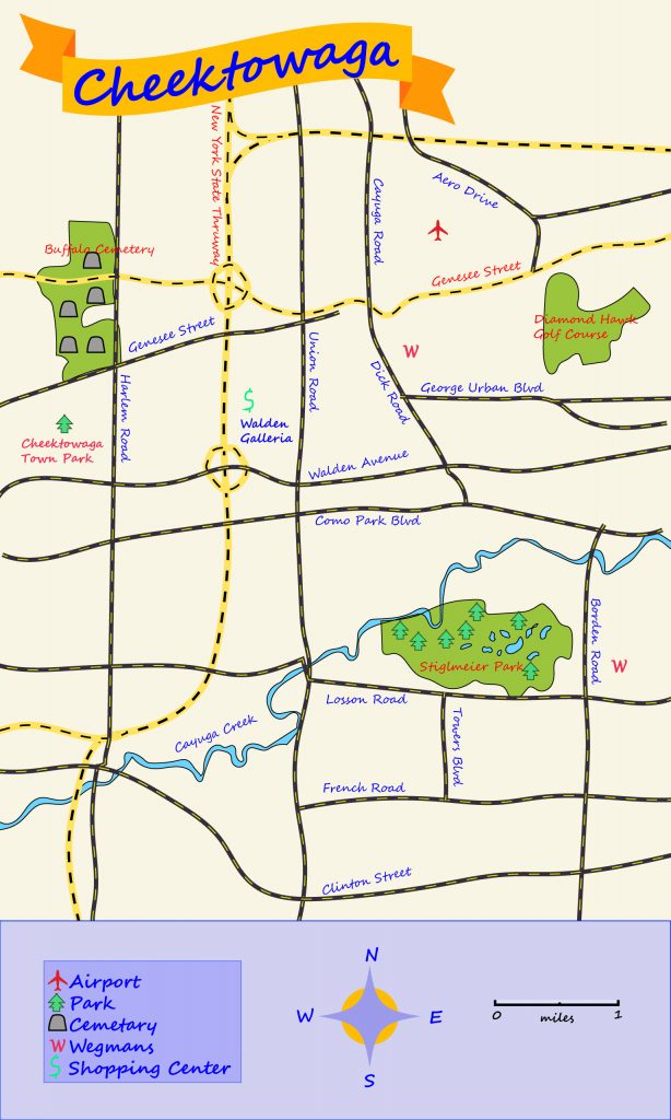
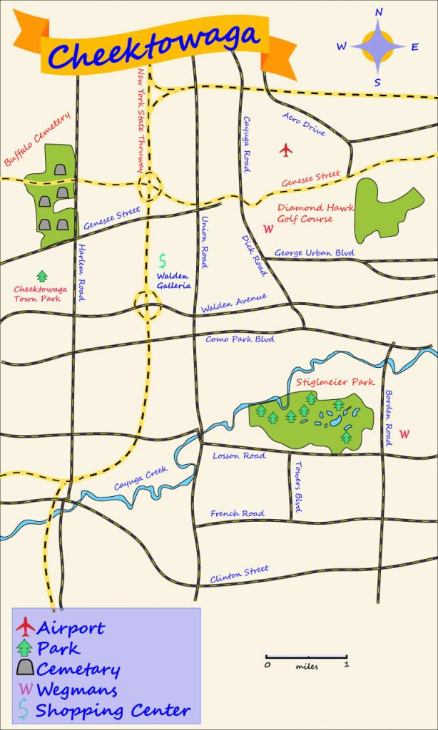
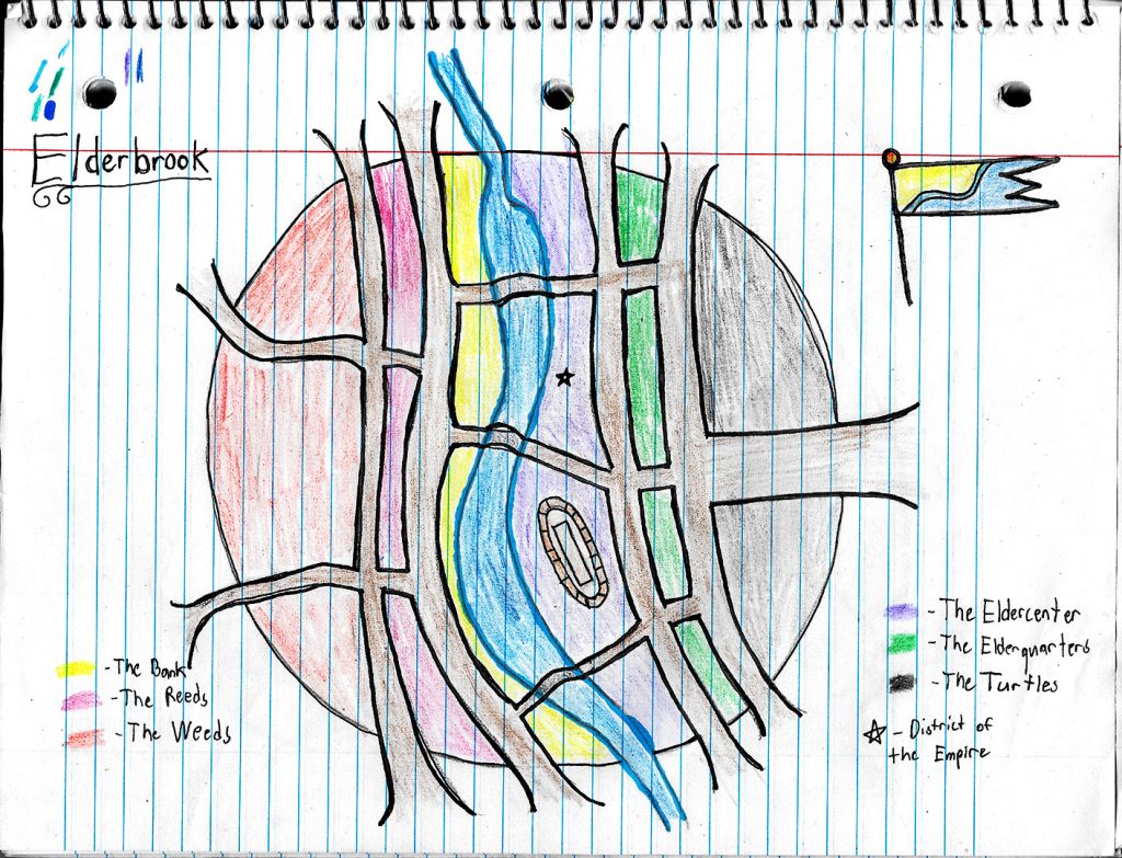
For this project, I decided to just create the map of my hometown, Cheektowaga. I went for a blue and orange/red color scheme for the map, as they are complementary and some of my favorite colors. Even though Cheektowaga does not have too many exciting places, I made sure to mark the highlights of the town, including the Walden Galleria mall, the Buffalo Airport, Cheektowaga Town Park and one of my favorite places to go for a walk when the weather is nice, Stiglmeier Park.
After receiving critique, I have not changed much. I moved the labels for some of the areas off the colored areas and onto the background so they are easier to see. I also slightly increased the font size for easier reading. I removed the bottom rectangle and moved the legend, compass rose and scale. This was done to make the map seem more together and that these three parts almost exist on the actual map. I did enjoy the rectangle before, but I do see the appeal of it not being there as well. Overall, I think this was a very fun project. It was a lot more open ended and taught me a lot about how layers interact with each other. I think my favorite part was the town banner. There was a lot of cool options for it and the making of the ends of the banner was creative. It is very neat how changing the colors of pieces of the banner can make it look like it is 3D.
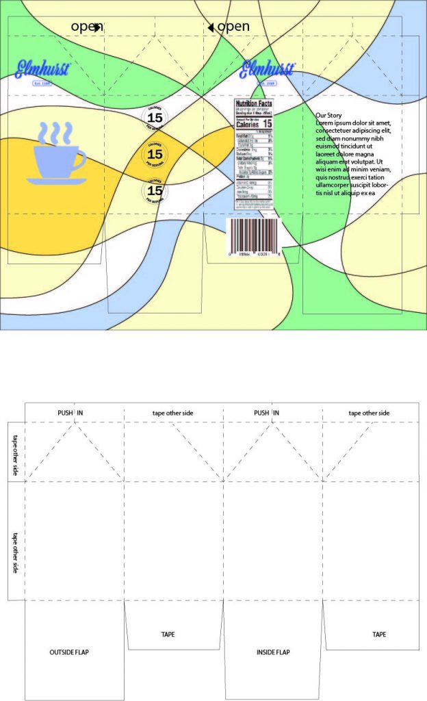
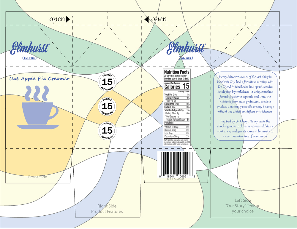
This is my product package. When I think of milk, creamer and dairy products, I usually think of more pastel colors. For the background pattern, I made a combination of more pastel colors that reminded me of these product colors. The cream color, the blue colors and the orange color were appropriate for this. I also added a green to the background pattern as this product is an apple pie spice creamer. I chose a simple coffee cup to the front and make it the same color as the logo, a light blue. I chose light blue as I usually think of the light blue that some milk containers are to signify that they are skim milk.
After the critique period, the first thing I did was reduce the opacity of the background. This made the colors a little less vibrant and achieved the pastel look I wanted to achieve. I made the calorie circles have a white background to contrast them from the pattern in the background. Finally, I updated the “Our Story” section with a short story from the Elmhurst website about how they started. I made all the font to be a similar script font to match the logo of the company. I added a lower opacity white box behind the Our Story to make it easier to read.
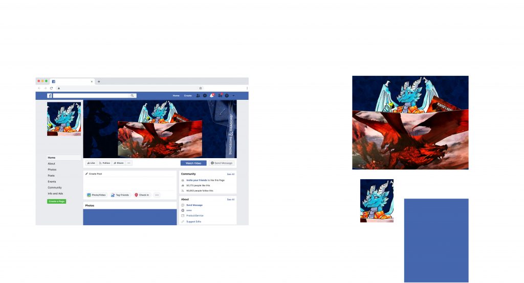
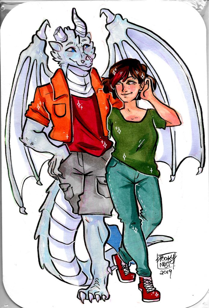
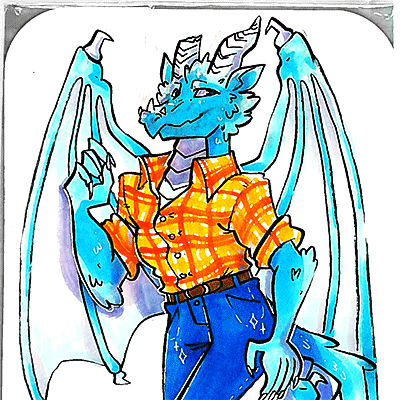
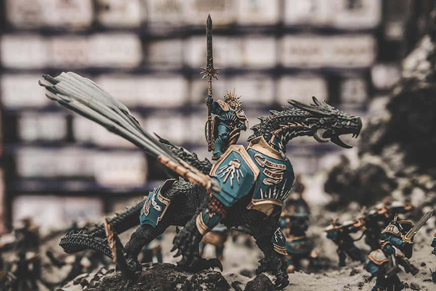
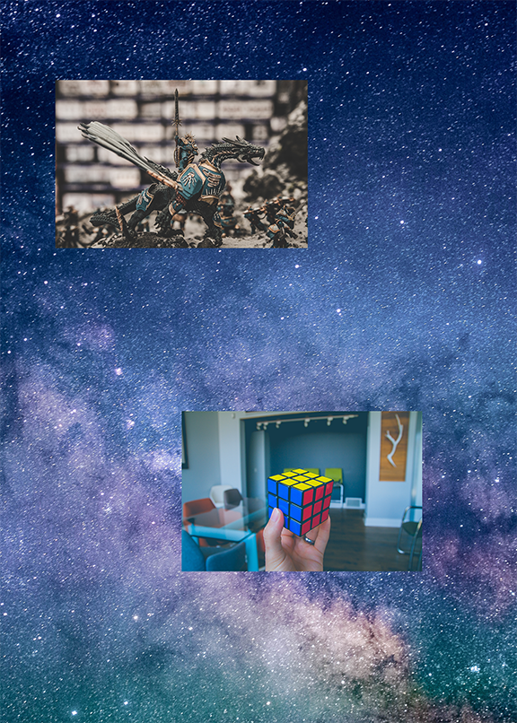
For Project 2, I decided to take the photos that I made and edited in Project 1 to create a Facebook page for if my character, Fulgur, decided to become a DM like myself. This could also be a suitable composite image for my own profile as a DM of D&D since he is my favorite character that I have made. I learned how to use various tools in Photoshop to make a composite image including masking, layers and layer options and effects. I used these tools to create an engaging and layered image.
Honestly, I didn’t find this project too hard or too easy. Discovering all the different options for masks and layer properties was fun to experiment with. I even learned how to change the pattern I used in the background. Masking the various pieces of the composite image was a bit tedious, especially with the number of details there are on Fulgur (the dragon). Overall, this was a fun project to work on and experiment with and explore Photoshop in.
I believe I did a fantastic job with this project. If I were to improve anything, I could have tried to do something with the small empty space to the left of Fulgur. However, I thought with the silhouette of the dragon statue on the left that adding else would make the left side too crowded. I believe the image is well balanced enough that the small empty space is fine to be there.
I believe the assignment is good as is. It allows a lot of creativity and experimentation, which I enjoyed. I believe one of the best ways to learn the workings of the program is to just let students find out themselves and explore what they can truly do once presented with the basic tools.
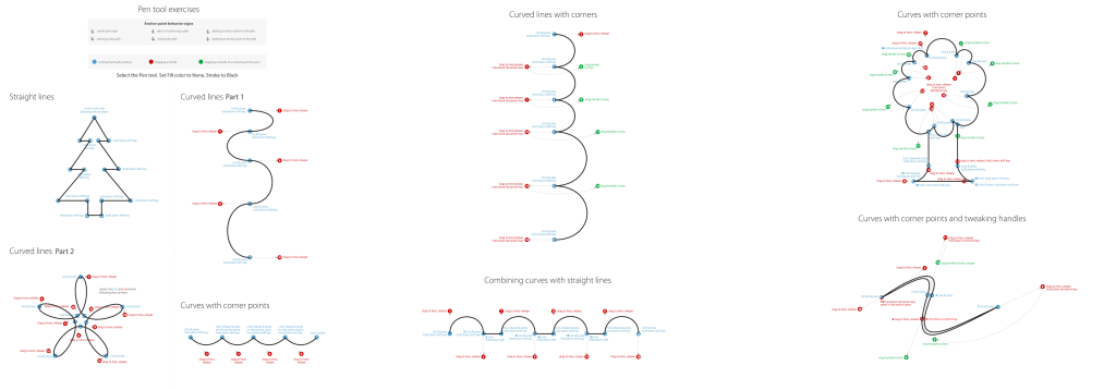
I learned how to use the pen tool in Adobe Illustrator to make corners and curves. We made different lines and shapes using the pen tool.
Before doing the exercises, I found the pen tool challenging. While the follow-along helped me learn how the pen tool works, I still find the tool confusing and had to use at times. I believe I need more practice with it to fully understand how to draw with it.
I don’t know how else my submission could be improved. I followed along with the guides and made the shapes. I could possibly try to make these shapes on my own without the guides as practice with the pen tool.
I did enjoy the guides for using the pen tool. I believe a lot of practice is needed with the pen tool, especially with someone who has never worked in these programs before. I could use these guides to practice more, either by timing myself or doing it without the guides.
In this lab, I learned a variety of ways to make textures from scratch and how to make a texture from an already existing photo. I have made a “Space Time” texture from a picture of space and a clouds texture from the complimentary colors of blue and orange. Overall, I like the clouds option, the gradients option and the brushed metal options. They produced pleasing textures that didn’t look too subtle or too overbearing.
The lab was not hard at all, and it was quite fun. My original idea for the texture from an image was snake scales, but that did not work well to turn into a pattern so I changed my ideas.
I think my space texture can be tweaked a bit to make it less unnatural, but I don’t think it is too bad. It was a lot worse before since there was a larger star in the corner that made it much more apparent.
For my first project, I decided to focus on a hobby I have grown to love, table-top roleplaying games (TTRPGs) such as Dungeons and Dragons and Starfinder. However, the hobby didn’t start as one at first.
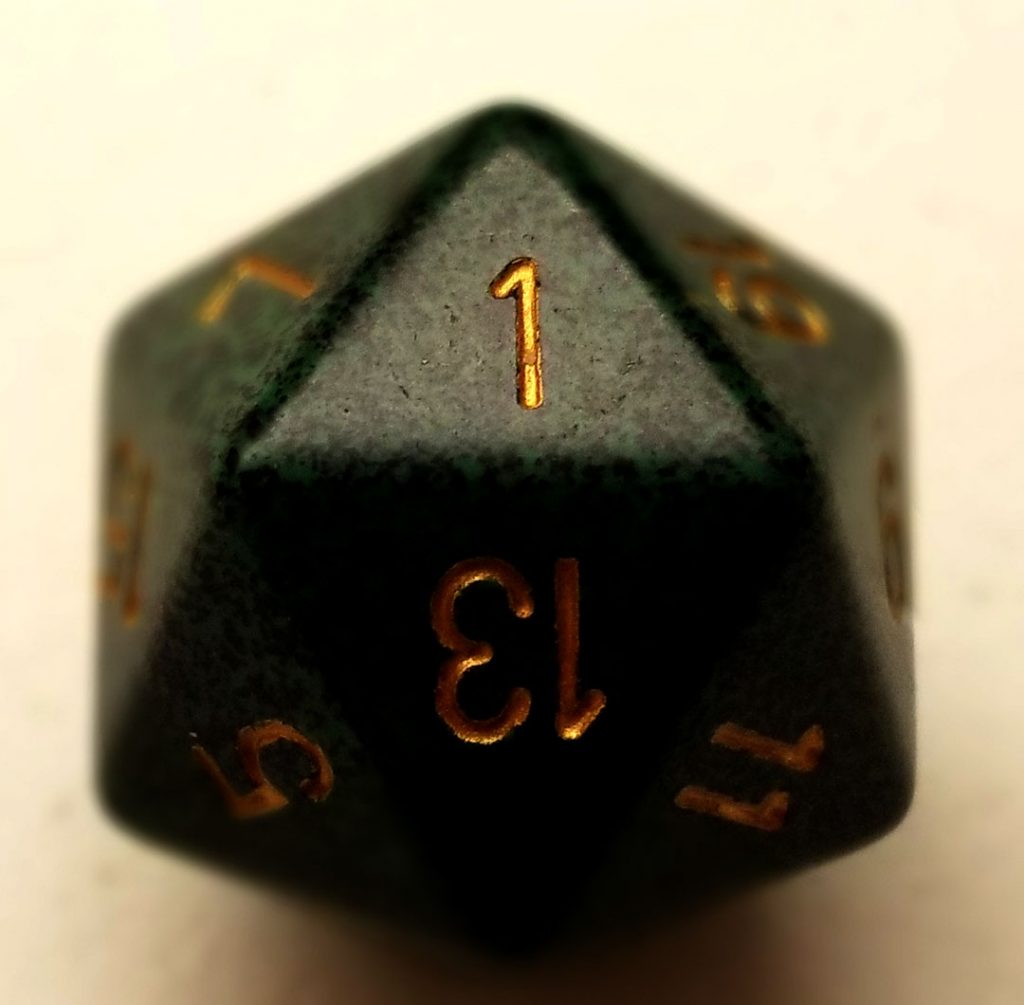
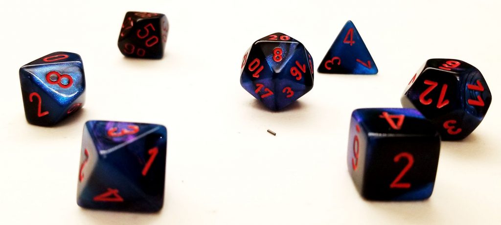
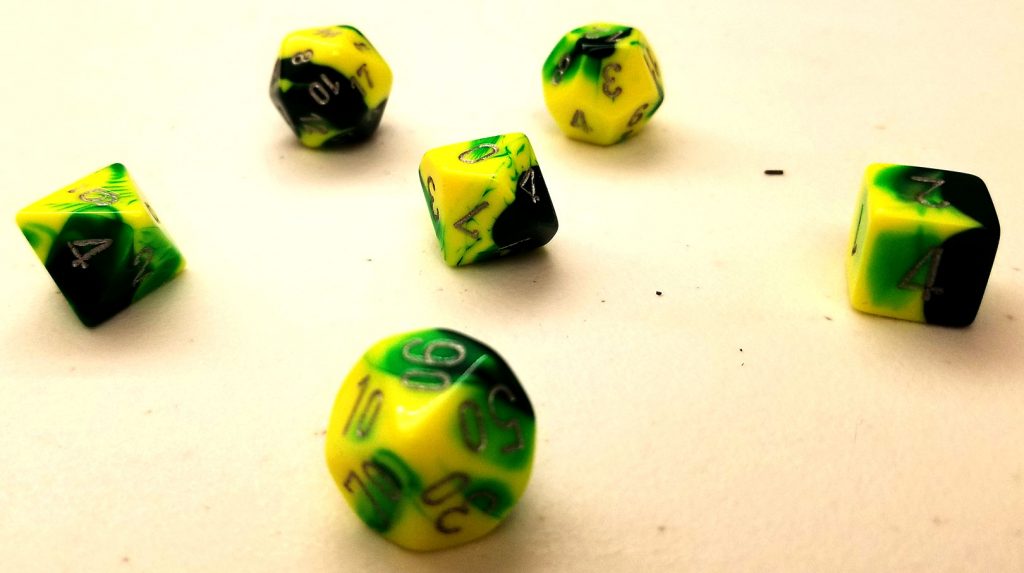
A variety of dice. The first one is a one to represent the unfortunate start of my hobby. The other dice sets belong to characters from then that I love, but they never got to their full realization. I have a different dice set for each character I have played.
I started playing TTRPGs a few years ago with a group of people from the Fusion gaming club at Canisius. I did have a good time with it in the moment. However, I learned that some of the people who introduced me to the games were not the best of people. After that, I didn’t think I was going to play much anymore. The games had associated themselves with these people and a bunch of my friends and I stopped playing them.
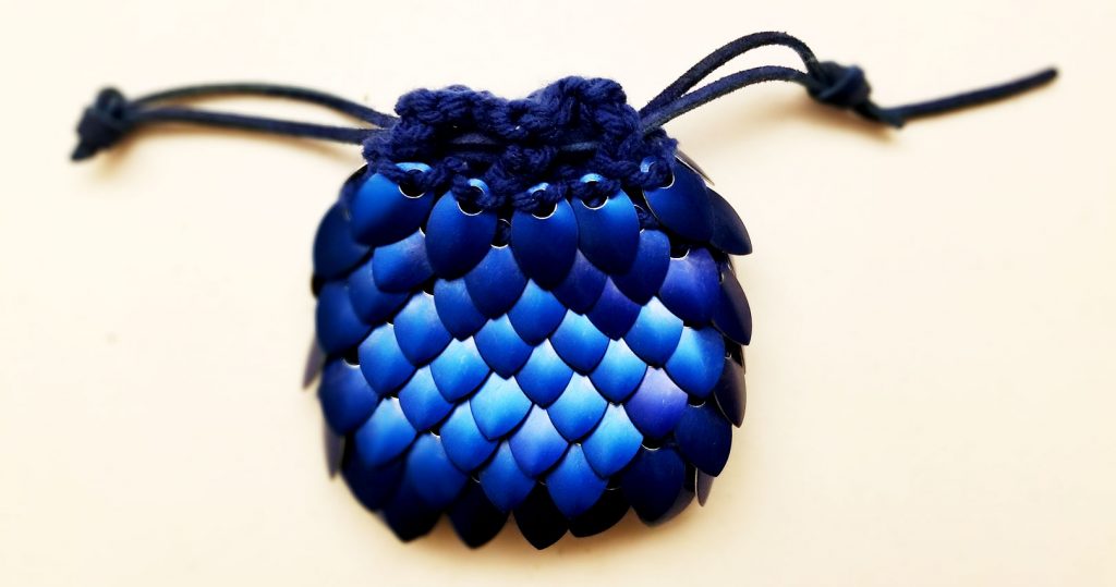
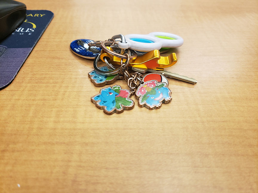
Some of the “hardware” of TTRPGS that I have recently gotten for my own games.
I still wanted to play the TTRPGs, but no one else really wanted to. So I made the decision to take it into my own hands. I wanted to dissociate it from the people from before and make it fun again. I bought myself the Starter Set for Dungeons and Dragons and rallied a group of friends to play. We loved it. They thought I was a good DM, and I loved doing it.
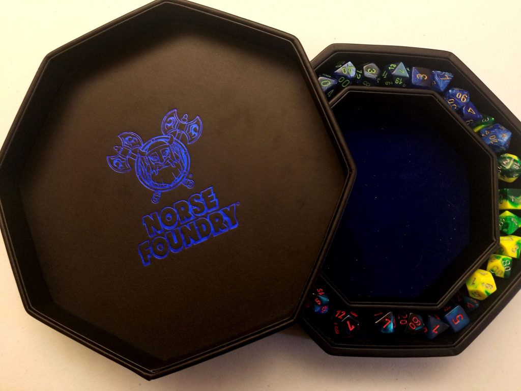
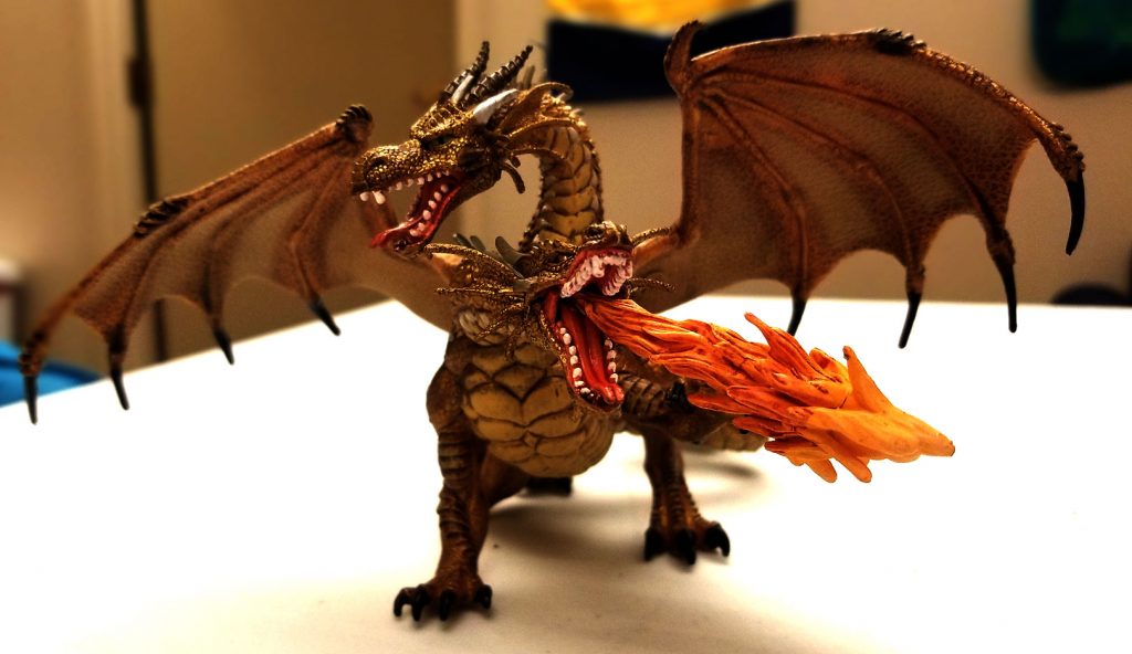
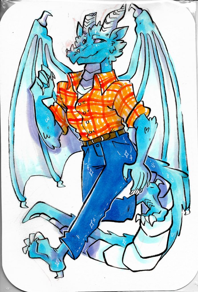
These are things that represent my reclaiming of TTRPGs for myself and my friends. The top row contains two character sheets for two of my characters and the pawns I used for my first campaign. The second row contains a map for the new campaign I created and two commissions of my character, Fulgur. He was originally from the time I played TTRPGs with those from the past, but I have also reclaimed him as my own. He’s my favorite character ever.
I’m now currently writing and DMing a campaign with the same friends that I have made myself. TTRPGs have quickly become one of my favorite hobbies that I cannot wait to play with my friends every week.
I learned how to use Photoshop and InDesign to touch up, color-correct and resize photos and scans and organize them into a document. The project was not that hard, only tedious. I did enjoy doing the levels and curves on the pictures, especially for the Fulgur drawings. They look so much better and brighter than the scans of them were by themselves. I think I did the best that I could with the assignment. I did improve it from its original by changing the picture of the dicebox. I think it can be improved by making the amount of pictures smaller, but forcing the theme to be more strict. Some people’s projects might have way too far of a spread to have a “theme”. I think a smaller set of pictures with a more strict theme requirement would be. Overall, I did enjoy the project. I was happy to show off my love for TTRPGs and my characters, specifically Fulgur.
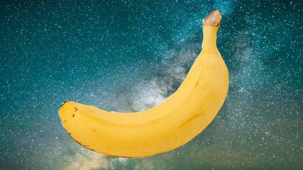
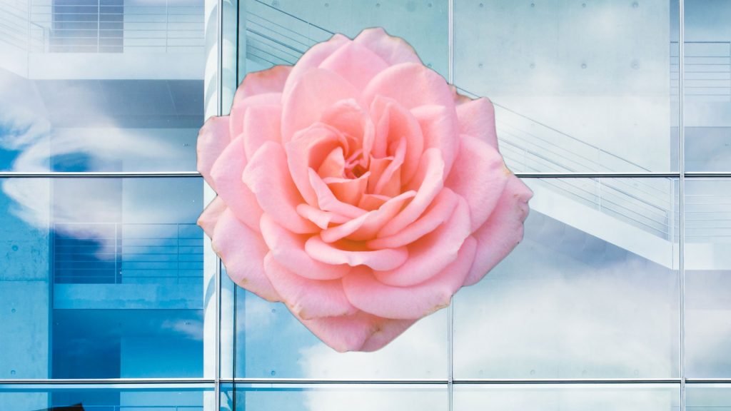
I learned how to use some of the tools in Photoshop in order to create mask layers and hide the background of images to put onto a different background. The banana was done with the pen tool, while the rose was done with the magnetic lasso tool.
Overall, I found the lab fairly easy. I like the magnetic lasso tool the most, as it is easy to use and still offers a good amount of options to fix the image. I did not like the pen tool. I found it hard to use and not as good as the other options. The background eraser was easy, but tedious to do. It did produce good results.
I believe the banana could be improved, as well as the model. The pen tool was hard to use and I would need more practice on it to make it better. The model would just take more time to adjust the background tool so I could keep more of her hair and less of the blue background.
I don’t think the lab could be improved. It was simple and taught about the important tools to use to make layer masks.
I can use this in the future to make images for the web, especially if I want a specific object from an image and want to put it on a different background. It can also be useful for getting rid of things in the background that one would not want.
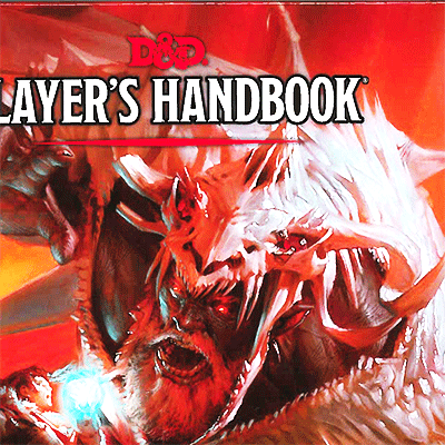
In this lab, I learned how to retouch images. I scanned two of the things that going to use for my first project, which is going to be a portfolio of images pertaining to one of my favorite things, Dungeons and Dragons and other table-top role-playing games. One of them is the D&D book and the other is my favorite character, a dragon named Fulgur. Learning to adjust the colors of the scanned images was fun to do and not too hard. It really just required a good eye for how color looks.
I believe the lab was relatively easy. Figuring out how the levels and the curves just took some practice and playing around with to understand how they worked. I used the scanner at the library again, and it was just as easy as before. For the first project however, I may omit or make the D&D book better as it couldn’t scan that well.
I think the first thing that I could do to improve my submission is to use something other than the D&D book. It didn’t scan well despite my best efforts. The dragon may also be too bright. I kept it though, since how the colors looked how they were supposed to with the character. I used my “photographer’s eye” in order to decide that his colors were correct.
I don’t think the lab can be improved. It was simple enough and taught me how to color correct the best I could. It is also good that we can use scanned images from our project, since it encourages us to do our project.
I can use this knowledge in the future to make images that are taken and scanned and make them look better than their originals. This is useful in web design so that images used on a website look professional, clean and vibrant.
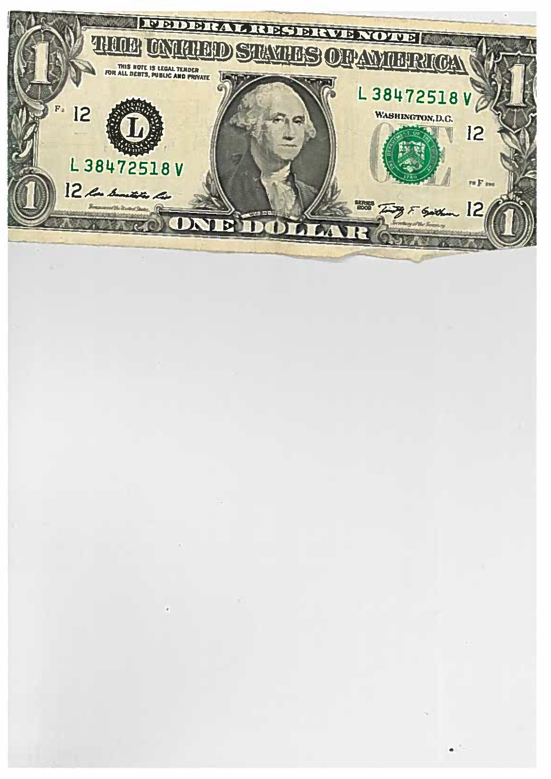
In this lab, I learned how different forms of acquiring images affects the quality of the image. The images that were taken with the high-end camera were brighter, sharper and higher quality. The scanned images retained the full size of the scan even though the objects or images weren’t the full size of the scanner.
Most of the lab was easy. Taking the pictures was easy enough, but getting the high-end camera may be harder to get with the limited amount of cameras that are available. The scanner was easy to use and easy to send the scanned images to my email in the library. Creating an image from Photoshop was also simple. The only thing I could count as challenging would be getting the camera, but I had no problem with it.
I don’t think my submission can be improved much because of how simple it is. Making the dollar bill smaller may have made it more like the rest of the images.
I think the lab can be improved if the use of the high-end camera was either removed or implemented differently. Perhaps it could be fixed by renting a single camera out for the class and let everyone get a chance to take a picture with it during class time.
I can use the knowledge from this lab for future projects by making sure to use the correct and most accurate image acquirement option for the job.
For this project, I learned the basics of Adobe Premiere and GarageBand to make a video based around an emotion.
The project was not that hard. I enjoyed making the music for the video. Filming clips was a little more difficult because of it being around an emotion, but I’ll talk more about that later.
I could have improved this project by finding more interesting clips to make the video out of. I also believed the music could always be improved.
I believe the project could be improved as a whole by allowing a different idea for the video. I felt limited by what kind of video I could make because it had to be based on an emotion.
Based on this video alone, I don’t know if I would be interested in making more. However, I extremely enjoyed the animation making and the music-making parts of the project. I may mess around with GarageBand more in the future.
I think the article from The New Yorker was the most inspirational article about film. It is true that what really matters is the idea behind the film, not the film itself. This inspired me during this project.